4.6 Scored Assessment

Charting  Sales Data

Download Data File: SC4 Data

An effective way to communicate findings in Excel is by graphing data. Graph the attached sales information, visualizing profit margin trends, and production patterns, and the sales pipeline; enabling decision-makers to grasp concepts of current business practices.

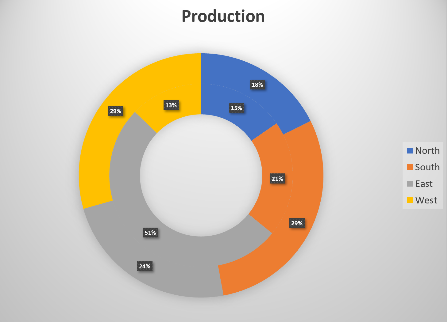
Task 1 Quarterly Production Data

Create the below Pie Chart showing how many locations will be producing products in the North, South, East and West Regions.

  1. From the Products sheet create the below chart.
  2. Move the chart to a new sheet. Name the sheet Doughnut.
  3. Save your work.


Screenshot of the Doughnut Chart
Figure 4.37 Doughnut Chart

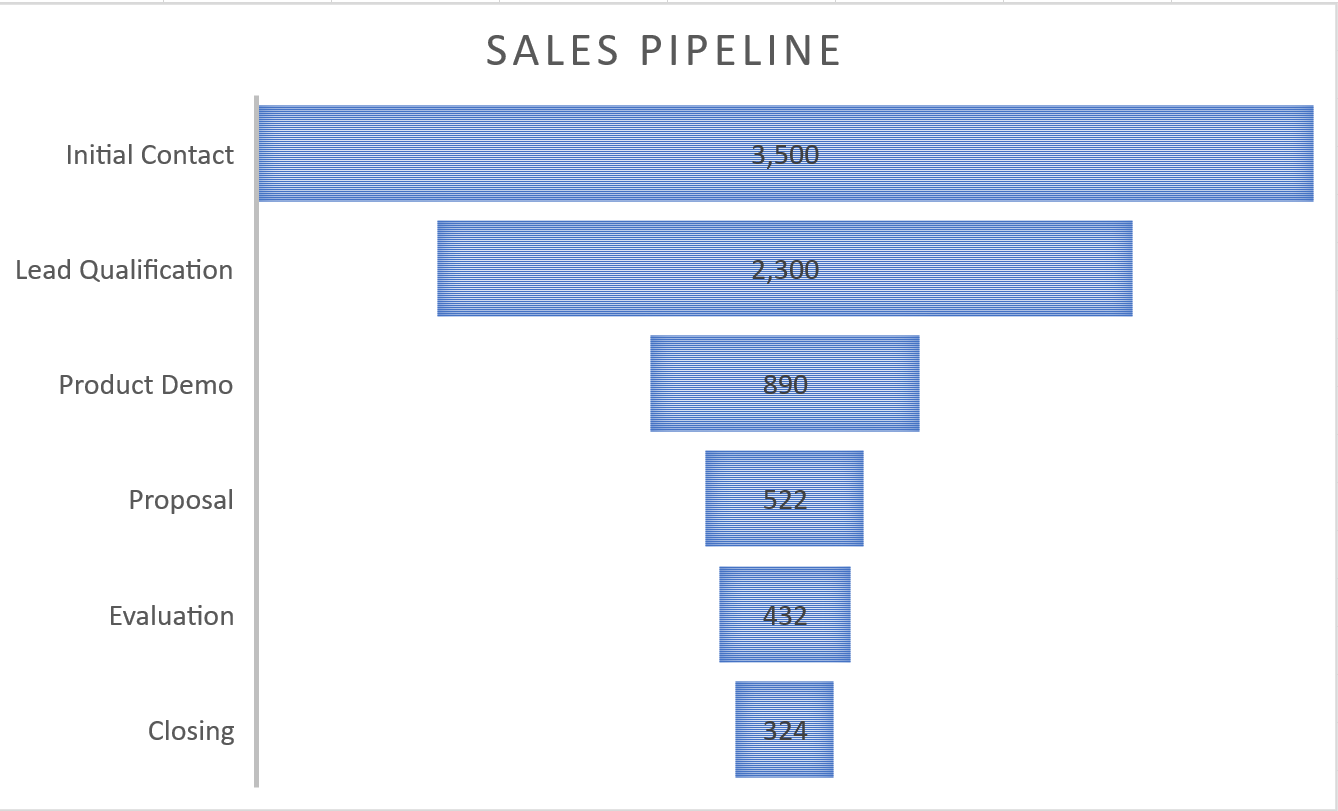
Task 2 Sales Pipeline

Create the below Funnel Chart to provide our sales team a visual snapshot of the company’s sales process, outlining deals that are expected to close within the month.

  1. From the Sales sheet, create the below Funnel Chart.
  2. Note to leave the chart embedded in the sheet.  Resize, and move the chart accordingly.
  3. Check the spelling on all of the worksheets and make any necessary changes. Save your work and submit SC4 Sales as directed by your instructor.


Screenshot of the Funnel Chart
Figure 4.38 Funnel Chart

License

Icon for the Creative Commons Attribution 4.0 International License

Excel for Contractors Copyright © by Barbara Lave; Nick Bredleau; Hallie Puncochar; Julie Romey; Mary Schatz; and Art Schneider is licensed under a Creative Commons Attribution 4.0 International License, except where otherwise noted.

Share This Book