
4.6 Scored Assessment
Charting Data
An effective way to communicate findings in Excel is by graphing data. Graph the attached sales information, visualizing profit margin trends, and production patterns, and the sales pipeline; enabling decision-makers to grasp concepts of current business practices.
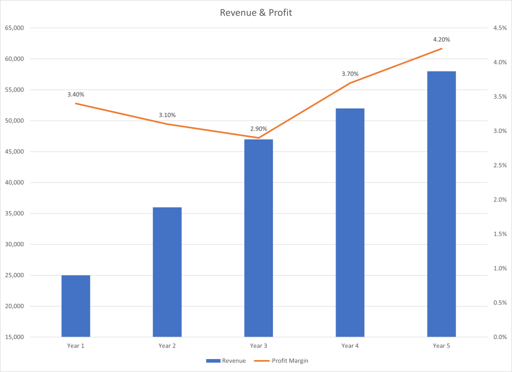
Task 1 Revenue & Profit Margin
Following the directions below create the charts shown. Note to match each chart exactly, including the chart styles, and axis bounds.
- Open the file named SC4 Data and then Save As SC4 Charts.
- From the Revenue & Profit Margin sheet, create the below Combination Chart.
- Move the chart to a new sheet. Name the sheet Combo.
- Save your work.
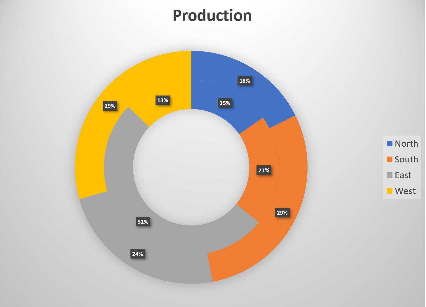
Task 2 Quartly Production Data
Create the Pie Chart below showing how many locations will be producing products in the North, South, East and West Regions.
- From the Products sheet create the below chart.
- Move the chart to a new sheet. Name the sheet Doughnut.
- Save your work.
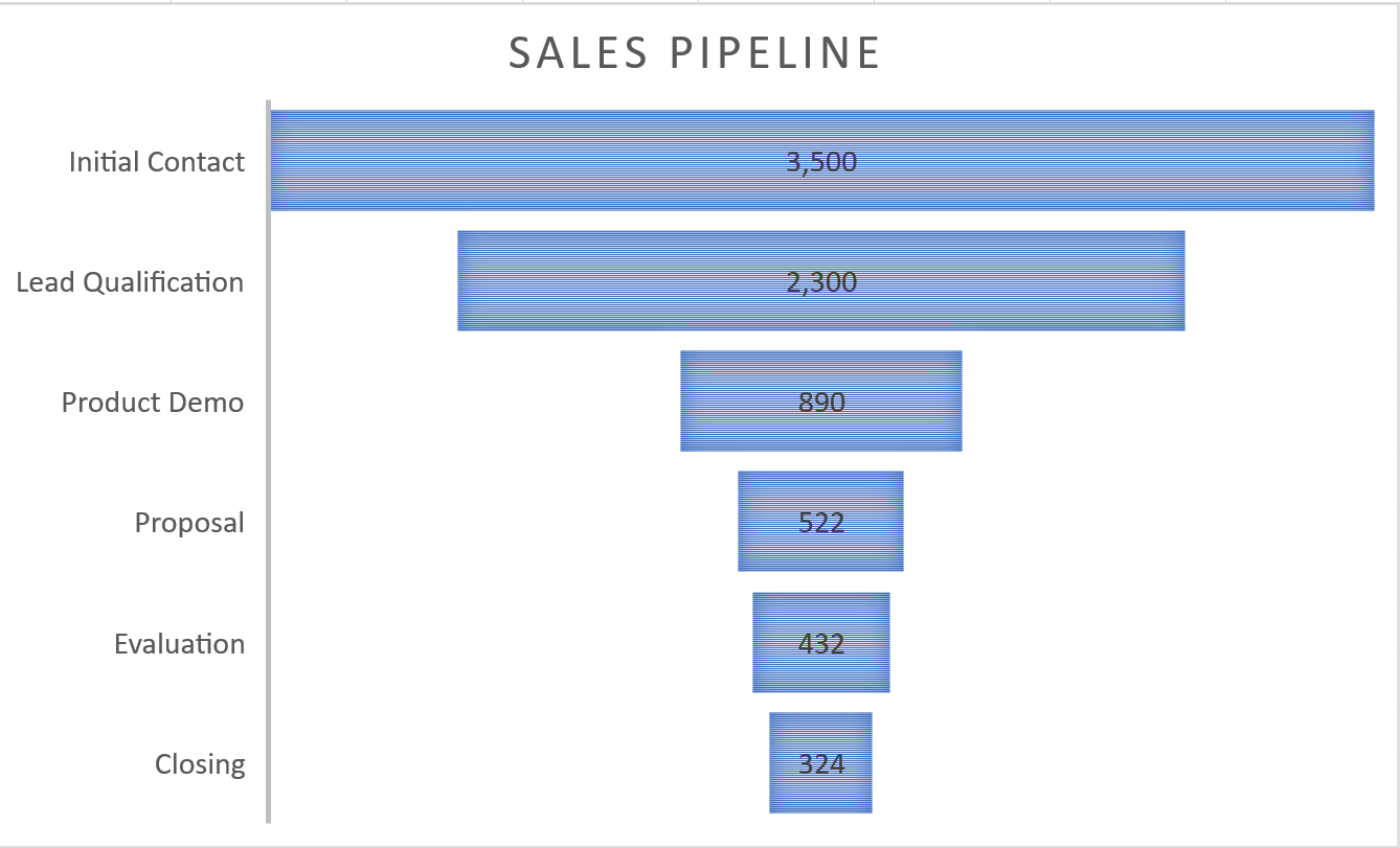
Task 3 Sales Pipeline
Create the below Funnel Chart to provide our sales team a visual snapshot of the company’s sales process, outlining deals that are expected to close within the month.
- From the Sales sheet, create the below Funnel Chart.
- Note to leave the chart embedded in the sheet. Resize, and move the chart accordingly.
For the next three tasks, you will not be given images of how the completed chart will look. There is no one correct answer. Remember to select an appropriate chart for what you want to show.
Task 4 Donation and Costs Chart
Create a chart comparing donations to costs.
- From the Donations & Costs sheet, create a chart that compares the donations and costs.
- Leave the chart on the Donations & Costs sheet, moving and resizing it as necessary.
- Format the chart appropriately.
- Save your work.
Task 5 Expenses Chart
Create a chart showing the total expenses for January – June for Nourish Now.
- From the Jan-June sheet select the appropriate data to create a chart comparing only the total expenses for each category.
- Leave the chart on the Jan-June sheet, moving and resizing it as necessary.
- Format the chart appropriately.
- Save your work.
Task 6 World Population Chart
Create a chart that shows the population percentage of various countries.
- Select the Countries Population worksheet tab. Select the appropriate data to create a chart showing the population percentage of the countries listed.
- Leave the chart on the Countries Population sheet, moving and resizing it as necessary.
- Format the chart appropriately.
- Save your work.
Finalize the Workbook
- Reorder the worksheets in this order: Combo, Doughnut, Sales, Donations & Costs, Jan-June, Countries Population, Revenue & Profit Margin, and Products.
- Adjust scaling so all sheets print on one page.
- Check the spelling on all the worksheets and make any necessary changes.
- Save your work and submit SC4 Charts as directed by your instructor.
