
12.1 Introduction to Control Charts

Learning Objectives
After studying this chapter, you will be able to:
- Define key concepts of Shewhart control charts.
- Distinguish different types of Shewhart control charts.
- Explain the statistical formulation of Shewhart control charts for Variables.
- Recognize out-of-control behaviors in Shewhart control charts.
- Develop an implementation strategy of Shewhart control charts.
- Create and analyze variable control charts Xbar and R Charts.
Control charts are used to routinely monitor quality and should be of particular interest to manufacturing, industrial, and process engineers. In general the goal is to create a plot over time and identify common causes of variation (due to random chance) and separate those from special causes of variation (due to malfunctioning equipment, human error, or unusual processing conditions, for example). If random variation is due to common causes alone, then the system is in statistical control. There are many types of control charts. We will focus on just a few.
When a process generates continuous independent data, such as measured diameters or weights, we apply variables control charts. Charts in this category are the Xbar, R, and S Charts.
Besides variable charts, there are attribute control charts that we apply when a process generates independent discrete counted data of defects. The types of attribute charts in this category include the P Chart, NP Chart, C Chart, and U Chart, to name a few. When a sample unit has one or more defects, we can classify it as being either defective or non-defective. The P Chart, which relates to the Bernoulli random variable, can be used to monitor the fraction of defective units. The NP Chart is derived from the binomial random variable and is applied to monitor the expected number of defective units. The C Chart and U Chart both relate to the Poisson random variable, and we can employ them to monitor the rate of defects.
The most commonly used control charts are the Xbar and R charts, together denoted as the XbarR Charts. These are a pair of control charts where continuous or variable data is collected. The Xbar Chart measures between-sample variation with the process mean, while the R chart measures within-sample variation. The R Chart can be used first to control the variability in the process and then the Xbar Chart can be used to control the process mean.
Why Control Charts Work
If a single quality characteristic has been measured or computed from a sample, the control chart shows the value of the quality characteristic versus the production number or versus time. In general, the chart contains a center line that represents the mean value for the in-control process. Two other horizontal lines, called the upper control limit (UCL) and the lower control limit (LCL), are also shown on the chart. These control limits are chosen, in accordance with the normal distribution, so that almost all of the data points will fall within these limits as long as the process remains in control. See Figure 1, which illustrates this.
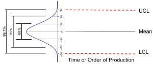
It should be noted that there is an underlying assumption of a symmetric distribution. If normality exists and we do not have to estimate the parameters, then the control limits as pictured in Figure 1 would indicate that if chance causes alone were present, the probability of a point falling above the upper limit would be roughly 1.5 out of 1000, and similarly, a point falling below the lower limit would be 1.5 out of 1000. If a point falls outside of the UCL or LCL, we would be searching for an assignable cause. Where we put these UCL and LCL limits will determine the risk of undertaking such a search when in reality there is no assignable cause for variation. On one hand, we want a small likelihood of a false issue being raised. On the other hand, we do want to discover a problems as quickly as we can.
Since 3 out of 1000 is a very small risk, the three standard deviation limits may be said to give practical assurances that, if a point falls outside these limits, the variation was caused be an assignable cause. It must be noted that 3 out of 1000 is a purely arbitrary number. There is no reason why it could not have been set to 2 out of 1000 or 1 out of 100 or even larger! The decision would depend on the amount of risk the management of the quality control program is willing to take. In general in the world of quality control it is customary to use limits that approximate the three standard deviation standard, as long as the statistic being plotted comes from a reasonably symmetric distribution and does not wander too far away from normal.
Out of Control
If a data point falls outside the control limits, we assume that the process is probably out of control and that an investigation is warranted to find and eliminate the cause or causes. Does this mean that when all points fall within the limits, the process is in control? Not necessarily. If the plot looks non-random, that is, if the points exhibit some form of systematic behavior, there is still something wrong. For example, if the first 25 of 30 points fall above the center line and the last 5 fall below the center line, we would wish to know why this is so. Statistical methods to detect sequences or nonrandom patterns can be applied to the interpretation of control charts. To be sure, “in control” implies that all points are between the control limits and they form a random pattern.
Source:
NIST/SEMATECH e-Handbook of Statistical Methods. (n.d.). https://www.itl.nist.gov/div898/handbook/, July 9, 2024
6.3.1. What are Control Charts? (n.d.). https://www.itl.nist.gov/div898/handbook/pmc/section3/pmc31.htm, July 9, 2024
Wikipedia contributors. (2024, July 5). Walter A. Shewhart. Wikipedia. https://en.wikipedia.org/wiki/Walter_A._Shewhart

Feedback/Errata