
2.5 Measures of Center
Averages as Measures of Central Tendency
One of the awkward parts of any language is that a word we use can often be interpreted differently by each person. If someone is trying to sell you something or get you to vote a certain way by telling you about some “average” value, you should be very suspicious and find out more. Which average is the person talking about? There are actually a lot of different averages, such as the arithmetic mean, median, mode, geometric mean, root mean square, and harmonic mean, to name a few. They are each calculated differently and express something different about a data set.
In statistics, we want a way to describe the “center” of a data set. Where is the center located? When someone uses the generic term “average” they are most often talking about the arithmetic mean, or we tend to just call it the mean. It is one statistic that describes the center of a data set. The second most widely used “average” that measures the “center” of a data set is the median, and as we know, it physically divides the data into two parts and identifies a value in the middle.
The Mean
The mean is the most widely used measure of the center of a data set. The word “mean” refers to the familiar arithmetic mean of a set of numbers, found by first adding up all of the data values and then dividing by the total number of data values.

The symbol used to represent the sample mean,  , is read “x bar.” A strength of the mean is that it is a summary statistic that uses every data value, but because of this, it can be affected by outliers or extreme values. An extreme value will pull the mean in the direction of the extreme value.
The Median
The median is another widely used measure of the center of a data set. As discussed in a previous section, the median is the data value at the 50th percentile and is physically located in the middle of the ordered data set. Recall how the median is calculated. First order the data values from smallest to largest. If the data set contains an even number of data points, then the median is the average of the two middle data values. If the data set contains an odd number of data points, then the median is the middle data value. The median is generally a better measure of the center when there are extreme values or outliers because it is not affected by the numerical values of the outliers. One drawback of the median is that it does not use all the information from a data set.
Example 1
A new treatment for pancreatic cancer is undergoing trials. The number of months a patient with pancreatic cancer lives after taking the new drug are listed and arranged from smallest to largest.
3; 4; 8; 8; 10; 11; 12; 13; 14; 15; 15; 16; 16; 17; 17; 18; 21; 22; 22; 24; 24; 25; 26; 26; 27; 27; 29; 29; 31; 32; 33; 33; 34; 34; 35; 37; 40; 44; 44; 47
Calculate the mean and the median.
Solution:
The calculation for the mean is  months.
The location of the median is found as follows:  , so half way between the 20th and 21st data value.
The 20th and 21st values are both 24.
3; 4; 8; 8; 10; 11; 12; 13; 14; 15; 15; 16; 16; 17; 17; 18; 21; 22; 22; 24; 24; 25; 26; 26; 27; 27; 29; 29; 31; 32; 33; 33; 34; 34; 35; 37; 40; 44; 44; 47;
Thus the median of this data set is  months.
Notice both the mean and median are similar and there are no extreme values affecting the mean. Often both the mean and median are provided for clarity.
Why do we call these statistics measures of central tendency, or measures of center. It may be more clear when we view the locations of the mean and median in a histogram.
Example 2
The following data, for 50 patients, show the number of months patients waited on a transplant list before getting surgery. The data are ordered from smallest to largest. Calculate the mean and median and locate these values on a histogram of the data.
3, 4, 5, 7, 7, 7, 7, 8, 8, 9, 9, 10, 10, 10, 10, 10, 11, 11, 11, 11, 12, 12, 12, 12, 12, 13, 14, 14, 15, 15, 15, 15, 16, 16, 16, 17, 17, 18, 19, 19, 19, 21, 21, 22, 22, 23, 24, 24, 24, 35
To compute the mean find  .
.
To compute the median, since there are 50 data points, the median between the 25th and 26th data value , which is 12.5. (Recall that the data position of the median is  .)
.)
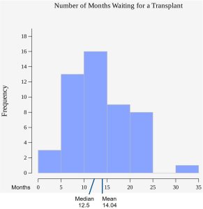
Notice that the mean and median are not in the same location. There is a large data value that affects the location of the mean and pulls it to the right. That 35 month wait by one patient does not affect the median.
Because we are aware that the mean is affected by extreme data values, we can use the median when we know the data set contains extreme data values, or at least provide both the mean and the median to give a more complete picture of the center of the data.
Example 3
A small tech start-up company has 50 employees and advertises a job opening, hoping to get a lot of applicants. In the job description, they advertise the fact that the “average salary of the employees at their company is $129,400.” When called and asked, they reveal that the CEO earns $5,000,000 per year and the other 49 employees each earn $30,000. Which average did they use to advertise the job? Comment on what the most appropriate measure of center is for this data set, the mean or the median, and why.
Answer: We know there are 49 employees who have a salary of $30,000 and one with a salary of $5,000,000, so the mean of this set of salaries is  $129,400. Because there are 49 salaries of $30,000, the median is $30,000.
Notice that the mean is much higher than the median, solely because of the one outlier. The CEO’s extreme salary is pulling the value of the mean toward the extreme value, making it less useful as a measure of center. In this case, the median is a better measure of the center because it better captures the fact that all but one of the data points is $30,000. Using the mean in this case to represent the center of the data would be misleading and might make the job applicants think that potential salary is much higher than it actually is. Offering both the mean and the median provides the job applicants much more information about the salary structure at this company.
The Mode
The mode of a data set is the data value that occurs the most frequently. This is also classified a measure of center for a data set, but does not always tell the whole story. It is very possible for the mode to not be located at the center of the data set. It is often reported in addition to the mean and median, if it is useful. If a data set has several modes, then the information about the mode may not useful. The mode does have its place as a statistic and is the most appropriate measure of center to offer in certain situations. It is found without calculation and is very easy to interpret and communicate.
Example 4
The daily temperatures (in degrees Celsius) were recorded during the month of May in Hamburg, Germany. Find the mode and explain why it is a useful statistic in this situation.
Daily Temperatures: 20, 21, 22, 20, 23, 22, 20, 24, 25, 25, 20, 21, 20, 22, 23, 24, 25, 25, 25, 20, 20, 21, 22, 23, 25, 24, 24, 24, 25, 25, 25
Answer: There are 31 data values, and the most frequently occurring data values. There are 9 recorded temperatures of 25 degrees Celsius. The mode tells us the most frequently occurring temperature in the month of May. Knowing this may provide insight into temperature patterns, especially if they occur near each other. We might know that the weather is warming up as the result of the mode.
When is the mode the best measure of the center? Consider a weight loss program that advertises a mean weight loss of six pounds the first week of the program. That might sound good, but we should keep in mind we know the mean is affected by extreme values, so it is possible most people lose two pounds in the first week and a few people lose many more pounds causing the mean to be larger. The mode might indicate that most people lose two pounds the first week, making the program less appealing. One strength of the mode is that it can be be calculated for qualitative data as well as for quantitative data. For example, if the data set is: red, red, red, green, green, yellow, purple, black, blue, the mode is red.
When to Use the Mean, Median, or Mode
The purpose of these statistics is to characterize what is a usual or typical data value from a data set. The mean is used most often for this purpose, but it becomes less useful if the data in the data set are skewed or the data set contains outliers and extreme values. In this case, other descriptive statistics can give a better idea about the typical or usual value of the data set. The median, for example, is a useful number if the distribution is heavily skewed. The mode is not used as frequently but it may be useful in describing some types of distributions, for example, ones with more than one peak.
Calculating the Mean of Grouped Frequency Tables
There are many ways to summarize data. Sometimes data values are tallied into intervals. When only grouped data is available, we do not know the individual data values (we only know intervals and interval frequencies); therefore, we cannot compute an exact mean for the data set. What we must do is estimate the actual mean by calculating the mean of the grouped frequencies from the frequency table. A grouped frequency table is a data representation in which grouped data is displayed along with the corresponding frequencies. To calculate the mean from a grouped frequency table we can apply the basic definition of mean:
Mean =  .
.
We simply need to modify this definition to fit within the restrictions of a grouped frequency table. One common approach here is to estimate unknown individual data values with the midpoint of each interval. Example 5 will illustrate this approach.
Example 5
After a recent exam, students arrive at class and find the following tally projected at the front of the room. Find the best estimate of the class mean.
| Grade Interval | Number of Students |
| 50–56.5 | 1 |
| 56.5–62.5 | 0 |
| 62.5–68.5 | 4 |
| 68.5–74.5 | 4 |
| 74.5–80.5 | 2 |
| 80.5–86.5 | 3 |
| 86.5–92.5 | 4 |
| 92.5–98.5 | 1 |
Solution:
Since the individual grade for each student is not available, we can take the approach of estimating data points using the midpoint of each interval.
| Grade Interval | Midpoint | Frequencies |
| 50–56.5 | 53.25 | 1 |
| 56.5–62.5 | 59.5 | 0 |
| 62.5–68.5 | 65.5 | 4 |
| 68.5–74.5 | 71.5 | 4 |
| 74.5–80.5 | 77.5 | 2 |
| 80.5–86.5 | 83.5 | 3 |
| 86.5–92.5 | 89.5 | 4 |
| 92.5–98.5 | 95.5 | 1 |
Calculate the sum of the product of each interval frequency and midpoint.
 76.86. The class mean is approximately 76.86%.
Videos
Watch the following video from Kahn Academy on finding the mean, median and mode of a set of data. Finding the Mean, Median, and Mode:
Sources
Data from The World Bank, available online at http://www.worldbank.org (accessed April 3, 2013).
“Demographics: Obesity – adult prevalence rate.” Indexmundi. Available online at http://www.indexmundi.com/g/r.aspx?t=50&v=2228&l=en (accessed April 3, 2013).
The result of adding up a set of data values and dividing by the number of data values. Also called the arithmetic mean.
A measure of center, it is the middle value when data are ordered from smallest to largest. The median does not have to be one of the observed data values. It is a number that separates the data into halves and is equivalent to the 50th percentile and the second quartile.
The data value that occurs most frequently. It is possible for there to be more than mode.

Feedback/Errata