3.3 Writing Figure Captions, Alt Text, and Image Descriptions
Veronica Vold
Writing Figure Captions
Remember: all users of the textbook will read figure captions. This means that you are writing for your broadest audience. When revising figure captions, keep the following in mind:
- Be descriptive. The goal of the figure caption is to help users understand the purpose of the image without needing to read the rest of the page.
- Synthesize major themes. Direct reader attention to the information the image conveys in a new, but related way to the paragraphs of text around the image.
- Keep it short. If you find yourself writing more than one or two sentences in a figure caption, shift any additional phrases to the surrounding paragraphs of text or the image description. This will allow you to elaborate on the image and its relationship to your learning objectives without making it too heavy for readers.
Figure Caption Examples
The following two examples of figure captions accompany an image from a section on collaboration in the first chapter from Introduction to Human Services. The first example is a satisfactory figure caption. The second example (the actual caption in the chapter!) is even stronger.

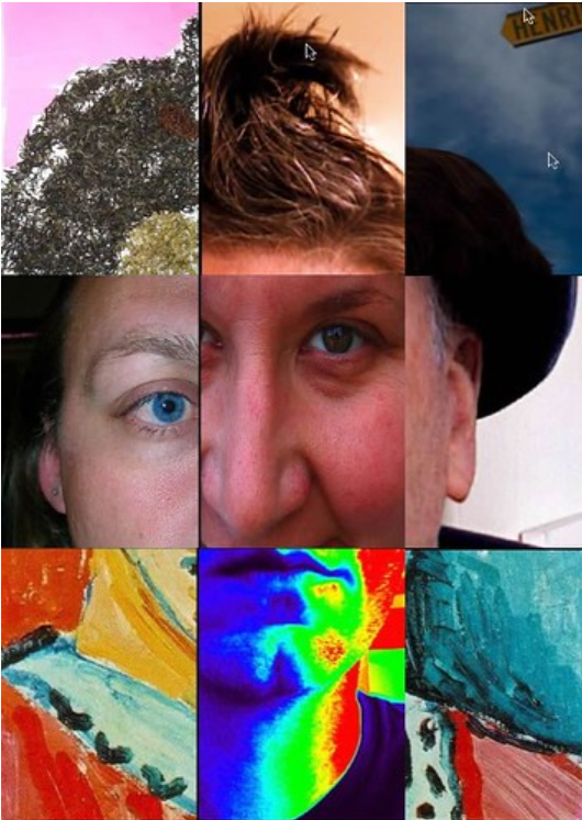
Example 1: Figure 3.4. Lots of learners find their fit in the human services field.
Example 2: Figure 3.4. Collaboration amongst multidisciplinary agencies and individuals can feel disjointed, but it is important to work together toward the best quality of life for clients.
Both of these figure captions are good. They both include figure numbers and provide a short, concise statement as the caption. They also both orient introductory students to the career of human services. However, what sets them apart is the degree of alignment with chapter content and the interpretative claim they make about the image itself. The first figure caption encourages students that they can “find their fit” in human services, perhaps drawing on the puzzle-like appearance of the composite portrait. However, the second figure caption draws on a key term discussed in the chapter section: collaboration. It also references the “disjointed” feeling of different service providers working together on behalf of a client, much like the composite portrait itself feels jointed and strains to form a human face. This caption interprets the image in support of a core claim in the chapter section. It also directly references the tension and problem of collaboration when services are siloed. In this way, it directs reader attention in a new, but related way to the text itself.
Writing Alt Text
When writing alt text, you are writing for members of your audience who can’t access relevant visual information an the image. People without screen reader software won’t access alt text information. When figure captions don’t describe the visual information, follow these guidelines to write alt text:
- Keep it short (usually 10 words or less). Screen reader users expect short alt text phrases. If you have a lot to say, include more info in the accompanying image description or in the figure caption.
- Avoid the phrase “picture of” or “image of.” The screen reader software will say “graphic” as part of reading the alt text. If the medium of the image is relevant to its meaning, for example, a painting or a handwritten letter, it’s fine to include this info.
- When describing people, don’t assume race or gender. Unless someone’s race or gender is self-described, do not assign people social identities. You can use terms like “dark skin tone” or “light skin tone” and note hairstyle, clothing, and physical build. Remember: the Targeted Pathways project aims for diverse representation in images. Alt text should reference this diverse representation as well.
- Consider the context for the image. Different contexts will require different alt text for the same image. For example, alt text for an image of a child riding a bus for a sociology chapter that analyzes inequitable access to public transit by race might describe the skin tone of the people on the bus as well as features of the city street. The alt text for that same image in a math textbook might describe the skin tone of people on the bus as well as the bus schedule as it relates to a relevant problem set.
- If the image is decorative rather than meaningful, mark it as decorative. Most images in our textbooks are informative. However, if there is a decorative image, note that Google Docs do not include a “mark as decorative” option when you right-click on an image and select “Alt text.” Instead, you can use the null attribute in the “description” field, which is two quotation marks (alt = “”)
- Don’t make your alt text the same as the figure caption. Alt text is intended to convey visual information that is available to sighted users. Try not to be redundant.
- If the image includes relevant words or numbers, write them out in the alt text. If the image includes words or numbers that are relevant to its meaning, transcribe them into the alt text, unless they are already included in figure caption or image description. If this is the case, you can direct users to “see image description.”
- When adding alt text in Google Docs, use the “description” field. Different authoring platforms include different fields for adding alt text. In Google docs, you can ignore the “title” field and just use the “description” field. In contrast, when writing directly in Pressbooks, you can ignore the “description” field and instead use the alt text and figure caption field (see below).

Screen Reader Demo: Missing Alt Text
Screen reader software and user preferences vary on reading speed and settings, but alt text is a universal expectation for informative images. Watch this screen reader user demonstrate what happens when an image is missing alt text. As the user points out, what if this was an assignment? What does missing alt text communicate about who belongs and who does not?
Figure 3.6. A demonstration of screen reader software by a screen reader user produced by Colorado State University Assistive Technology Resource Center (ATRC). See also: Video Transcript for Screen Reader: Image without Alt Text [copyright permission pending].
Alt text Examples
Keep in mind: Alt text for the same image will be different depending on its purpose and use. This is why we ask revising authors to write alt text: alt text is most effective when it relates to the claims and learning objectives of a chapter section.
Alt Text Example 1
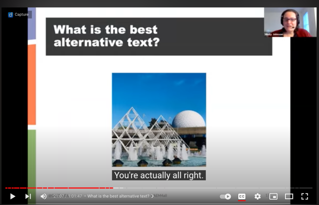
In a 1-minute video clip from a webinar from the National Center on Accessible Educational Materials [YouTube], presenters pose a question to participants: What’s the best alt text for this image from Disney World?

Turns out, this is a trick question! “You’re actually all right,” the presenter reveals. Without knowing the context or purpose for the image, the alt text for this image could focus on any number of features: geographical location, contrasting color, weather conditions, or architecture. The list is long! And without a clear purpose, it will be quite random! This is why the role of the revising author is so critical to writing alt text. Nobody wants it to be random. And ultimately, the revising author is the person best situated to determine the purpose for an image and the best alt text.
For additional examples of how alt text for the same image differs by purpose for decorative, functional, and informative images, visit WebAIM’s Alternative Text [Webpage].
Alt Text Example 2
Writing Image Descriptions
While alt text is a short phrase that captures only the most important information about an image, and figure captions usually summarize or synthesize information in a few sentences, image descriptions include rich detail and context. As accessibility advocate Veronica Lewis notes, “alt text tells someone that there’s a puddle on the floor, and image description tells someone that the puddle on the floor is in the middle of the floor and it’s orange juice” (“How to Write Alt Text and Image Descriptions for the Visually Impaired” [Blogpost]).
Image descriptions help all users understand language, relationships, and actions they otherwise might miss. By using image descriptions, authors often make the content of an image more transparent not only to users but to themselves!
To write image descriptions, use the following guidelines:
- Keep the image description to a few sentences. The goal of an image description is to provide more context and detail than the alt text alone. It should not repeat the alt text but add something new.
- When describing people in image descriptions, include emotions when relevant. If facial expressions and body language communicate emotions (anger, joy, fear) that are relevant to the purpose of using the image, describe them.
- Just like when writing alt text, when describing people, don’t assume race or gender. Unless someone’s race or gender is self-described, do not assign people social identities. You can use terms like “dark skin tone” or “light skin tone” and note hairstyle, clothing, and physical build. Remember: the Targeted Pathways project aims for diverse representation in images. Alt text should also follow these choices.
- If the image includes words or numbers, write them out. If an image is an infographic or chart, it will likely include a great deal of information. It’s okay to allow the image description to run longer if this is the case.
- Don’t forget to note relevant details about the setting of an image. You might choose to describe the visual perspective of the image (close-up, bird’s eye view, high-angle, low-angle), the weather conditions, the lighting, different figures or creatures, or visual textures.
- Place the image description near the image in the text of the page. In Pressbooks, a link to the image description will be adjacent to the image for ease of reference. It’s fine to create a separate Google doc for each image description and link it next to the image in your chapter document. Please see examples below:
Image Description Example 1

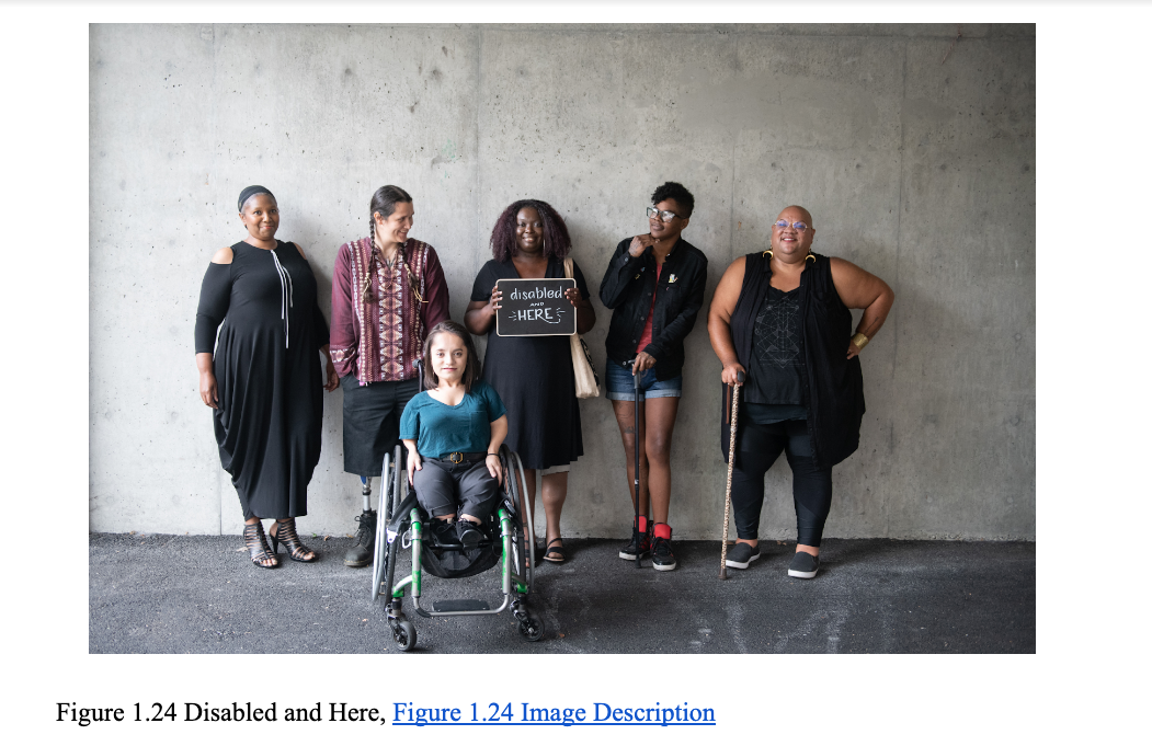
Figure 3.8 A sample image and figure number from a textbook chapter.
Alt text: A group of people of color with a range of disabilities pose together (Image Description Available)
Image Description for 1.24 from Disabled and Here [Website]: Six disabled people of color smile and pose in front of a concrete wall. Five people stand in the back, with the Black woman in the center holding up a chalkboard sign reading “disabled and here.” A South Asian person in a wheelchair sits in front.
Note: This image description includes self-described social identities of the people in the photo. Unless someone’s identity is self-described, it is best practice not to assume someone’s identity. Instead, consider terms like “dark skin tone” or “light skin tone” and note hairstyle, clothing, and physical build.
Image Description Example 2

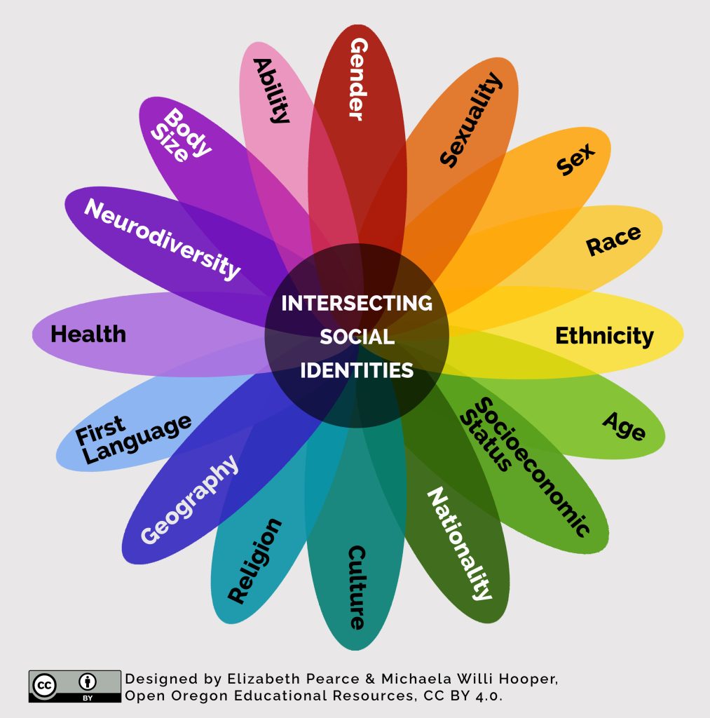
Figure 3.9. A sample complex image from a textbook chapter that requires an image description.
Alt text: A vibrant flower with with different social identities on each petal and a center labeled “Intersecting social identities.” Image Description Available.
Image Description for 3.9:
A vibrant, rainbow-toned flower with different social identities marked on each petal, including: Neurodiversity, Body size, Ability, Gender, Sexuality, Sex, Race, Ethnicity, Age, Socioeconomic status, Nationality, Culture, Religion, Geography, First Language, and Heath. Each petal intersects at the flower’s center, which is labeled “Intersecting social identities.” Creators Elizabeth Pearce and Michaela Willi Hooper are noted along with the CC BY Creative Commons license.
Self-Comprehension Check
Licenses and Attributions
Open Content, used previously
“Writing Figure Captions” is adapted in part from “Figures and Tables” by Susan Last in Technical Writing Essentials is licensed Creative Commons Attribution 4.0 International License
Image: Collaboration by bre pettis is licensed CC BY-NC 2.0.
Image: How would you improve the alt text for the situation and purpose described below? Select any answer to see suggestions Question set features LGBT Love by @Planetnehemiah for nappy.co is licensed CC0.
Image: Screenshot of Figure 1.24 Disabled and here group shot by Disabled And Here is licensed CC-BY.
Image: 3.9 “Intersecting Social Identities” by Michaela Willi Hooper and Elizabeth Pearce for Open Oregon Educational Resources [Website] is licensed CC BY
Open Content, original
All other content by Veronica Vold for Open Oregon Educational Resources [Website] is licensed CC BY 4.0.
Attributions
Figure 1.2. “Collaboration” by bre pettis is licensed CC BY-NC 2.0.

