Defining Architecture
This chapter introduces our framework for examining architecture as the entirety of the built environment. Rather than defining architectural achievement only through the lens of “masterpieces,” our approach throughout this text will be to consider what everyday, vernacular structures can teach us about ourselves and our built environment.
To Read
The two readings below set up why studying the structures that surround us everyday is so important. There are reflection questions for both the Huxtable reading and the Goldberger text at the end of this textbook.
- Ada Louise Huxtable, “The Art We Cannot Afford to Ignore (But Do)” (New York Times, Sunday, May 4, 1958)
- Paul Goldberger, “Meaning, Culture, and Symbol,” Chapter 1 from Why Architecture Matters (available as an eBook from Portland Community College Library)
To Watch
The two videos below complement the material presented in the Huxtable reading and Chapter 1 of the Goldberger text. These videos also outline broader issues of why we build and the different functions of architecture.
- “Jim Olson: Why Architecture Matters” (JSMAWSU via YouTube, 1:55)
- “Daniel Libeskind: 17 Words of Architectural Inspiration” (TED Talks via YouTube, 18:24)
Stop & Reflect
This brief video outlines some important functions of architecture. It also brings up the importance of both functionality and aesthetics to the art of building. As you watch the video, keep the following questions in mind:
- In what ways is architecture an extension of ourselves?
- What are some of the different functions of architecture described in the video?
- How does architecture communicate?
- What gives meaning to architecture?
Daniel Libeskind (b. 1946) is a prominent Polish-American architect who founded his eponymous studio in 1989. He is known for his commitment to evoking memory and place with his designs and often takes inspiration from music, philosophy, literature, and poetry. Some of Libeskind’s buildings include the Jewish Museum Berlin in Berlin, Germany (2001), the Royal Ontario Museum in Toronto, Canada (2007), and the World Trade Center Master Plan, New York, NY (2003).
In this TED Talk, Libeskind reviews different projects using adjectives to describe his practice. It’s a helpful video to excite viewers about the potential of architecture to both reflect the past and look towards the future. Libeskind’s work is considered Deconstructivist, which is a branch of Postmodern design. Deconstructivist architecture uses diagonal lines to inspire movement and incorporates distorted shapes to suggest fragmentation. It is an often imposing style that confronts the viewer with large cantilevered forms and sharp angles.
After watching the video, discuss the aesthetics of Deconstructivism to prompt deeper reflection about how notions of beauty are formed in architecture. Deconstructivism is discussed further in Chapter 4 of this text, using Zaha Hadid’s designs as an example.
Stop & Reflect
- Consider your reaction to Libeskind’s work and think about the effect of his buildings on the viewer.
- How does the architect use shape and form to generate meaning and symbolism in his structures? How do they reflect history?
- Why do you think Libeskind would use the architectural language of Deconstructivism to honor the history of a place?
Key Structures
The structures listed below are featured in the Goldberger textbook (if using) and can be used as specific examples to discuss the main ideas surrounding function and architecture, as well as the Vitruvian Triad. The links below each structure are for further exploration and images.
- Sir John Soane, Breakfast Room, London, England, 1792-1823
- This example can be used to discuss utilitarian and symbolic function.
- Robert Venturi and Denise Scott Brown tour of the Breakfast Room courtesy of Encyclopedia Britannica
- Thomas Jefferson, University of Virginia, Charlottesville, VA, 1817-1826
- This example is helpful in discussing utilitarian and symbolic, as well as contrast in form and texture.
- A helpful page with lots of resources about Jefferson’s campus design from the University of Virginia.
- An article from the Khan Academy discussing Jefferson’s design.
- A great resource for comparing and contrasting Monticello with the campus design.
- Information on enslaved people at the University of Virginia.
- Maya Lin, Vietnam Veterans Memorial, Washington, D.C., 1982
- A great example of different types of function (symbolic, ethical, circulatory).
- Smarthistory video on the Vietnam Veterans Memorial.
- Maya Lin on being a female architect, from TIME Magazine.
Introduction: What is Architecture and Why Does it Matter?
Simply defined, architecture is the art of designing structures and spaces. Think of all the buildings, structures, and spaces you encounter day-to-day (you can even make a list if you want to). All of these places were intentionally designed to serve a particular purpose. You likely don’t pay attention to every structure you pass by, and this is intentional. As we’ll learn, not every building is meant to stand out (these are referred to as foreground buildings) and, in fact, many are built to recede into their surroundings (a background building) to avoid visual chaos. It is important to study not only monumental icons of architectural history, but also the vernacular, or everyday, buildings we experience. Both are important to create a complete picture of the built environment.
Related to sculpture, architecture creates three-dimensional objects that occupy a given space and create a visual relationship with the space around them. The differences between the sculpture and architecture are in their scale and utility. Early human structures provided shelter from the elements. As hunter- gatherer societies transitioned to farming they made more permanent shelters, eventually forming communities, towns and cities. For thousands of years, architecture reflected the specific environment and materials available in any given region, including rock caves or huts of wood, soil and brick. Many were assemblages of materials like grasses, leaves and animal hides. Nomadic people still utilize these materials. (Modified from: Art Appreciation – Art 100 by Chris Gildow, Washington State Board for Community & Technical Colleges. This work is licensed under a Creative Commons Attribution 3.0 License.)
It’s important to keep in mind that architecture is a collaborative profession. There are architects, defined as people who are licensed to design spaces and structures; engineers, who are trained to design the systems in the structures (within this category there are specializations such as civic, structural, and mechanical engineering); and landscape architects who are licensed to design all aspects of an outdoor environment. Architects also have to work collaboratively with individuals (clients) and entities (such as cities), in order to design spaces that are safe and adhere to building codes and best practices. Can you think of other ways architecture is collaborative?
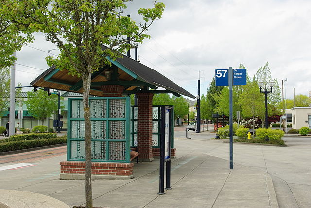
Architecture is communication. Even at its most basic, it tells us what is important to a culture or society. Look, for example, at the bus shelter pictured below. What do the characteristics of the shelter demonstrate to the person using the space? Think about the bus shelter’s form, its materials, its use of color, and its ornament (or decoration).
Stop & Reflect
You might have noted the following:
- It’s covered. There is a sloping, gabled roof that protects the person waiting for the bus from the weather.
- It has a place to sit down. It also uses principles of universal design to promote accessibility. These include a wide waiting area, a step-free entry, and a curb ramp.
- It uses color. The use of green is carried throughout the structure, framing the etched glass panels and the timber supports for the roof.
- It uses a mix of materials. You can see the wood beams under the roof, the use of brick at the base of the structure, and the use of frosted and etched glass surrounding the seating area.
- Finally, observe how the shelter interacts with its surrounding environment. How are its colors, shapes, and materials echoed in the landscape and other structures?
All of these characteristics demonstrate the sense of the importance the City of Hillsboro places on designing comfortable and accessible spaces for users of public transit. Where the city might have put a simple bus stop sign and an uncovered bench to serve the utilitarian function, they instead designed a structure that welcomes the transit taker, inviting them into a protected space designed for a specific purpose.
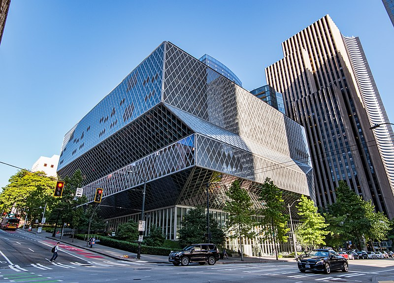
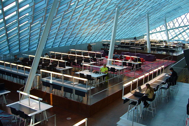
Let’s look at another example. Pictured below are images of the exterior and interior of the Seattle Public Library, Seattle, WA designed by Dutch architect Rem Koolhaas (b. 1944), which opened in 2004.
Stop & Reflect
- Imagine you didn’t know the function, or use, of the building. Just by looking at the exterior, could you guess what it’s used for? Would you have guessed a library? Why or why not? Think about specific elements of the building’s façade, or its face, that helped form your conclusion.
- Imagine passing by this structure at street level. What does it communicate to you? How do you think it would feel to enter this library?
- How does the building interact with its surroundings? What do you notice about its size, or scale, related to the other buildings behind and next to it?
- Once inside, what different kinds of light do you notice? Is there color used? How would you describe it? What shapes do you see? Are any shapes repeated throughout the interior and exterior of the structure to form a pattern?
This text approaches buildings in a holistic way by considering their function and context within the built environment. As you examine each example, think about what it communicates to the public, as well as how it communicates through scale, materials, and form.
The Vitruvian Triad
The ancient 1st century BCE Roman architect, scholar, and engineer, Vitruvius (Marcus Vitruvius Pollio) wrote a series of books on architecture that still influence how we evaluate the built environment today. In his writing, Vitruvius identifies three key components of a successful building: firmitas (firmness or commodity), utilitas (utility or function), and venustas (beauty or delight). Together, these are known as the Vitruvian Triad; we will consider the Vitruvian Triad throughout this book when examining various examples.
Firmness
When considering a building’s firmness, you are evaluating its structural integrity, or asking how does the building stand up? What are its materials? How do they impart strength and stability to the structure? This is the building’s physical strength.
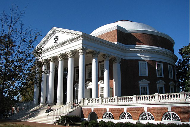
Let’s discuss firmness by looking at the Rotunda, pictured above, at the University of Virginia campus, which was designed by Thomas Jefferson (1743-1826) in the early 19th century.
The Rotunda houses the library and is just one part of Jefferson’s original plan at the University of Virginia, which also includes campus housing for faculty and students (the Pavilions) and a large open greenspace (the Great Lawn). Jefferson referred to these three parts as an “academical village.” You can see the Rotunda in the context of the Great Lawn and Pavilions in the image below.
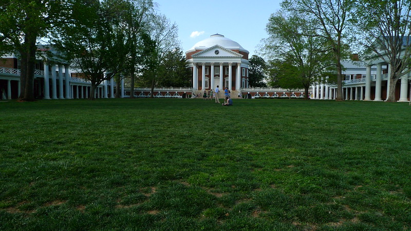
Remember, when we’re talking about firmness in architecture, we’re looking at how the building stands up. What are the building’s materials? Does the structure seem strong and heavy, or is it light and transparent? At the University of Virginia, notice the use of red brick and white stone and white painted wood. In the detail of the Rotunda, above, you can see the brick runs in horizontal coursework. The use of brick and stone, as well as the horizontal line, helps stabilize the structure and gives it a firm base.
What other shapes and lines do you notice on the Rotunda?
You might have thought of the triangular pediment supported by tall vertical columns. These features reflect Jefferson’s interest in ancient Greek and Roman architecture, such as the Maison Carrée in France. Another influence to Jefferson’s building is the ancient Roman Pantheon, which will be discussed in the next section.
Utility
Utility refers to the function, or purpose, of a building (for example, a school, store, home, hospital, museum, bathroom, etc.). Utility, or function, asks: how are spaces arranged? How does the structure work to serve the functional needs of its occupants? There are several different types of function that we will consider when examining a building: utilitarian, symbolic, social, circulatory, psychological, and ethical.
Thinking back to our example of the Rotunda at the University of Virginia, we can say that its utilitarian, or practical, function is a library. It also has a symbolic function. Jefferson was inspired by the design of the Pantheon in Rome, Italy and created his (smaller) version of this iconic temple in Virginia. But why did Jefferson borrow from this structure, specifically?
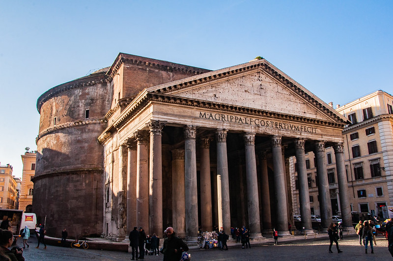
Neoclassicism (or, “new classicism”) was a very popular style of architecture, developed in Europe in the 18th century. The style borrows the architectural language of ancient Greece and Rome through its use of pediments, columns, domes, and white marble or stone. According to historian Dr. Bryan Zygmont, “In utilizing classical architectural forms for his library, Jefferson was expressing his admiration of the ideas set forth from the classical past: democracy, learning, and permanence. And, to make it more emphatic, the Rotunda was far removed from anything that could be considered British.”
There are, of course, important differences between the two buildings; Jefferson was not directly derivative of the ancient Roman structure. If you compare the two, you can see the Rotunda has two levels of windows, letting light into the interior of the space, while the Pantheon has only an oculus, or “eye,” which is a round opening at the center of the domed roof. Light is critical to the function and symbolism of each space; the Rotunda, a library, needs abundant natural light on the interior, while the Pantheon, a temple to all the Roman gods, used only the oculus to illuminate its vast interior in order to draw symbolism to the heavens above.
What other similarities or differences do you notice between these two structures?
Beauty
The term venustas references the Roman goddess Venus, a symbol of beauty. When we consider a structure’s beauty, we are evaluating its formal elements and their aesthetic qualities. Judging a building’s formal elements (its use of light, color, space, and texture, for example) is objective, but the overall effect of these elements on the viewer will elicit a subjective response. We can also consider using the word delight instead of beauty to describe the appealing effect of an architectural structure or space on the senses; these are the qualities that are not utilitarian or mundane, but rather evoke or inspire emotion. The term delight is also separate from venustas’ connection to Western European idealizations of beauty.
Let’s look at Maya Lin’s Vietnam Veterans Memorial to explore delight in architecture more thoroughly, as well as reflect on some different aspects of function mentioned in the previous section.
American architect, designer, and sculptor Maya Lin (b. 1959) won a design competition with her concept for the Vietnam Veterans Memorial, which was completed in 1982. Lin was in her early 20s and an undergraduate student at Yale University when she entered the competition as part of a school assignment. The simplicity of her design won over the committee, but critics argued it wasn’t symbolic, representational, or monumental enough to memorialize those who fought and died during the Vietnam War.
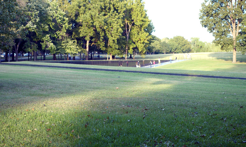
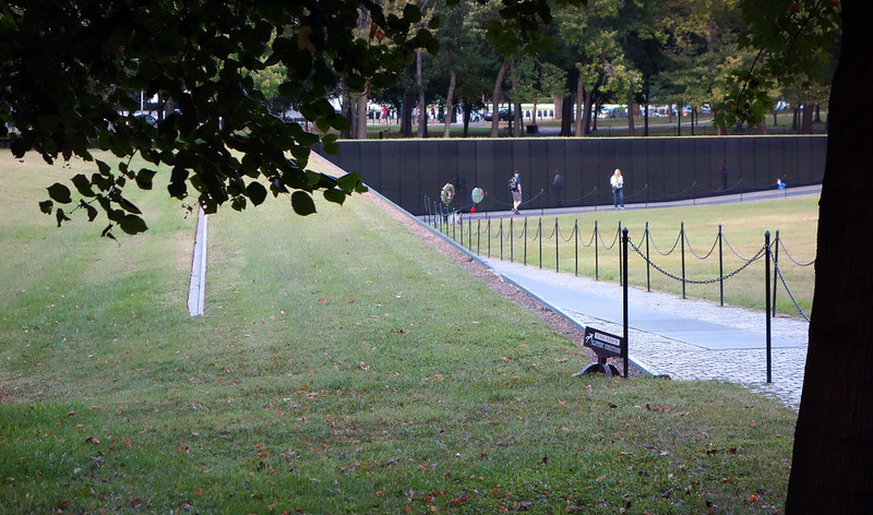
Maya Lin’s memorial features a black granite wall with the names of over 58,000 U.S. service members who lost their lives, or went missing, during the Vietnam War. The names are about ½ an inch high and cover all 140 panels. The width of each wall of the memorial is about 246 feet and their heights vary, from about 10 feet high at the center and tapering down to about 8 inches at each end. The tallest panels have 137 lines of names with five names on each line; the smallest panels have just one line of five names. Listing the names of those dead or missing in action is a critical component of the work and was a requirement for the design competition. You can learn more about Lin’s design and the controversy she faced by visiting the Smarthistory website to view a video on her work.
With an understanding that delight is subjective, let’s discuss the impact of Lin’s work on the viewer. When approaching the memorial, the wall starts out very low, only about 8 inches high. As you move towards the center, the wall climbs to a height of over 10 feet. At the apex where the two sides meet, the viewer is swallowed by the wall. The black granite is highly polished and reflective; in the image above, you can see how it reflects back to the viewers images of themselves. Viewers are accompanied by these ghostly reflections as they read the names of the dead incised on the wall’s surface.
So what does this have to do with delight? We might consider delight here as more of an invitation to the viewer to feel and process emotion. Lin used abstraction in her design, meaning she has not incorporated any representational images of soldiers, for example (though a representational sculpture, The Three Servicemen by Frederick Hart was later added adjacent to the site). Lin’s design slices into the earth, creating two black granite arms, one points to the Washington Monument, the other to the Lincoln Memorial. In this way, Lin has situated her work in conversation with other monuments and political leaders memorialized on the Washington Mall.
We can also consider Lin’s work as an example of ethical function, or the ability of architecture to express the ethos of the society that produces it. This idea, best explored by philosopher Karsten Harries, asks what architecture’s responsibility is to its community.
Stop & Reflect
- What are the different types of function discussed in this section?
- Can you name and describe the 3 parts of the Vitruvian Triad?
- In addition to Maya Lin’s Vietnam Veterans Memorial, what other structures can you think of, from this section or elsewhere, that demonstrate ethical function?
Learning Objectives
By the end of this chapter, learners should be able to:
- Define the different types of function and apply them to architectural examples.
- Evaluate structures in their own community based on the Vitruvian Triad.
- Compare and contrast the different architectural structures presented here based on their functional and formal qualities.
- Evaluate the importance of the built environment and its impact on the surrounding landscape and people.

