
Elements of Architecture
This chapter covers the visual elements and how to apply them to examples of architecture. The architect in focus is Julian Abele, a Black architect whose work at Duke University (Durham, North Carolina) complements Goldberger’s discussion of Gothic Revival style buildings at Yale University (New Haven, Connecticut) in Chapter 3 of his text. Abele’s work also connects stylistically to the Renaissance revival style of Portland City Hall, and Michael Graves’ Postmodern take on Classical architecture with his Portland Building, both of which are discussed in the first section of this chapter.
To Read
The Getty Museum Education handouts, linked to below, help define the Elements of Art and Principles of Design as they relate to art and design, and can be adapted to the study of the built environment. The material can be used to provide a brief overview of the elements and principles, while the examples discussed in this section will help the learner apply these to works of architecture.
- Paul Goldberger, “Architecture as Object,” Chapter 3 from Why Architecture Matters (available as an eBook from Portland Community College Library)
- Getty Museum Education, “Elements of Art,” available as a PDF here
- Getty Museum Education, “Principles of Design,” available as a PDF here
Key Terms
Below are the elements of architecture, which are detailed in this chapter. Each key term is presented in bold in the material below.
- Scale & Proportion
- Balance
- Light
- Color
- Line
- Texture
- Ornament
- Rhythm
- Space
Key Terms: Elements of Architecture
Scale & Proportion
Scale refers to a building’s size in relation to its surroundings and other objects, including the human body. If you are in a room right now, think about how high the ceilings are related to your size. What about the doorway you went through to enter the room? When looking at a building from the outside, scale takes into consideration how large other structures are in comparison. You also want to think about any landscaping and how that relates to the building as a whole. Proportion is a little bit different than scale and describes the relationship between the different parts of an object. When thinking about a building’s proportion, consider how the parts relate to the whole. Let’s look at the Portland Municipal Building (or The Portland Building) by Michael Graves, below, to help illustrate proportion and scale.
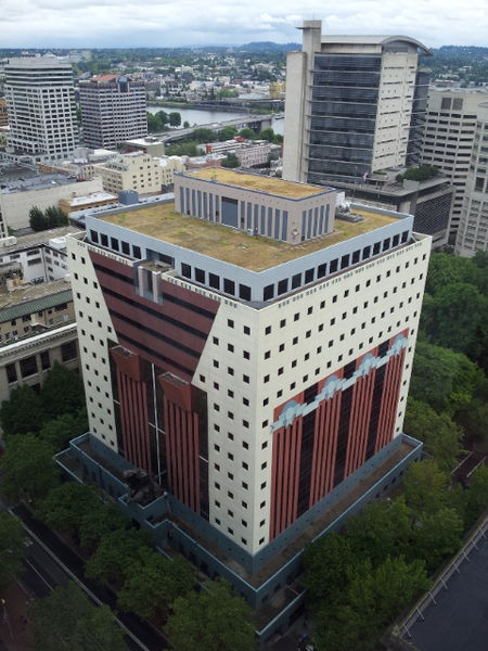
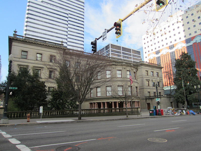
First, when looking at Grave’s building, notice its size compared to the surrounding structures; this is the building’s scale. While it’s larger than the immediately adjacent building (to the left in the image above), the Portland Building is smaller than some of the other skyscrapers we can notice in the photograph. At 15 stories, Graves’ structure is not as tall as most modern skyscrapers in the U.S., which are between 25-35 stories, but it is more vertical than Portland City Hall, a Renaissance Revival style structure, which resides next door. You can see the two next to each other in the image below.
We can also consider proportion when looking at the Portland Building. See all those windows forming a grid-like pattern on the façade? Notice how relatively small they are compared to the other details on the building. When examining proportion, we are considering the relationship of parts to the whole. We can also observe how Graves’ plays with proportion by using outsized “capitals” to top off the vertical lines of his red columns, and the large, festive festoon of teal ribbon that adorns one side of the building. Graves’ playful sense of proportion helps his small building feel larger than it is and reflects his Postmodern interpretation of more traditional, Classical architectural elements.
Balance
One way to consider balance in architecture is to examine a building’s symmetry. Symmetry is when two halves of the façade, or face, of the structure correspond to one another in terms of size, shape, and placement of forms. The implied center of gravity is the vertical axis (an imaginary line drawn down the center of the composition). Symmetrical balance often lends a sense of stability to a building, while asymmetrical balance often lends a sense of movement and dynamism to a structure. Asymmetrical balance is achieved when neither side of a building reflects or mirrors the other. This is usually achieved by a balance of the visual weights of forms and spaces represented.
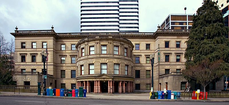
Portland City Hall, constructed in 1895 by the architecture firm Whidden & Lewis, reflects symmetrical balance. If we divide the structure in half on the vertical axis, we can see that the two halves of the building are nearly identical. Comparing this structure with the Portland Building, we can also see how Graves’ structure responds to its neighbor. Do you notice the use of red granite columns supporting the portico on City Hall? This red is echoed in the terracotta pilasters (or, flattened, rectangular columns) that decorate the side of the Portland Building. This rusty red color is picked up again at City Hall through the painted window frames. By incorporating the terracotta color and some of the classically-inspired elements of City Hall, such as columns, the Portland Building is in harmony with its older neighbor.
Some additional visual elements of architecture are outlined below. If you’d like more information please visit “Form in Architecture,” Chapter 7 from the OER textbook, Introduction to Art: Design, Context, and Meaning by Pamela Sachant (University of North Georgia) and Peggy Blood (Savannah State University), University of North Georgia Press: 2016.
Light
Any analysis of architecture should always comment on the use of light. You want to consider the different kinds of light that you notice, such as natural, incandescent, or filtered. Look back up to the example of Kahn and Tyng’s Yale University Art Gallery, which uses both track lighting to focus the viewer’s attention on specific works of art, and natural light filtered in through screened windows, which lends a softness to the interior space.
Light can also be colored, such as the light that filters in through the stained glass windows of a Gothic Cathedral (read more about Gothic Architecture on the Smarthistory website). It can also create contrast on the façade of a structure.
Color
When color is used in architecture it can have an emotional effect on the viewer. Think about how you might feel entering a red room, or seeing a building with multiple colors used on its façade. You might also consider how color is used to blend in, or to contrast, with a building’s surroundings.
Line
The use of line in architecture can be actual or implied. Lines can be used to imply movement and to direct the viewer’s eye around the structure’s composition. In general, horizontal lines and horizontally arranged compositions are calm. Vertical lines can express height and power, like a vertical skyscraper. Diagonal and curved lines often express movement and energy.
Texture
Texture is the surface quality of an object. Does it look smooth and polished, or rough and coarse, for example? Actual surface texture is referred to as tactile or haptic, while texture you can see, but not touch, is called visual or optical. Visual texture can be created through the use of pattern, for example. Tactile texture can be expressed through the use of a wooden door handle, or metal stair railing, for example.
Ornament
Ornament refers to a building’s decoration. Ornament can be functional, like a gargoyle on a Gothic cathedral, it can be purely decorative, like the blue-green festoon on the Portland Building, or it can help articulate an entrance, for example, such as in Julian Abele’s Duke University Chapel discussed below.
Rhythm
In architecture, rhythm refers to the alternation of solids and voids on a structure. Consider, for example, the regular rhythm made by the uniform windows on a skyscraper. You can also think about the way repetition might create a rhythm and the way that these elements contribute to your experience of the structure.
Space
Mass and volume are used to describe three-dimensional space. Mass is a three-dimensional form, often implying bulk, density, and weight. Volume is similar to mass, but volume can also be void or empty or suggest an enclosed space. In architecture, space is often considered to be the volume of a structure, or how big a structure is and what can fit inside. Three-dimensional space is the space in which our bodies stand. Sculpture, architecture, and other objects with mass exist in space. When talking about architectural space, the terms “carving space” and “creating space” are often used to consider how space is not only something that can be seen, but is also experienced. Space can affect your emotional experience of a site; it is intangible, yet we know when we feel cramped or swallowed by space. When analyzing architecture, always think about space, both interior spaces and exterior, and how you might experience or be directed through space.
Architect in Focus: Julian Abele
Julian Abele (1881-1950) was the first African-American student to graduate from the University of Pennsylvania’s Department of Architecture in 1902. With over 400 buildings attributed to him, Abele was one of the most prolific and highly trained architects of his generation. It was due to racism that Abele’s work was largely ignored or not credited to him during his lifetime. This section will focus on Abele’s Gothic and Beaux-Arts revival style structures at Duke University in Durham, North Carolina, designed and executed at a time when Duke only admitted white students. Abele also worked for decades at the Philadelphia firm of Horace Trumbauer and designed many buildings in a Beaux-Arts inspired style around the city.
In this section, we’ll examine Abele’s work in the context of the Elements of Architecture outlined above, as well as the historical context in which he worked.
To Read
The resources below will help add additional context to Julian Abele’s life and work.
- For a concise biography on Julian Abele and an overview of his contributions to Duke University and beyond, please read “Julian Abele: Honoring a Legacy no longer ‘in the shadows’” by Jocelyn Rogers on The American Institute of Architects website (published June 25, 2020)
- For further information and additional images of Abele’s work at Duke University, please follow this link to the University’s web page dedicated to Abele’s legacy.
To Watch
The video series embedded below highlights Abele’s architectural work on Duke University campus, including the Duke University Chapel, discussed below.
-
Watch the series, “Documenting Julian Abele’s Contributions” from Duke University via YouTube (5 short videos, 13:08 total)
Watch the series, “Documenting Julian Abele’s Contributions” from Duke University via YouTube (5 short videos, 13:08 total)
Julian Abele, Duke University Chapel, Durham, NC, 1935
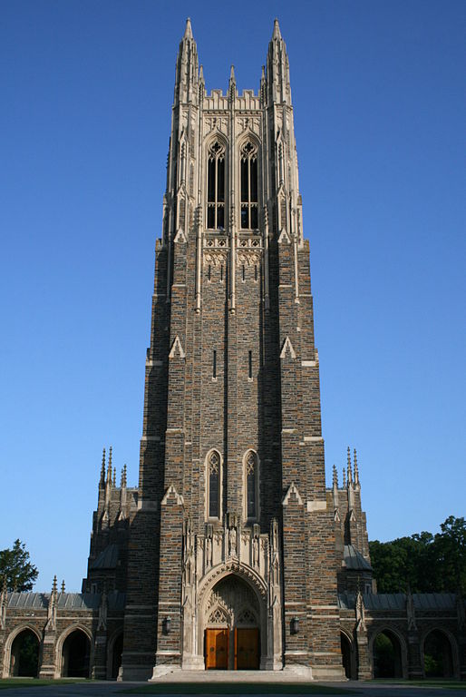
One element to consider when looking at Julian Abele’s Duke University Chapel is scale. Remember, scale refers to the building’s height in relation to human size. In this case, the entire tower soars 210 feet above us and its pointed spires emphasize its height. Abele directs our attention upwards by using lots of pointed features. Notice, for example, the lighter stone used to cap each section of the towers with an inverted “v”.
Another element to think about is proportion, which refers to how the parts relate to the whole. For example, the archway that frames the entrance is very large compared to the brown wooden doors. Flanking the archway are two large rectangular columns; this emphasis serves to aggrandize the entrance to the chapel and is also a good example of how ornament can be used to articulate an important feature to the viewer.
Abele draws our eyes upwards by using many pointed elements, such as the pointed arches, tall windows, and spires; this is an excellent example of the use of line in architecture, since the verticality of the spires is echoed by the windows and arches, which all express the vertical velocity of the structure.
An example of another one of Abele’s buildings, the Free Library in Philadelphia, Pennsylvania, is discussed below.
Julian Abele, Free Library, Philadelphia, PA, 1927
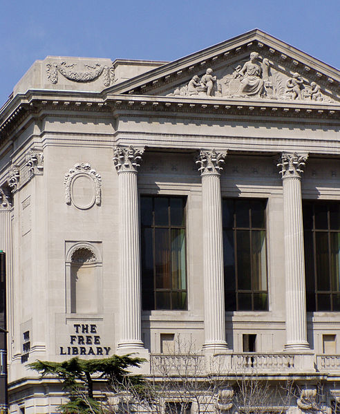
The façade of Abele’s Free Library provides a good opportunity to talk about the use of ornament. For example, Corinthian columns with decorated capitals support the entablature and sculpture-filled pediment, rectangular pilasters articulate the corner, a stone garland hangs, festooned with ribbons, above the cornice, and a sculpture niche sits, framed with a shell-like decoration, adjacent to the rounded columns. Even though the building is a muted limestone, the play of light and shadow across the ornament creates visual interest and engages the viewer.
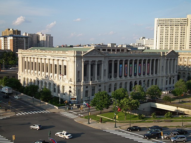
When we pull back and look at the building as a whole, we can see its rhythm. Notice the alternation of solids and voids made by the building’s recessed windows (voids) and projecting columns (solids). The rhythm is even and uniform in keeping with Abele’s Beaux Arts style. References to ancient Roman and Greek architecture can be found in the structure’s use of triangular pediments, stone arches along its base, and the aforementioned columns. The base of the building also uses rusticated masonry, or blocks of stone that are deeply cut along their edges to create shadows; this adds a rougher texture and contrasts with the smooth, ashlar masonry above.
Conclusion
Beaux Arts style architecture was popular in the United States from about 1880-1930 and Abele was one of its most notable practitioners. Because he was a Black architect, systemic racism prevented him from starting his own practice. He instead worked for decades in the office of Horace Trumbauer. He became Trumbauer’s chief designer in 1909, but did not sign any plans with his own name until after Trumbauer’s death in 1938, when he and another architect took over the firm. While at the time it was common practice for plans to be signed only with the name of the firm, Abele’s race played a part as well.
He designed over 250 buildings, but only was credited for his work at Duke University in 1986, 36 years after his death. His great grand-niece Susan Cook, a sophomore at Duke at the time, was moved by student protests against Duke’s investments in apartheid South Africa, to write a letter calling attention to her great grand-uncle’s achievements. You can read more about Abele, Cook, and how Duke University more formally recognized Abele’s contributions to their campus in the essay, “Out of the Shadows,” by Susan E. Tifft for Smithsonian Magazine (February, 2005).
To Watch: Lecture Videos on the Elements of Architecture (Part 1, 20:43 and Part 2, 19:40)
The lecture videos embedded below review key terms, ideas, and examples of the elements of architecture and complements the material presented in this chapter.
Part 1:
Part 2:
Learning Objectives
At the end of this chapter, learners should be able to:
- Identify and define the key visual elements of architecture.
- Discuss Julian Abele’s contributions to American architecture.
- Examine Abele’s work in the context of the racial discrimination he faced as an African-American architect.
- Apply the visual elements of architecture to their own experience of the built environment.
