
4.1 Choosing a Chart Type
LEARNING OBJECTIVES
- Construct a line chart to show a time series trend.
- Learn how to adjust the Y axis scale.
- Construct a line chart to present a comparison of two trends.
- Learn how to use a column chart to show a frequency distribution.
- Create a separate chart sheet for a chart embedded in a worksheet.
- Construct a column chart that compares two frequency distributions.
- Learn how to use a pie chart to show the percent of total for a data set.
- Construct a stacked column chart to show how a percent of total changes over time.
This section reviews the most commonly used Excel chart types. To demonstrate the variety of chart types available in Excel, it is necessary to use a variety of data sets. This is necessary not only to demonstrate the construction of charts but also to explain how to choose the right type of chart given your data and the idea you intend to communicate.
Choosing a Chart Type
Before we begin, let’s review a few key points you need to consider before creating any chart in Excel.
- The first is identifying your idea or message. It is important to keep in mind that the primary purpose of a chart is to present quantitative information to an audience. Therefore, you must first decide what message or idea you wish to present. This is critical in helping you select specific data from a worksheet that will be used in a chart. Throughout this chapter, we will reinforce the intended message first before creating each chart.
- The second key point is selecting the right chart type. The chart type you select will depend on the data you have and the message you intend to communicate.
- The third key point is identifying the values that should appear on the X and Y axes. One of the ways to identify which values belong on the X and Y axes is to sketch the chart on paper first. If you can visualize what your chart is supposed to look like, you will have an easier time selecting information correctly and using Excel to construct an effective chart that accurately communicates your message. Table 4.1 “Key Steps Before Constructing an Excel Chart” provides a brief summary of these points.
Integrity Check
Carefully Select Data When Creating a Chart
Just because you have data in a worksheet does not mean it must all be placed onto a chart. When creating a chart, it is common for only specific data points to be used. To determine what data should be used when creating a chart, you must first identify the message or idea that you want to communicate to an audience.
Table 4.1 Key Steps before Constructing an Excel Chart
| Step | Description |
| Define your message. | Identify the main idea you are trying to communicate to an audience. If there is no main point or important message that can be revealed by a chart, you might want to question the necessity of creating a chart. |
| Identify the data you need. | Once you have a clear message, identify the data on a worksheet that you will need to construct a chart. In some cases, you may need to create formulas or consolidate items into broader categories. |
|
Select a chart type. |
The type of chart you select will depend on the message you are communicating and the data you are using. |
| Identify the values for the X and Y axes. | After you have selected a chart type, you may find that drawing a sketch is helpful in identifying which values should be on the X and Y axes. In Excel, the axes are:
The “category” axis. Usually the horizontal axis – where the labels are found The “value” axis. Usually the vertical axis – where the numbers are found. |
Time Series Trend: Line Chart 1
The first chart we will demonstrate is a line chart. Figure 4.1 shows part of the data that will be used to create two line charts. This chart will show the trend of the NASDAQ stock index.
Read more: http://www.investopedia.com/terms/n/nasdaq.asp
This chart will be used to communicate a simple message: to show how the index has performed over a two-year period. We can use this chart in a presentation to show whether stock prices have been increasing, decreasing, or remaining constant over the designated period of time.
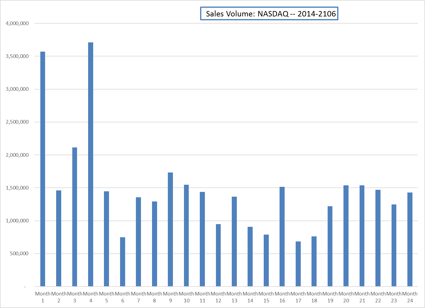
Before we create the line chart, it is important to identify why it is an appropriate chart type given the message we wish to communicate and the data we have. When presenting the trend for any data over a designated period of time, the most commonly used chart types are the line chart and the column chart. With the column chart, you are limited to a certain number of bars or data points. As you increase the number of bars on a column chart, it becomes increasingly difficult to read. As you scroll through the data on the worksheet shown in Figure 4.1 you will see that there are 24 points of data used to construct the chart. This is generally too many data points to put on a column chart, which is why we are using a line chart. Our line chart will show the volume of sales for the NASDAQ on the Y axis and the Month number on the X axis. The following steps explain how to construct this chart:
Download Data file: CH4 Data
- Open data file CH4 Data and save a file to your computer as CH4 Charting.
- Navigate to the Stock Trend worksheet.
- Highlight the range B4:C28 on the Stock Trend worksheet. (Note – you have selected a label in the first row and more labels in column B. Watch where they show up in your completed chart.)
- Click the Insert tab of the ribbon.
- Click the Line button in the Charts group of commands. Click the first option from the list, which is a basic 2D Line Chart (see Figure 4.2).
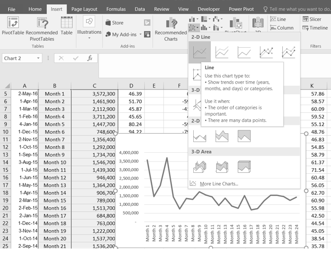
This adds, or embeds, the line chart to the worksheet, as shown in Figure 4.3
Why?
Line Chart vs. Column Chart
We can use both a line chart and a column chart to illustrate a trend over time. However, a line chart is far more effective when there are many periods of time being measured. For example, if we are measuring fifty-two weeks, a column chart would require fifty-two bars. A general rule of thumb is to use a column chart when twenty bars or less are required. A column chart becomes difficult to read as the number of bars exceeds twenty.
Figure 4.3 shows the embedded line chart in the Stock Trend worksheet. Do you see where your labels showed up on the chart?
Notice that additional tabs, or contextual tabs, are added to the ribbon. We will demonstrate the commands in these tabs throughout this chapter. These tabs appear only when the chart is activated.
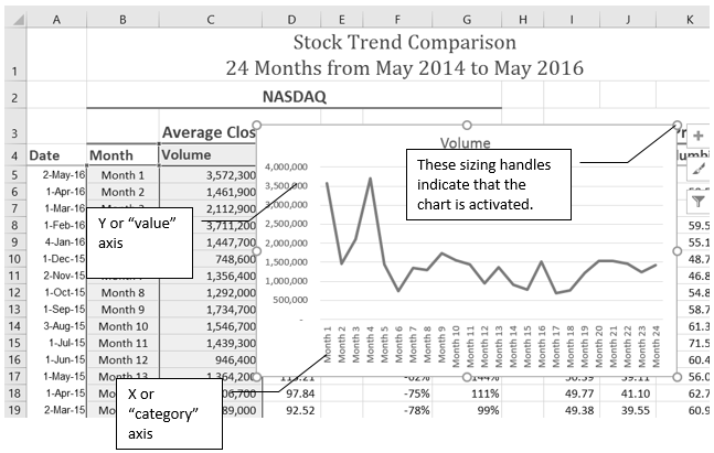
As shown in Figure 4.3, the embedded chart is not placed in an ideal location on the worksheet since it is covering several cell locations that contain data. The following steps demonstrate common adjustments that are made when working with embedded charts:
- Moving a chart: Click and drag the upper left corner of the chart to the corner of cell B30.
Note: Keep an eye on your pointer. It will change into
 when you are in the right place to move your chart.
 - Resizing a chart: Place the mouse pointer over the right upper corner sizing handle, hold down the ALT key on your keyboard, and click and drag the chart so it “snaps” to the right side of Column I.
Note: keep an eye on your pointer. It will change into
 when you are in the right place to resize your chart
 - Repeat step 2 to resize the chart so the top “snaps” to the top of Row 30, the bottom “snaps” to the bottom of Row 45, and the left side “snaps” to the left side of Column B. Make sure the right side of the chart snaps to the line between column I and J.
- Adjusting the chart title: Click the chart title once. Then click in front of the first letter. You should see a blinking cursor in front of the letter. This allows you to modify the title of the chart.
- Type the following in front of the first letter in the chart title: May 2014-2016 Trend for NASDAQ Sales.
- Click anywhere outside of the chart to deactivate it.
- Save your work.
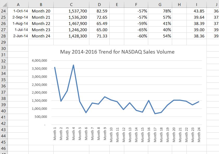
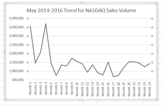
Figure 4.4 shows the line chart after it is moved and resized. You can also see that the title of the chart has been edited to read May 2014-2016 Trend for NASDAQ Sales Volume. Notice that the sizing handles do not appear around the perimeter of the chart. This is because the chart has been deactivated. To activate the chart, click anywhere inside the chart perimeter.
Integrity Check
When using line charts in Excel, keep in mind that anything placed on the X axis is considered a descriptive label, not a numeric value. This is an example of a category axis. This is important because there will never be a change in the spacing of any items placed on the X axis of a line chart. If you need to create a chart using numeric data on the category axis, you will have to modify the chart. We will do that later in the chapter.
Skill Refresher
Inserting a Line Chart
- Highlight a range of cells that contain data that will be used to create the chart. Be sure to include labels in your selection.
- Click the Insert tab of the ribbon.
- Click the Line button in the Charts group.
- Select a format option from the Line Chart drop-down menu.
Adjusting the Y Axis Scale
After creating an Excel chart, you may find it necessary to adjust the scale of the Y axis. Excel automatically sets the maximum value for the Y axis based on the data used to create the chart. The minimum value is usually set to zero. That is usually a good thing. However, depending on the data you are using to create the chart, setting the minimum value to zero can substantially minimize the graphical presentation of a trend. For example, the trend shown in Figure 4.4 appears to be increasing slightly in recent months. The presentation of this trend can be improved if the minimum value started at 500,000. The following steps explain how to make this adjustment to the Y axis:
- Click anywhere on the Y (value or vertical) axis on the May 2014-2016 Trend for NASDAQ Sales Volume line chart (Stock Trend worksheet).
- Right Click and select Format Axis. The Format Axis Pane should appear, as shown in Figure 4.5.
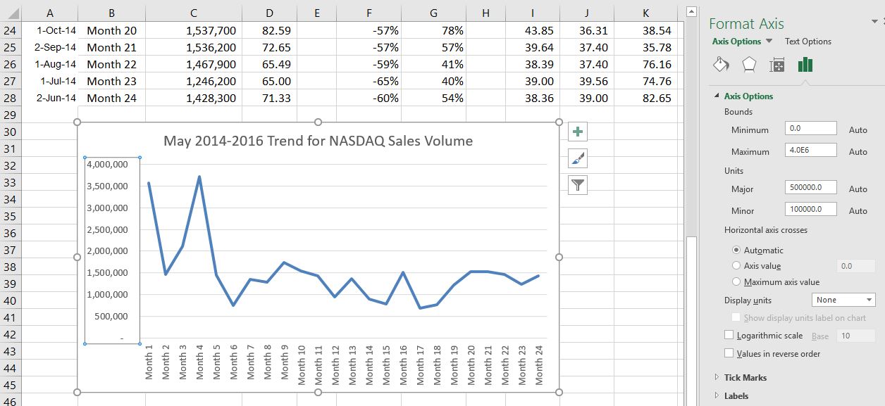
- In the Format Axis Pane, click the input box for the “Minimum” axis option and delete the zero. Then type the number 500000 and hit Enter. As soon as you make this change, the Y axis on the chart adjusts.
- Click the X in the upper right corner of the Format Axis pane to close it.
- Save your work.
Figure 4.6 shows the change in the presentation of the trend line. Notice that with the Y axis starting at 500,000, the trend for the NASDAQ is more pronounced. This adjustment makes it easier for the audience to see the magnitude of the trend.
Skill Refresher
Adjusting the Y Axis Scale
- Click anywhere along the Y axis to activate it.
- Right Click.
(Note, you can also select the Format tab in the Chart Tools section of the ribbon.) - Select Format Axis . . .
- In the Format Axis pane, make your changes to the Axis Options.
- Click in the input box next to the desired axis option and then type the new scale value.
- Click the Close button at the top right of the Format Axis pane to close it.
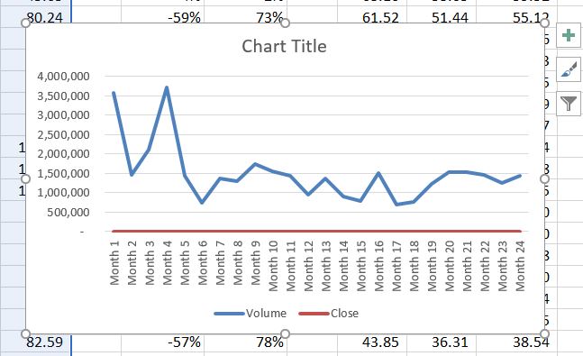
Trend Comparisons: Line Chart 2
We will now create a second line chart using the data in the Stock Trend worksheet. The purpose of this chart is to compare two trends: the change in volume for the NASDAQ and the change in the Closing price.
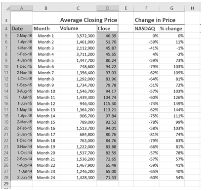
Before creating the chart to compare the NASDAQ volume and sales price, it is important to review the data in the range B4:D28 on the Stock Trend worksheet. We cannot use the volume of sales and the closing price because the values are not comparable. That is, the closing price is in a range of $45.00 to $115.00, but the data for the volume of Sales is in a range of 684,000 to 3,711,000. If we used these values – without making changes to the chart — we would not be able to see the closing price at all.
The construction of this second line chart will be similar to the first line chart. The X axis will be the months in the range B4:D28.
- Highlight the range B4:D28 on the Stock Trend worksheet.
- Click the Insert tab of the ribbon.
- Click the Line button in the Charts group of commands.
- Click the first option from the list, which is a basic line chart.
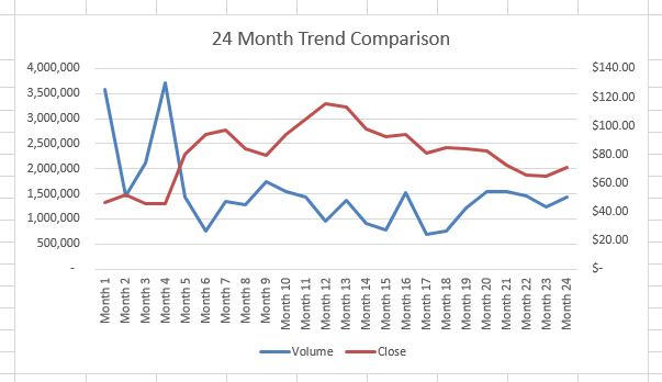
Figure 4.6.5 shows the appearance of the line chart comparing both the volume and the closing price before it is moved and resized. Notice that the line for the closing price (Close) appears as a straight line at the bottom of the chart. Also, the chart is covering the data again, and the title needs to be changed.
- Move the chart so the upper left corner is in the middle of cell M3.
Note: The line representing the closing values is flat along the bottom of the chart. This is hard to see and not very useful as is. Fear not. We will fix that.
- Resize the chart, using the resizing handles and the ALT key, so the left side is locked to the left side of Column M, the right side is locked to the right side of Column U, the top is locked to the top of Row 3, and the bottom is locked to the bottom of Row 17.
- Click in the text box that says “Chart Title.” Delete the text and replace it with the following: 24 Month Trend Comparison.
Good. But, we still cannot really see the Closing Price data. It is the flat red line at the very bottom of the chart.
- Right click the red line across the bottom of the chart that represents the Closing Price.
- On the menu, select Format Data Series. This will open the Format Data Series pane.
- In the Series Options, select Secondary Axis.
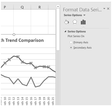
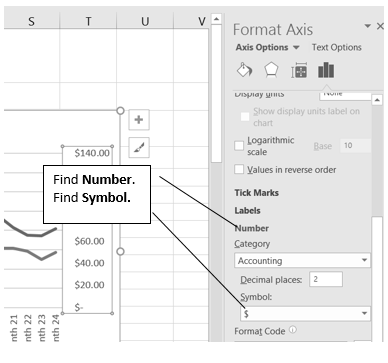
Better! But, it would be nice to be able to see that the values on the right represent prices.
- Right click the Secondary Vertical Axis. (The vertical axis on the right that goes from 0 to 140.)
- From the menu, select Format Axis.
- In Axis Options, select Number. (You may have to scroll down to see it.)
- Use the Symbol list box to add the $.
- Press the Close button to close the Format Axis pane.
- Save your work.
“Instant” Chart – F11
On the Stock Trend worksheet:
- Select A4:A28.
- Hold down the Ctrl key and select D4:D28. Figure 4.10 shows what that will look like.

Figure 4.10 Range Selection - Press F11. (The F11 function key is on the top row of the keyboard.) If the factory default settings haven’t been changed, Excel will create a column chart and place it on a separate chart sheet. (See Figure 4.11).
- Change the name of the chart sheet by double-clicking the worksheet name Chart1. Type Closing Prices as the new name and hit Enter.
- Save your work.
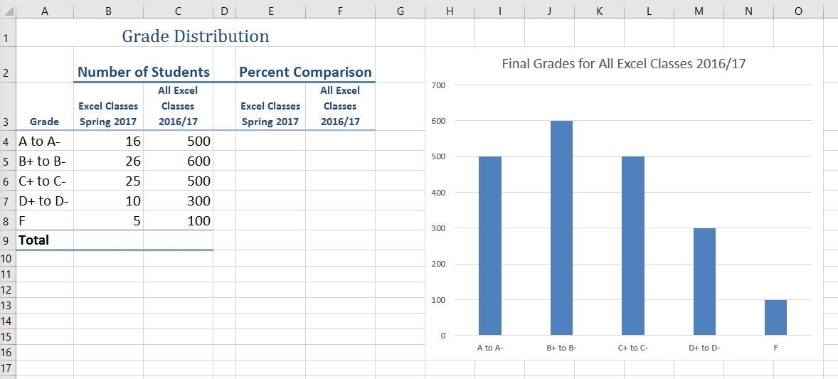
Frequency Distribution: Column Chart 1
A column chart is commonly used to show trends over time, as long as the data are limited to approximately twenty points or less. A common use for column charts is frequency distributions. A frequency distribution shows the number of occurrences by established categories. For example, a common frequency distribution used in most academic institutions is a grade distribution. A grade distribution shows the number of students that achieve each level of a typical grading scale (A, A−, B+, B, etc.). The Grade Distribution worksheet contains final grades for some hypothetical Excel classes. To show the grade frequency distribution for all the Excel classes in that year, the numbers of students appear on the Y axis and the grade categories appear on the X axis. The number of students for this chart is in Column C. The labels for grades are in Column A. The following steps explain how to create this chart:
- Select the Grade Distribution worksheet.
- Change the years in Row3 to the current academic term and year.
- Highlight the range A3:A8 on the Grade Distribution worksheet. Column A shows the grade categories.
- Hold down the Crtl key.
- Without letting go of the Ctrl key, select C3:C8
- Click the Column button in the Charts group section on the Insert tab of the ribbon. Select the first option in the 2-D Column section, which is the Clustered Column format.
- Click and drag the chart so the upper left corner is in the middle of cell H2.
- Resize the chart so the left side is locked to the left side of Column H, the right side is locked to the right side of Column O, the top is locked to the top of Row 2, and the bottom is locked to the bottom of Row 16.
- If Excel displays a legend, delete it by clicking the legend one time and pressing the DELETE key on the keyboard. Since the chart presents only one data series, the legend is not necessary.
- Add the text Final Grades for to the chart title. The chart title should now be Final Grades for All Excel Classes 2016/2017 (or whichever academic year you are using).
- Click any cell location on the Grade Distribution worksheet to deactivate the chart.
- Save your work.
Figure 4.12 shows the completed grade frequency distribution chart. By looking at the chart, you can immediately see that the greatest number of students earned a final grade in the B+ to B− range.
Why?
Column Chart vs. Bar Chart
When using charts to show frequency distributions, the difference between a column chart and a bar chart is really a matter of preference. Both are very effective in showing frequency distributions. However, if you are showing a trend over a period of time, a column chart is preferred over a bar chart. This is because a period of time is typically shown horizontally, with the oldest date on the far left and the newest date on the far right. Therefore, the descriptive categories for the chart would have to fall on the horizontal – or category axis, which is the configuration of a column chart. On a bar chart, the descriptive categories are displayed on the vertical axis.
Creating a Chart Sheet
- Click anywhere on the Final Grades for All Excel Classes chart on the Grade Distribution worksheet.
- Right click on the chart. Select Move Chart . . . This opens the Move Chart Dialog box.
- Click the New sheet option on the Move Chart dialog box. (The top option.)
- The entry in the input box for assigning a name to the chart sheet tab should automatically be highlighted once you click the New sheet option. Type All Excel Classes. This replaces the generic name in the input box (see Figure 4.13).
- Click the OK button at the bottom of the Move Chart dialog box. This adds a new chart sheet to the workbook with the name All Excel Classes.
- Save your work.
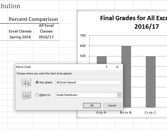
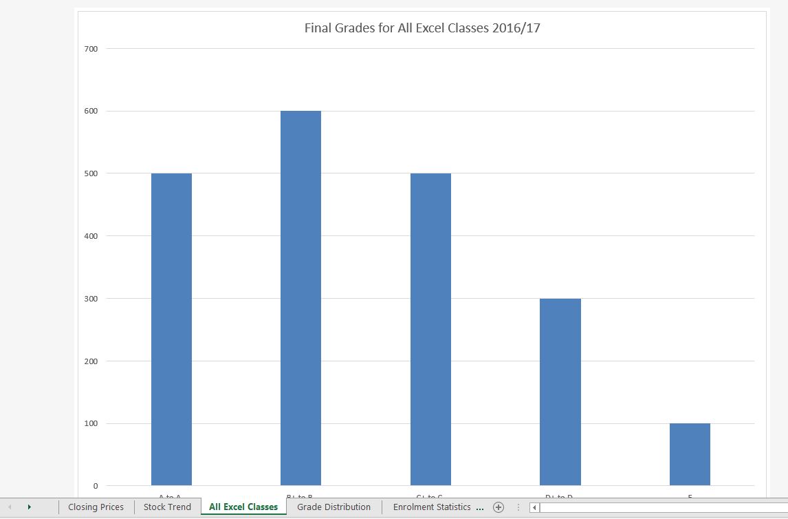
Figure 4.14 shows the Final Grades for the all the Excel Classes column chart is in a separate chart sheet. Notice the new worksheet tab added to the workbook matches the New sheet name entered into the Move Chart dialog box. Since the chart is moved to a separate chart sheet, it no longer is displayed in the Grade Distribution worksheet.
Frequency Comparison: Column Chart 2
We will create a second column chart to show a comparison between two frequency distributions. Column B on the Grade Distribution worksheet contains data showing the number of students who received grades within each category for the Spring Quarter. We will use a column chart to compare the grade distribution for Spring (Column B) with the overall grade distribution for the whole year (Column C).
However, since the number of students in the term is significantly different from the total number of students in the year, we must calculate percentages in order to make an effective comparison. The following steps explain how to calculate the percentages:
- Highlight the range B9:C9 on the Grade Distribution worksheet.
- Click the AutoSum button in the Editing group of commands on the Home tab of the ribbon. This automatically adds SUM functions that sum the values in the range B4:B8 and C4:C8.
- Activate cell E4 on the Grade Distribution worksheet.
- Enter a formula that divides the value in cell B4 by the total in cell B9. Add an absolute reference to cell B9 in the formula =B4/$B$9.
- Copy the formula in cell E4 and paste it into the range E5:E8 using the Paste command.
Or, use the Fill Handle to copy the calculation in E4 all the way down to E8. - Activate cell F4 on the Grade Distribution worksheet.
- Enter a formula that divides the value in cell C4 by the total in cell C9. Add an absolute reference to cell C9 in the formula =C4/$C$9.
- Copy the formula in cell F4 and paste it into the range F5:F8 using the Paste command.
Or, use the Fill Handle to copy the calculation in F4 all the way down to F8.
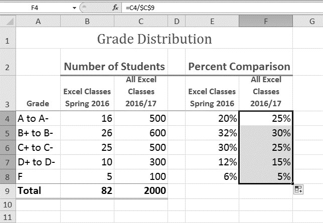
Figure 4.15 shows the completed percentages added to the Grade Distribution worksheet.
The column chart we are going to create uses the grade categories in the range A4:A8 on the X axis and the percentages in the range E4:F8 on the Y axis. This chart uses data that is not in a contiguous range, so we need to use the Ctrl key to select the ranges of cells.
- Select A3:A8, hold down the Ctrl key and select E3:F8.
- Click the Insert tab of the ribbon.
- Click the Column button in the Charts group of commands. Select the first option from the drop-down list of chart formats, which is the Clustered Column.
- Click and drag the chart so the upper left corner is in the middle of cell H2.
- Resize the chart so the left side is locked to the left side of Column H, the right side is locked to the right side of Column N, the top is locked to the top of Row 2, and the bottom is locked to the bottom of Row 16.
- Change the chart title to Grade Distribution Comparison. If you do not have a chart title, you can add one. On the Design tab, select Add Chart Element. Find the Chart Title. Select the Above Chart option from the drop-down list.
- Save your work.
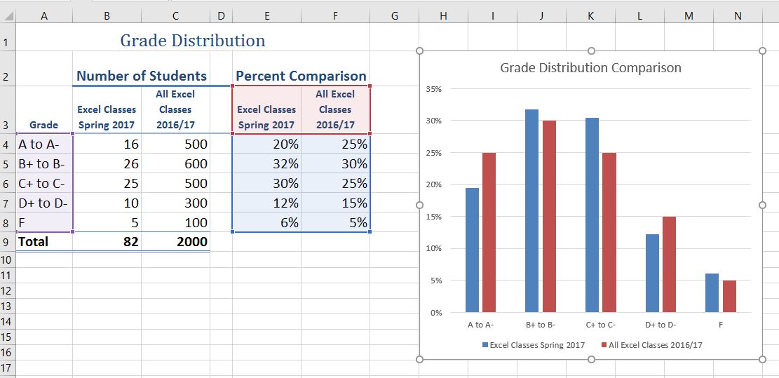
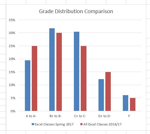
Figure 4.17 shows the final appearance of the column chart. The column chart is an appropriate type for this data because there are fewer than twenty data points and we can easily see the comparison for each category. An audience can quickly see that the class issued fewer As compared to the college. However, the class had more Bs and Cs compared with the college population.
Integrity Check
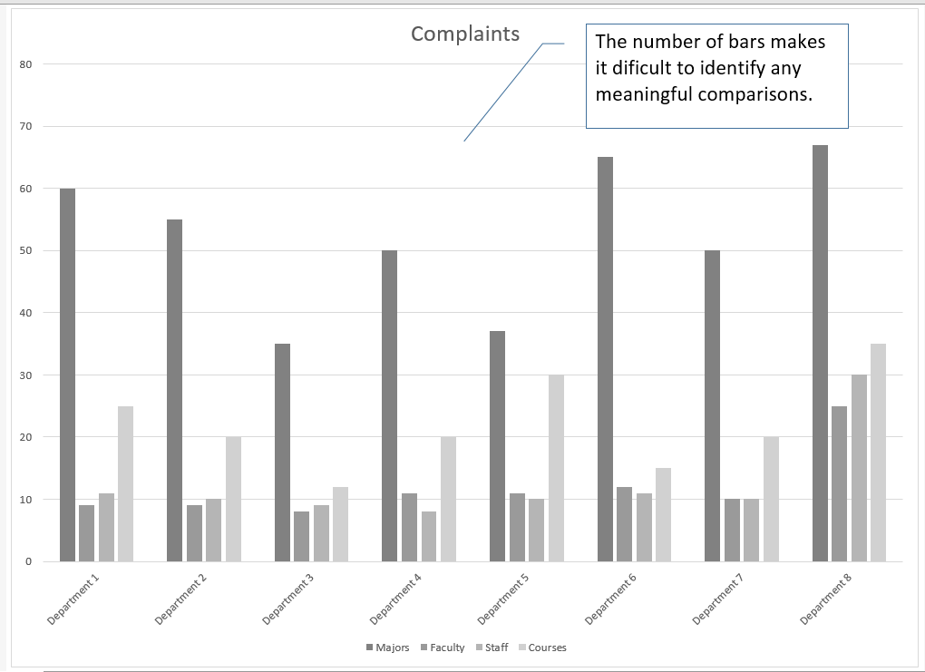
Too Many Bars on a Column Chart?
Although there is no specific limit for the number of bars you should use on a column chart, a general rule of thumb is twenty bars or less. Figure 4.18 contains a total of thirty-two bars. This is considered a poor use of a column chart because it is difficult to identify meaningful trends or comparisons. The data used to create this chart might be better used in two or three different column charts, each with a distinct idea or message.
Percent of Total: Pie Chart
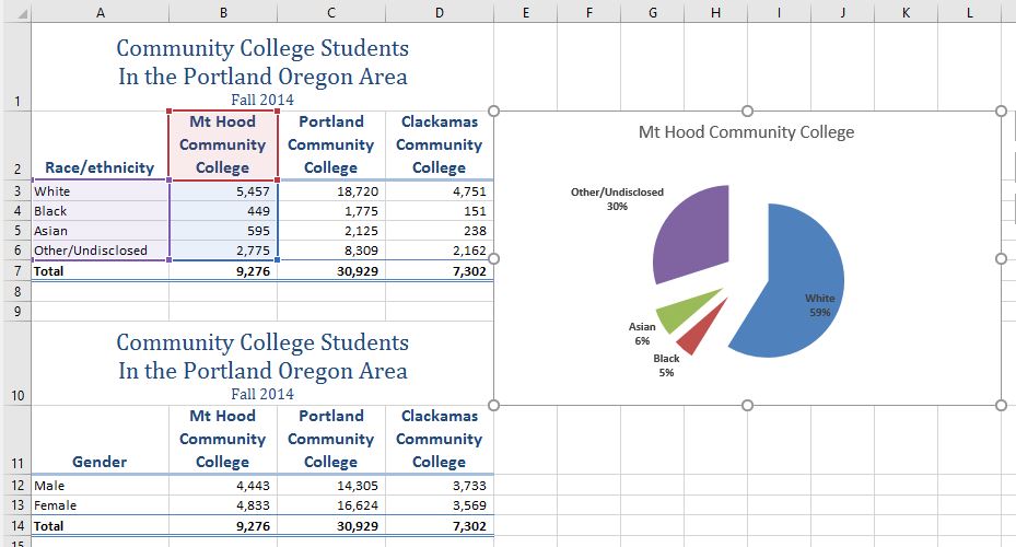
The next chart we will demonstrate is a pie chart. A pie chart is used to show a percent of total for a data set at a specific point in time. The data we will use to demonstrate a pie chart is related to enrollment data for Portland Area Community Colleges for Fall of 2014. You will find that data on the Enrollment Statistics sheet.
- Highlight the range A2:B6 on the Enrollment Statistics worksheet.
- Click the Insert tab of the ribbon.
- Click the Pie button in the Charts group of commands.
- Select the first “2-D Pie” option from the drop-down list of options.
- To make the “slices” stand out better, “explode” the pie chart.
- Click and hold the mouse button down in any of the slices of the pie.
- Note that you have selection handles on all of the pie slices.
- Without letting go of your mouse button; drag one of the slices away from the center.
- All of the slices “explode” out from the center.
- Click off the slices and into the white canvas to deselect the pie and select the entire chart.
- Click and drag the pie chart so the upper left corner is in the middle of cell E2.
- Resize the pie chart so the left side is locked to the left side of Column E, the right side is locked to the right side of Column L, the top is locked to the top of Row 2, and the bottom is locked to the bottom of Row 10 (see Figure 4.19).
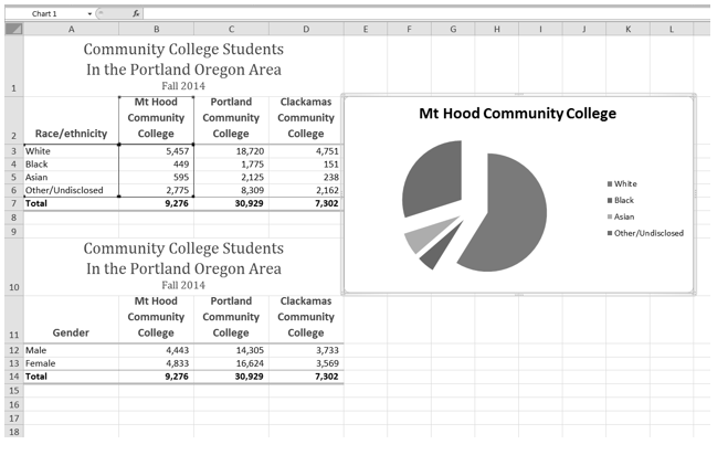
- Click the chart legend once and press the DELETE key on your keyboard. A pie chart typically shows labels next to each slice. Therefore, the legend is not needed.
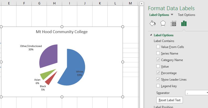
- Right click any of the slices in the pie chart, and select Add Data Labels from the list. This will add the values for each of the slices in the pie.
- Now, you can right click one of the numbers and select Format Data Labels from the list. This will open the Format Data Labels pane on the right.
- Check the boxes for Category Name and Percentage in the Label Options section in the Format Data Labels pane. This will add the Race/ethnicity labels as well as the percentage data to the pie chart.
- Uncheck the box next to the Value box. This will remove the numbers from the pie chart (see Figure 4.20).
- Click the Close button at the top of the Format Data Labels pane.
- Select the data labels again (if needed). Click the Home tab of the ribbon and then click the Bold button. This will bold the data labels on the pie chart.
- Save your work.
Although there are no specific limits for the number of categories you can use on a pie chart, a good rule of thumb is ten or less. As the number of categories exceeds ten, it becomes more difficult to identify key categories that make up the majority of the total.
Skill Refresher
Inserting a Pie Chart
- Highlight a range of cells that contain the data you will use to create the chart.
- Click the Insert tab of the ribbon.
- Click the Pie button in the Charts group.
- Select a format option from the Pie Chart drop-down menu.
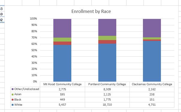
Percent of Total: Stacked Column Chart
The last chart type we will demonstrate is the stacked column chart. We use a stacked column chart to show a percent of a total . For example, the data on the Enrollment Statistics worksheet shows student enrollment by race for several colleges. We would like to see all of the data on all of the colleges.
- Highlight the range A2:D6 on the Enrollment Statistics worksheet.
- Click the Insert tab of the ribbon.
- Click the Column button in the Charts group of commands. Select the 100% Stacked Column format option from 2-D Column section in the drop-down list (see Figure 4.22).
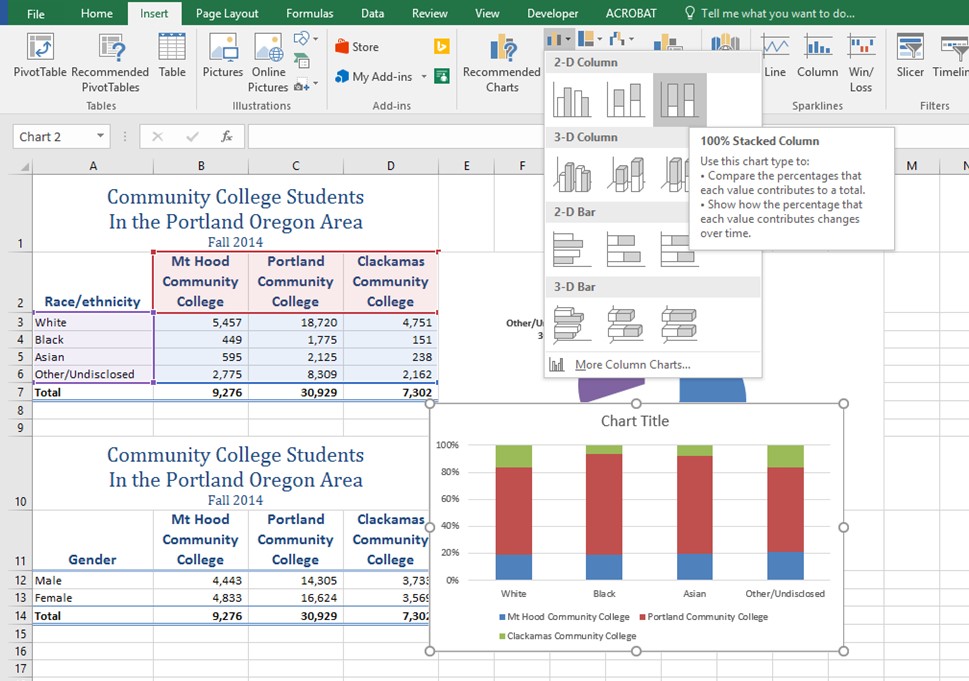
Figure 4.23 shows the column chart that is created after selecting the 100% Stacked Column format option. As mentioned, the goal of this chart is to show the enrollment of students by race. However, notice that Excel places the racial categories on the X axis. It would be more useful if the different colleges were there instead.
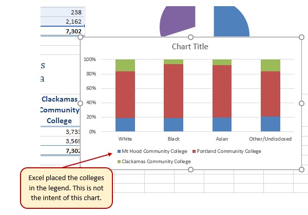
The reason that Excel organized the data this way is that there are more Race/ethnicity categories (data in column A) than there are colleges (data in row 2). Not a bad guess. But, not what we wanted in this case.
The remaining steps explain how to correct this problem and complete the chart:
- Click the Switch Row/Column button in the Design tab on the Chart Tools section of the ribbon. This reverses the legend and current X axis categories.
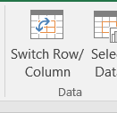
Figure 4.24 Switch Row/Column. - Click and drag the chart so the upper left corner is in the middle of cell E12.
- Resize the chart so the left side is locked to the left side of Column E, the right side is locked to the right side of Column N, the top is locked to the top of Row 12, and the bottom is locked to the bottom of Row 30.
- Click the legend one time and press the DELETE key on your keyboard.
- Add a Data Table. This is another way of displaying a legend for a column chart along with the numerical values that make up each component.
- In earlier versions of Excel, find the Labels group of commands and select the Show Data Table with Legend Keys option from the drop-down menu.
- In Excel 2016, find the Add Chart Element tool on the Design tab, select Data Table With Legend Keys
- Change the Chart Title to Enrollment by Race.
- If there is no chart title, you will need to add one using the Add Chart Element tool on the Design tab.
- Save your work.
Figure 4.25 shows the final stacked column chart. Notice the similarities and differences in the enrollment at the local community colleges.
Skill Refresher:
Inserting a Stacked Column Chart
- Highlight a range of cells that contain data that will be used to create the chart.
- Click the Insert tab of the ribbon.
- Click the Column button in the Charts group.
- Select the Stacked Column format option from the Column Chart drop-down menu to show the values of each category on the Y axis. Select the 100% Stacked Column option to show the percent of total for each category on the Y axis.
Key Takeaways
- Identifying the message you wish to convey to an audience is a critical first step in creating an Excel chart.
- Both a column chart and a line chart can be used to present a trend over a period of time. However, a line chart is preferred over a column chart when presenting data over long periods of time.
- The number of bars on a column chart should be limited to approximately twenty bars or less.
- When creating a chart to compare trends, the values for each data series must be within a reasonable range. If there is a wide variance between the values in the two data series (two times or more), the percent change should be calculated with respect to the first data point for each series.
- When working with frequency distributions, the use of a column chart or a bar chart is a matter of preference. However, a column chart is preferred when working with a trend over a period of time.
- A pie chart is used to present the percent of total for a data set.
- A stacked column chart is used to show how a percent total changes over time.
Attribution
Adapted by Noreen Brown from How to Use Microsoft Excel: The Careers in Practice Series, adapted by The Saylor Foundation without attribution as requested by the work’s original creator or licensee, and licensed under CC BY-NC-SA 3.0.
