
4.2 Formatting Charts
Learning Objectives
- Apply formatting commands to the X and Y axes.
- Enhance the visual appearance of the chart title and chart legend by using various formatting techniques.
- Assign titles to the X and Y axes that clarify labels and numeric values for the reader.
- Apply labels and formatting techniques to the data series in the plot area of a chart.
- Apply formatting commands to the chart area and the plot area of a chart.
- Employ series lines and annotations to enhance trends and provide additional information on a chart.
You can use a variety of formatting techniques to enhance the appearance of a chart once you have created it. Formatting commands are applied to a chart for the same reason they are applied to a worksheet: they make the chart easier to read. However, formatting techniques also help you qualify and explain the data in a chart. For example, you can add footnotes explaining the data source as well as notes that clarify the type of numbers being presented (i.e., if the numbers in a chart are truncated, you can state whether they are in thousands, millions, etc.). These notes are also helpful in answering questions if you are using charts in a live presentation. We will demonstrate these formatting techniques using the column chart and stacked column chart from the previous section.
X and Y Axis Formats
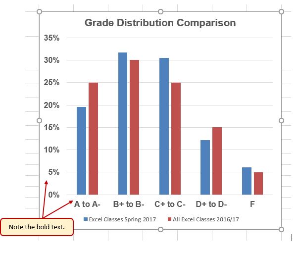
There are numerous formatting commands we can apply to the X and Y axes of a chart. Although adjusting the font size, style, and color are common, many more options are available through the Format Axis pane. The following steps demonstrate a few of these formatting techniques on the Grade Distribution Comparison chart:
- Switch to the Grade Distribution worksheet and click anywhere along the X axis (horizontal axis) of the Grade Distribution Comparison chart.
- Right click and select Font.
- Change the font to Arial, the Font Style to Bold, and the Size to 11 (see Figure 4.26).
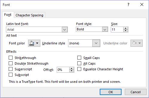
Figure 4.26 Font Dialog Box - Click anywhere along the Y axis to activate it and repeat steps 2 and 3.
- Click on the chart title and repeat steps 2 and 3, but set the Size to 14.
- The final appearance of the axes is shown in Figure 4.27 Formatted X & Y Axes.
Next we want to make some changes to the percentage numbers on the Y (vertical) axis.
- Right click the vertical (value) axis. Select Format Axis. This opens the Format Axis pane.
- Click Number from the list of options. The commands in this section of the Format Axis pane are used to format numbers that appear on the selected axis of the chart.
- Click in the Decimal places input box and change the value to 1.
- Select Axis Options. Change the Minimum Bound to .05 to make the differences in the columns more dramatic. The Format Axis pane should match Figure 4.28.
- Click the Close button at the top of the Format Axis pane.
- Save your work.

Skill Refresher
Formatting the X and Y Axes
- Click anywhere along the X or Y axis to activate it.
- Click either the Home tab or Design tab of the ribbon.
- Select any of the available formatting commands in these tabs.
Skill Refresher
X and Y Axis Number Formats
- Click anywhere along the X or Y axis to activate it.
- Click the Layout tab in the Chart Tools section of the ribbon.
- Click the Format Selection button in the Current Selection group of commands.
- Click Number from the list of options on the left side of the Format Axis dialog box.
- Select a number format and set decimal places on the right side of the Format Axis dialog box.
- Click the Close button in the Format Axis pane.
Chart Legend and Title Formats
The next items we will format on the Grade Distribution Comparison chart are the chart legend and title. Similar to the how we formatted the X and Y axes, we can format these items by activating them and using the formatting commands in the Home tab or the Format pane. The following steps explain how to add these formats:
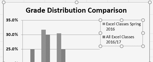
- Right click the legend on the Grade Distribution Comparison chart and select Format Legend.
- Select Right in the Legend Position options. Close the Format Legend pane.
- Move the legend by placing your cursor – shaped like a little plus sign with four arrows – on the edge of the selection box. Click and drag the legend so the top of the legend aligns with the 35% line next to the plot area (see Figure 4.29).
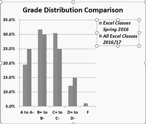
- While the legend is still selected, change the font style in the Home tab of the ribbon to Arial.
- Change the font size to 12 points.
- Click the bold and italics commands in the Home tab of the ribbon.
- Click and drag the left sizing handle so the legend is against the plot area (see Figure 4.30).
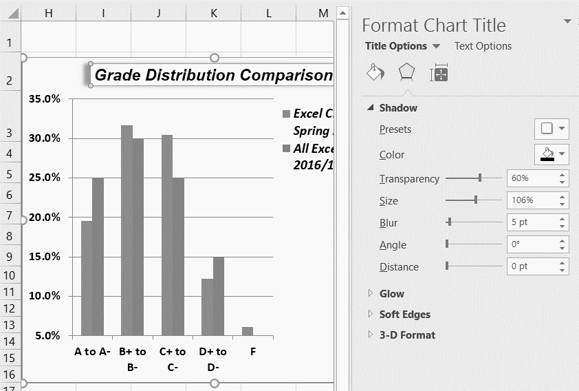
- Click the chart title to activate it.
- Right click on the chart title and select Format Chart Title to open the Format Chart Title pane.
- Under Title Options , in the Effects group (the option in the middle) give your title one of the Preset shadows. Change the color, if you like.
- Close the Format Chart Title pane.
- Save your work.
Skill Refresher
Formatting the Chart Legend
- Click the Legend to activate it.
- Click either the Home tab or right click to activate the appropriate formatting pane.
- Select any of the available formatting commands.
- Click and drag the legend to move it.
- Click and drag any of the sizing handles to adjust the size of the legend.
Skill Refresher
Formatting the Chart Title
- Click anywhere on the chart title.
- Click either the Home tab or right click to activate the appropriate formatting pane.
- Select any of the available formatting commands.
X and Y Axis Titles
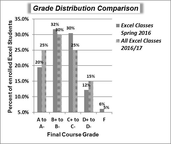
Titles for the X and Y axes are necessary for defining the numbers and categories presented on a chart. For example, by looking at the Grade Distribution Comparison chart, it is not clear what the percentages along the Y axis represent. The following steps explain how to add titles to the X and Y axes to define these numbers and categories:
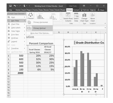
- Click anywhere on the Grade Distribution Comparison chart in the Grade Distribution worksheet to activate it.
- On the Design tab on the ribbon select the Add Chart Element button, then Axis Titles, then Primary Vertical. (See Figure 4.32)
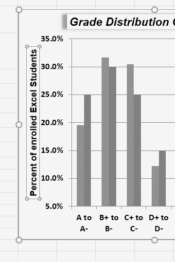
- Using the Home ribbon, change the font of the axis title to Arial, Bold, size 11.
- Click in the beginning of the Y axis title and delete the generic title. Type Percent of Enrolled Excel Students.(see Figure 4.33).
Next we will add the title for the X axis.
- On the Design tab select the Add Chart Element button, then Axis Titles, then Primary Horizontal.
- Using the Home ribbon, change the font of the axis title to Arial, Bold, size 11.
- Click in the beginning of the X axis title and delete the generic title. Type Final Course Grade. Figure 4.34 shows the added titles for the X and Y axes. The titles provide definitions for the grade categories along the X axis as well as the percentages on the Y axis.
- Save your work.

Skill Refresher
X and Y Axis Titles
- On the Design tab select the Add Chart Element button.
- Click anywhere on the chart to activate it.
- Select one of the options from the second drop-down list.
- Click in the axis title to remove the generic title and type a new title.
Data Series Labels and Formats
Adding labels to the data series of a chart is a key formatting feature. A data series is the item that is being displayed graphically on a chart. For example, the blue bars on the Grade Distribution Comparison chart represent one data series. We can add labels at the end of each bar to show the exact percentage the bar represents. In addition, we can add other formatting enhancements to the data series, such as changing the color of the bars or adding an effect. The following steps explain how to add these labels and formats to the chart:
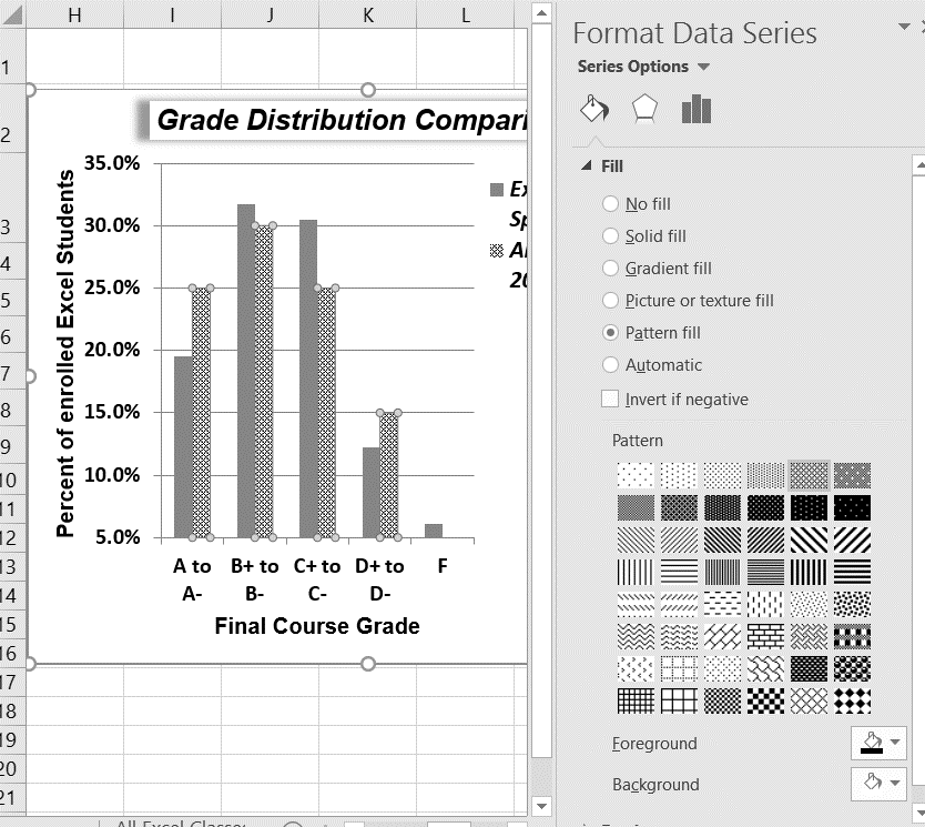
- Click on any of the the red bars representing the All Excel Classes data series on the Grade Distribution Comparison chart in the Grade Distribution worksheet. Clicking one bar automatically activates all bars in the data series. If you click a bar a second time, only that bar is activated.
- Right click and select Format Data Series to open up the Format Data Series pane.
- Click the Fill and Line (paint bucket) button to bring up the Fill and Border group of commands.
- Click the word Fill (if needed) to expand the list of Fill options.
- Select Pattern Fill. Then select 30% (fifth column, top row). Changing your fill pattern to a pattern makes it easier to distinguish between the data series when you print or view your chart in black and white. While you are there, make changes to the fill by experimenting with different foreground and background colors.
- Close the Format Data Series pane.
Now we are going to add the Data Labels at the end of the columns.
- Be sure that your entire chart is selected, not just one of the data series. Click the Design tab in the Chart Tools section of the ribbon.
- On the Design tab select the Add Chart Element button, then Data Labels, then Outside End (see Figure 4.36.)
- Click on one of the Data Labels. Note that all of the data labels for that data series are selected.
- Using the Home ribbon, change the font to Arial, Bold, size 9.
- Click on one of the data labels for the other data series. Format those data labels as Arial, Bold, size 9 as well.
- Save your work.

Figure 4.37 shows the Grade Distribution Comparison chart with the completed formatting adjustments and labels added to the data series. Note that we can move each individual data label. This might be necessary if two data labels overlap or if a data label falls in the middle of a grid line. To move an individual data label, click it twice, then click and drag.
Skill Refresher:
Adding Data Labels
- Click anywhere on the chart to activate it.
- Click the Design tab in the Chart Tools section of the ribbon.
- Click the Add Chart Element in the Chart Layout group.
- Then, select Data Labels
- Select one of the preset positions from the drop-down list.
Skill Refresher
Formatting a Data Series
- Click any bar or line for a data series.
- Right click to activate the Format Data Series pane.
- Use the formatting tools in the pane to make changes to the data series.
Adding Series Lines and Annotations to a Chart
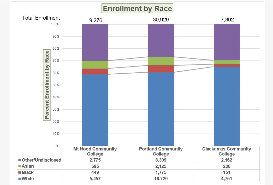
The last formatting features we will demonstrate are adding series lines and annotations to a chart. To demonstrate these skills, we will use the Change in Enrollment Statistics Spend Source stacked column chart. Series lines are commonly used in stacked column charts to show the change from one stack to the next. Annotations are useful for clarifying the data presented in a chart or for identifying data sources. In addition to demonstrating these skills, we will review several of the formatting skills that were covered in this section. The following steps include the skills review as well as the new formatting features:
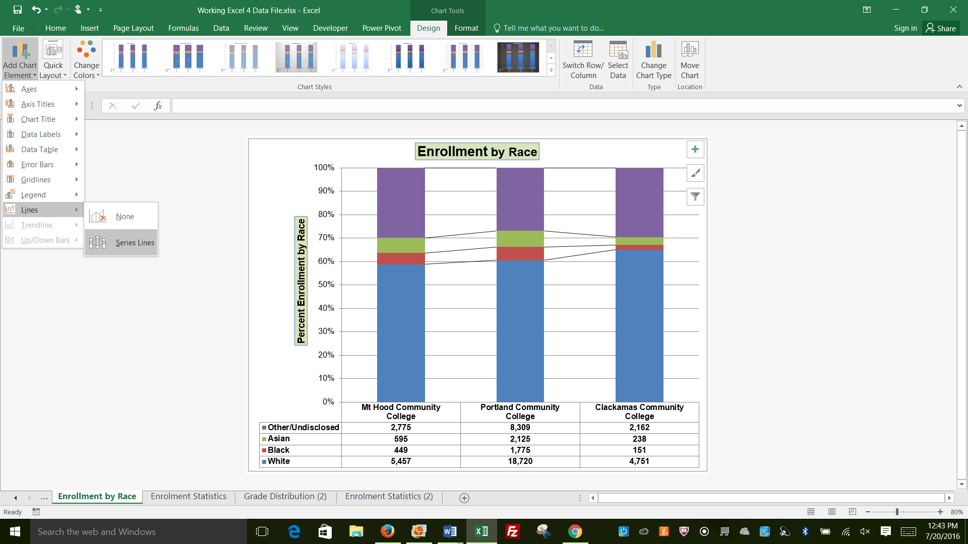
- Locate the Enrollment by Race stacked column chart on the Enrollment Statistics worksheet. Activate the chart by clicking anywhere inside the chart perimeter.
- Move the chart to a separate chart sheet by clicking the Move Chart button in the Design tab of the ribbon. Type the following in the New sheet input box: Enrollment by Race Chart. Click the OK button.
- Click anywhere on the data table (on the x axis) to activate it. Using the Home ribbon, change the font to Arial, Bold, size 12.
- Activate the Y axis and apply the same formatting adjustments as stated in step 3.
- Add a Y axis title using Add Chart Elements – Axis Titles – then More Axis Title Options.
- In the Format Axis Title pane change the fill color and border to colors of your choice.
- Then, using the Home tab of the ribbon, change the font to Arial, Bold, size 14.
- Change the text of the Y axis title to Percent Enrollment by Race.
- Check the horizontal axis to see if this process created an extra axis title there. If it did, delete it.
- Activate the title of the chart by clicking it once. The Format Chart Title pane should be open. If not, right click the Chart title and select Format Chart Title from the menu. Change the fill and border to match your vertical Axis label.
- Then, using the Home tab of the ribbon, change the font of the chart title to Arial, Bold, size 20.
- Close the Formatting pane.
- Click the Add Chart Elements tool (Design tab), then Lines, then Series Lines.
This adds lines to the chart, connecting each data series between the three stacks (see Figure 4.38).
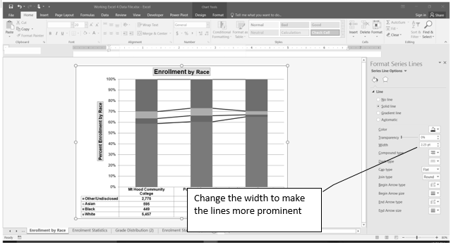
- Right click on any of the series lines added to the chart. Clicking one line will activate all lines on the chart. (If the Format Pane is open, you will not need to right click. Just left click on any of the series lines to change the format pane to Format Series Lines)
- Select Format Series Lines. This will open the Format Series Lines pane.
- Change the width to 2.25.
- Close the Format Series Lines pane.
Figure 4.39 shows the appearance of the chart with the series lines connecting the two stacks. This formatting enhancement is common for stacked column charts. The lines help focus the audience’s attention to changes in the percent of total trend.
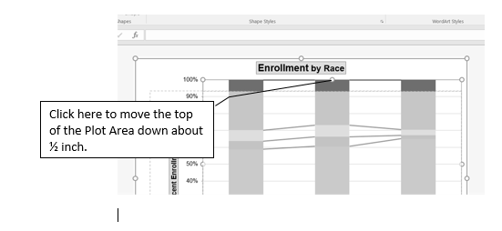
Our chart demonstrates the percentage differences in enrollment between the community colleges. But, it would be handy to know the total Enrollment at each of the colleges. To display that, we will add text boxes above each column. To start with, we need to make room for the text boxes.
- Select the Plot Area. Place your cursor on the top center handle of the Plot Area and drag down about ½ inch.
Add text boxes to include additional information in the chart.
- Click the Text Box button in the Text group on the Insert tab of the ribbon (see Figure 4.41).
- Place the mouse pointer on the left edge of the chart area approximately one-quarter inch from the top. Click and drag a rectangle approximately one and a half inches wide and one-quarter inch high (see Figure 4.41). Don’t worry if it’s not exact – you can move and resize text boxes at any time.
- Type Total Enrollment. This tells the audience the size of each school.
- Select all of the text in the text box. (You can either highlight the text or click on the border of the text box once to select all of the text). Using the Home tab of the ribbon, change the font to Arial, size 14.
- Repeat the process to add and format text boxes above each column. You can try to copy and paste the text boxes if you would like to save time.
- In each text box, type the Total Enrollment for each school:
- Mt Hood – 9,276
- Portland – 30,929
- Clackamas – 7,302
- Save your work.
Integrity Check
Annotations and Axis Titles
Although adding annotations and axis titles can be a tedious process, doing so maintains a high level of integrity for your charts. People can misinterpret the message being conveyed by the chart if they make inaccurate assumptions about the values displayed. Axis titles and annotations help prevent readers from making false assumptions and ensure that readers see the most accurate representation of the message being conveyed by the chart.
Skill Refresher
Adding Series Lines
- Click anywhere on the chart area.
- Click the Layout tab of the ribbon.
- Click the Lines button in the Analysis group of commands.
- Click the Series Lines option from the drop-down list.
Skill Refresher:
Adding Annotations
- Click anywhere on the chart area.
- Click the Insert tab of the ribbon.
- Click the Text Box button in the Text group of commands.
- Click and drag the size of the text box needed on the chart.
- Apply any desired format changes from the Home tab of the ribbon.
- Type the desired text.
Key Takeaways
- Applying appropriate formatting techniques is critical for making a chart easier to read.
- Many formatting commands in the Home tab of the ribbon can be applied to a chart.
- To change the number format for a data label, you must use the Number section in the Format Data Labels dialog box. You cannot use the Number format commands in the Home tab of the ribbon.
- To change the number format for the values on the Y axis, and the X axis in the case of a scatter chart, you must use the Number section of the Format Axis dialog box. You cannot use the Number format commands in the Home tab of the ribbon.
- Axis titles and annotations help prevent false assumptions from being made and ensure that the reader sees the most accurate representation of the information presented on a chart.
Attribution
Adapted by Noreen Brown from How to Use Microsoft Excel: The Careers in Practice Series, adapted by The Saylor Foundation without attribution as requested by the work’s original creator or licensee, and licensed under CC BY-NC-SA 3.0.
