
4.5 Chapter Practice
To assess your understanding of the material covered in the chapter, please complete the following assignments.
Although Excel is primarily used in business and scientific applications, you will find it useful in other areas of study as well. In these exercises, we will use Excel to create charts using historical, and health data.
Charting Historical Data (Comprehensive Review)
Download Data File: PR4 Data
Excel is an excellent tool for helping display historical data. In this exercise, we will be examining ways to display information on minimum mage data and life expectancy.
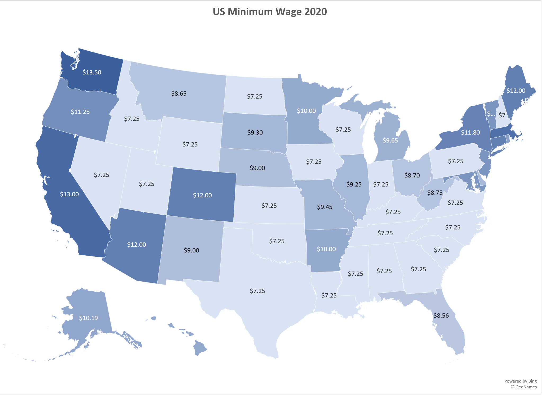
Task1 – National Minimum Wages Changes in The United States 2019-2020
Since the beginning of the previous century, the United States has set a minimum wage, in order to set a “floor” beneath which wages cannot fall. Most states have set their own minimum wages, but none are lower than the national minimum wage. Follow the below steps to insert a Map Chart outlining what the current minimum wage is per state.
1. Open the file named PR4 Data and then Save As PR4 Historical Data.
2. On the Minimum Wage worksheet, select the range B4:B55. Press and hold the CTRL key and select D4:D55.
![]() Mac Users: hold down the “Command” key not the CTRL key
Mac Users: hold down the “Command” key not the CTRL key
3. Select the Insert tab, then the Map Chart tool in the Charts group.
4. Move the Chart as a New Sheet. Rename the sheet Map.
5. Update the Chart Title to US Minimum Wage 2020.
6. From the Charts Element menu choose to display the Data Labels.
7. From the Charts Element menu, turn off the Legend.
8. Prepare the Minimum Wage worksheet for printing by changing the scaling to Fit Sheet on One Page.
9. Save your work.
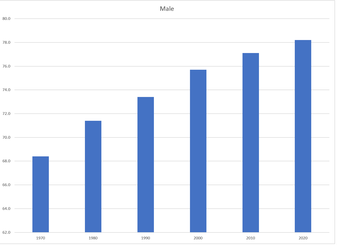
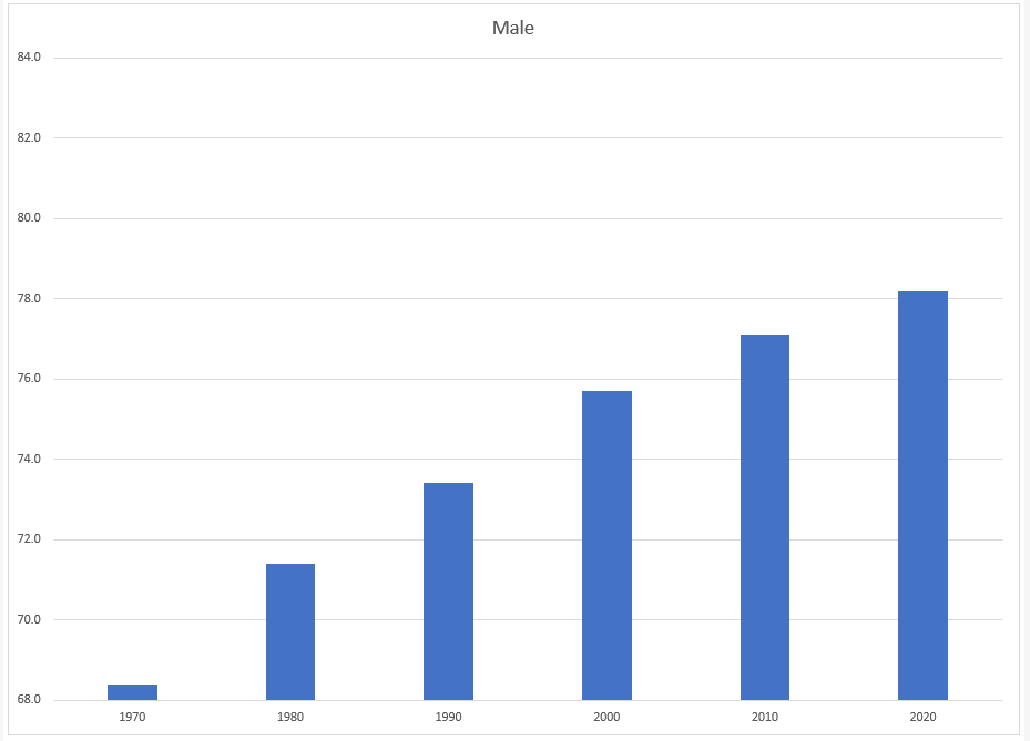
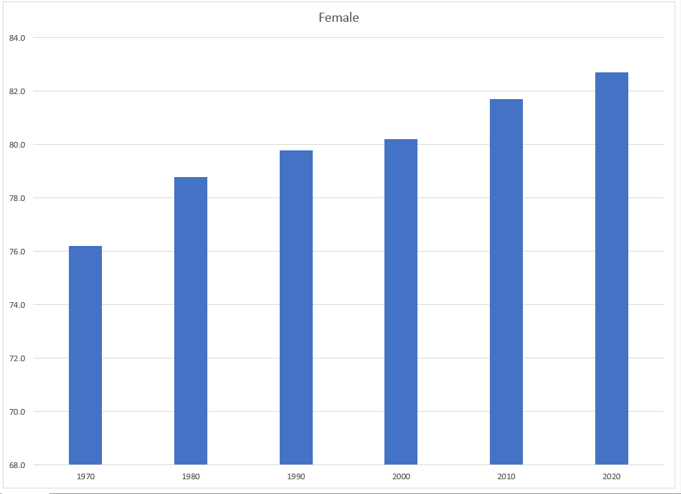
Task 2 – Oregon: Projected Life Expectancy at Birth
In the past 40 years, between 1970 and 2010, life expectancy for Oregon men improved by 8.7 years and for women by 5.5 years. Oregon’s life expectancy has remained slightly higher than the U.S. average. The life expectancy will continue to improve for both men and women. However, the gain for men has been outpacing the gain for women. Consequently, the difference between men’s and women’s life expectancies has continued to shrink.
https://www.oregon.gov/das/OEA/Documents/OR_pop_trend2012.pdf
1. On the Life Expectancy sheet, select A5:B11.
2. From the Insert tab choose Recommend Charts. Select the second option, Clustered Column chart.
3. Move the chart to a new sheet. Name the sheet Men.
4. Repeat steps above to create a matching chart for Life Expectancy for Oregon Women, by selecting A5:A11. Press and hold the CTRL key and select C5:C11.
![]() Mac Users hold down the Command key
Mac Users hold down the Command key
5. Use the Recommended Charts and select the Clustered Column chart.
6. Move the chart to a new sheet. Name the sheet Women.
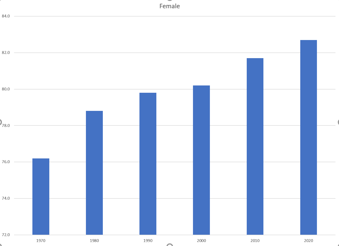
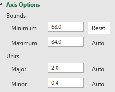
7. Notice on the men’s and women’s vertical axis the min and maximum bounds do not match. To ensure data is comparable, adjust the min and max bounds of both the Mens and Womens chart to chart to match:
8. Check the spelling on all of the worksheets and make any necessary changes. Save the PR4 Historical Data workbook.
9. Submit the PR4 Historical Data workbook as directed by your instructor.
Attribution
“4.5 Chapter Practice” by Hallie Puncochar and Noreen Brown, Portland Community College is licensed under CC BY 4.0
