
2 Presenting Data
After you have collected data in an experiment, you need to figure out the best way to present that data in a meaningful way. Depending on the type of data, and the story that you are trying to tell using that data, you may present your data in different ways.
Descriptive titles
All figures that present data should stand alone – this means that you should be able to interpret the information contained in the figure without referring to anything else (such as the methods section of the paper). This means that all figures should have a descriptive title that gives information about the independent and dependent variable. Another way to state this is that the title should describe what you are testing and what you are measuring. A good starting point to developing a title is “the effect of [the independent variable] on the [dependent variable].”
Here are some examples of good titles for figures:
- The effect of exercise on heart rate
- Growth rates of E. coli at different temperatures
- The relationship between heat shock time and transformation efficiency
Here are a few less effective titles:
- Heart rate and exercise
- Graph of E. coli temperature growth
- Table for experiment 1
Data Tables
The easiest way to organize data is by putting it into a data table. In most data tables, the independent variable (the variable that you are testing or changing on purpose) will be in the column to the left and the dependent variable(s) will be across the top of the table.
Be sure to:
- Label each row and column so that the table can be interpreted
- Include the units that are being used
- Add a descriptive title for the table
Example
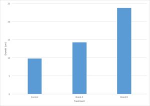
You are evaluating the effect of different types of fertilizers on plant growth. You plant 12 tomato plants and divide them into three groups, where each group contains four plants. To the first group, you do not add fertilizer and the plants are watered with plain water. The second and third groups are watered with two different brands of fertilizer. After three weeks, you measure the growth of each plant in centimeters and calculate the average growth for each type of fertilizer.
| Treatment | Plant Number | ||||
| 1 | 2 | 3 | 4 | Average | |
| No treatment | 10 | 12 | 8 | 9 | 9.75 |
| Brand A | 15 | 16 | 14 | 12 | 14.25 |
| Brand B | 22 | 25 | 21 | 27 | 23.75 |
Scientific Method Review: Can you identify the key parts of the scientific method from this experiment?
- Independent variable – Type of treatment (brand of fertilizer)
- Dependent variable – plant growth in cm
- Control group(s) – Plants treated with no fertilizer
- Experimental group(s) – Plants treated with different brands of fertilizer
Graphing data
Graphs are used to display data because it is easier to see trends in the data when it is displayed visually compared to when it is displayed numerically in a table. Complicated data can often be displayed and interpreted more easily in a graph format than in a data table.
In a graph, the X-axis runs horizontally (side to side) and the Y-axis runs vertically (up and down). Typically, the independent variable will be shown on the X axis and the dependent variable will be shown on the Y axis (just like you learned in math class!).
Line Graph
Line graphs are the best type of graph to use when you are displaying a change in something over a continuous range. For example, you could use a line graph to display a change in temperature over time. Time is a continuous variable because it can have any value between two given measurements. It is measured along a continuum. Between 1 minute and 2 minutes are an infinite number of values, such as 1.1 minute or 1.93456 minutes.
Changes in several different samples can be shown on the same graph by using lines that differ in color, symbol, etc.
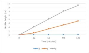
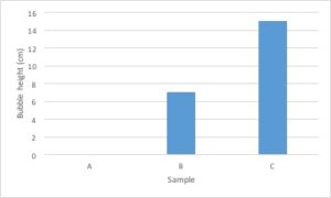
Bar Graph
Bar graphs are used to compare measurements between different groups. Bar graphs should be used when your data is not continuous, but rather is divided into different categories. If you counted the number of birds of different species, each species of bird would be its own category. There is no value between “robin” and “eagle”, so this data is not continuous.
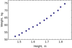
Scatter Plot
Scatter Plots are used to evaluate the relationship between two different continuous variables. These graphs compare changes in two different variables at once. For example, you could look at the relationship between height and weight. Both height and weight are continuous variables. You could not use a scatter plot to look at the relationship between number of children in a family and weight of each child because the number of children in a family is not a continuous variable: you can’t have 2.3 children in a family.
How to make a graph
- Identify your independent and dependent variables.
- Choose the correct type of graph by determining whether each variable is continuous or not.
- Determine the values that are going to go on the X and Y axis. If the values are continuous, they need to be evenly spaced based on the value.
- Label the X and Y axis, including units.
- Graph your data.
- Add a descriptive caption to your graph. Note that data tables are titled above the figure and graphs are captioned below the figure.
Example
Let’s go back to the data from our fertilizer experiment and use it to make a graph. I’ve decided to graph only the average growth for the four plants because that is the most important piece of data. Including every single data point would make the graph very confusing.
- The independent variable is type of treatment and the dependent variable is plant growth (in cm).
- Type of treatment is not a continuous variable. There is no midpoint value between fertilizer brands (Brand A 1/2 doesn’t make sense). Plant growth is a continuous variable. It makes sense to sub-divide centimeters into smaller values. Since the independent variable is categorical and the dependent variable is continuous, this graph should be a bar graph.
- Plant growth (the dependent variable) should go on the Y axis and type of treatment (the independent variable) should go on the X axis.
- Notice that the values on the Y axis are continuous and evenly spaced. Each line represents an increase of 5cm.
- Notice that both the X and the Y axis have labels that include units (when required).
- Notice that the graph has a descriptive caption that allows the figure to stand alone without additional information given from the procedure: you know that this graph shows the average of the measurements taken from four tomato plants.
For this class, graphs will typically be scored using the following rubric:
+1 An appropriate type of graph chosen to represent the data.
+1 Data is correctly graphed.
+1 Axes correctly labeled including units (if necessary).
+1 Descriptive caption contains enough information that the graph can be interpreted on its own.

Feedback/Errata