3 Printmaking
A Revolution of Process & Technology
This chapter outlines key moments in the development of printmaking, introduces several printmaking processes, and connects printmaking to New Media art. After reading a definition of each process and viewing a video demonstration, you are asked to examine both historic and contemporary examples. Throughout the chapter, we will reflect on how printmaking applies to the elements of New Media Art discussed in the Introduction.
Watch & Consider: Introduction to Printmaking
Watch “Pressure + Ink: Introduction to Printmaking” by MoMA (2011). Source: YouTube (1:49 minutes).
This video is from a series that introduces various printmaking methods. You will watch additional videos from this series throughout the chapter. Please note: this chapter will introduce four types of printmaking processes.
Questions to Consider:
- Remember, our chapter introduces four types of printmaking processes, but what are the three introduced in the video? What are some key differences you noted between the three processes outlined in the video?
- What do all printmaking processes have in common?
- How would you define “fine art” printmaking?
Read & Reflect: History of Printmaking
The reading linked below complements the information presented in this chapter. “History of Printmaking” is a short essay from Tribeca Printworks summarizing the history of printmaking from the Han Dynasty China, to the 21st century. This is a recommended resource for further background on the history of the print.
- History of Printmaking (Tribeca Printworks)
The Basics: What is a Print?
The process of making a print starts with a matrix. A matrix is a template or the base from which the print is pulled. In printmaking, the matrix is often made of wood, metal, or stone, but it can also be made of wax paper, linoleum, or even a potato!
An artist creates an image to print by drawing or carving onto the matrix’s surface using tools or chemicals. The matrix is then inked, and the image is transferred to paper, or another material such as fabric, through pressure, creating a reverse impression.
Prints differ from paintings or drawings in that they usually exist in multiples created from the same inked matrix (the exception would be a monoprint). Around the late 19th century, artists began to sign and number each impression, though this did not become common in the United States until the 1960s. A set of identical impressions made from an individual plate or group of plates is called an edition.
The four standard printmaking methods you’ll explore in this chapter are relief, intaglio, planographic, and stencil.
Why is Printmaking Revolutionary?
The advent of printmaking technologies contributed to shifts in how media is both produced and consumed. While in the 21st century, we are accustomed to the ubiquity and accessibility of printed and digital imagery (think of billboards, magazines, social media, etc.), prior to the 11th century in East Asia, and the 15th century in Western Europe, unique images were reproduced by hand, making them rare, expensive, and available only to an elite few.
In eleventh-century China, the artisan Bi Sheng created a clay collection of individual Chinese letterforms that could be freely assembled in any desired combination, a process called movable type. A thirteenth-century Korean inventor named Chwe Yoon Eyee created the first metal movable type, made of cast bronze, which was more durable than the previous known iterations made of wood or clay. Later, in 15th century Europe, a German goldsmith named Johannes Gutenberg developed a mechanical printing press that built on knowledge of printmaking processes gained through centuries of trade along the Silk Road, between East Asia and Europe.
These developments in movable type led to greater access to printed media, such as books, since printing was less expensive than creating a painting or drawing, and prints could be reproduced in multiples. In Europe, wealthy patrons still drove demand for paintings, sculptures, and altarpieces, but printmakers could create for a more diverse audience of collectors. This aided in the democratization of art and connects printmaking to later forms of New Media.
Both analog and digital printmaking methods share qualities with New Media Art. As you read in the Introduction, many works of New Media Art share several common characteristics including: fluidity, intangibility, “liveness,” variability, replicability, connectivity, interactivity, computability, and chance (revisit Elements of New Media Art in the Introduction to review the whole list). Let’s try applying some of these qualities of New Media to printmaking.
Elements of New Media Art: Replicability
Except for monoprints, prints exist in multiple impressions pulled from the same matrix. This ability to produce multiples differs from a more traditional medium, like painting, which creates a unique object. Replicability de-centralizes the importance of the singular art object by reconsidering how artworks are valued. Take a moment to consider, for example, how the existence of more than one impression of an artist’s work affects the art object’s perceived commercial value? Does having more than one copy of an artwork affect how it is collected?
Elements of New Media Art: Chance
What role does chance play in printmaking? Watch the video, embedded below, to see the contemporary artist Kiki Smith (born 1954) working on a print in the studio. Watch as Smith, whose work is discussed later in this chapter, pulls multiple impressions of an image, retouching the plate between each one, refining the composition she wants to create. Chance is an important principle to Smith’s process because she doesn’t know the exact effect each alteration to the plate will have on the finished product until she pulls the print from the press.
“Kiki Smith: Printmaking, Art21 Extended Play” (Art21, 4:56 minutes)
Elements of New Media Art: Variability
Closely related to the role of chance in printmaking, variability can refer to the slight differences between each proof of a print. We could also consider the different technologies that go into producing a print, such as the press or the type of paper used, and how these can affect the outcome of the finished artwork.
In his 2001 book, The Language of New Media, author Lev Manovich writes: “The principle of variability, exemplifies how, historically, changes in media technologies are correlated with social change.” If we apply Manovich’s description of variability to printmaking, we can see that even historic examples of the medium allowed artists to experiment and innovate with new technologies designed to democratize art by using lower cost materials, creating multiples, and de-centering the unique art object in favor of mass distribution.
Replicability, chance, and variability also reveal the importance of process not only to New Media art, but to twentieth and twenty-first-century artistic practices more broadly. An emphasis on process returns focus to how works of art are made, highlighting the primacy of creating in a conceptual and even performative way, rather than as a means to a completed object.
Though printmaking has been around since at least the fifth-century, in this chapter you will learn about several artists, such as Elizabeth Catlett (1915-2012), Corita Kent (1918-1986), and Mickalene Thomas (born 1971), who’ve intentionally incorporated printmaking into their revolutionary practices. We’ll also examine the work of a digital artist, Morehshin Allahyari (born 1985), who uses a 3D printer to create models of artifacts destroyed by ISIS fighters.
Focus: Defining Printmaking Processes
The section below reviews the different printmaking processes in greater detail. There are several additional resources listed below the explanation of each process, to help give a full overview of each method. You don’t have to visit every resource, but focus on at least one option for each process, more if there are techniques you’d like to learn more about.
All printmaking definitions are reproduced here with permission from Crown Point Press’ (San Francisco, CA) Magical Secrets website.
After reviewing the processes outlined below and watching some printmaking techniques in action, we’ll explore some specific examples. As we review each print in detail, we’ll practice some of the visual analysis strategies reviewed earlier in our text.
Relief
One of the four basic printmaking methods, which also include intaglio, stencil, and planographic. Relief printing, the oldest print process, encompasses woodcut, linocut, hand-set type, rubber stamps, and related processes like potato prints. The plate or block is incised, but the ink is applied to the top surface rather than to the incisions as in intaglio. Intaglio plates can be printed in relief, and sometimes relief and intaglio inkings are combined.
- Watch a video demonstrating the relief process from MoMA’s Pressure + Ink series (embedded below, 6:52 minutes).
- Optional: watch a short demonstration of the woodcut process from the British Museum (3:38 minutes).
- Optional: read about the woodcut process on the Metropolitan Museum of Art’s website.
Relief Processes
Relief printing is one of the four basic printmaking methods, which also include intaglio, stencil, and planographic. Relief printing is the oldest print process and we’ll examine woodcut and linocut below. For any relief process, the matrix is cut so that the design is raised above the surface of the plate or block. Ink is then applied directly to the raised surface of the design, rather than pressed into the grooves, or incisions. One common type of relief printing you may have used is a rubber stamp. The first relief process detailed below is woodcut.
Woodcut
As mentioned above, woodcut was developed in China in the 8th century and is the earliest printmaking method. Woodcuts are printed in relief, which means the image is carved into a wooden block, and the ink is applied to the top surface of the design. Woodcuts, such as Katsushika Hokusai’s (1760-1849) The Great Wave, pictured below, are printed using multiple blocks to achieve a polychrome, or multi-color, effect.
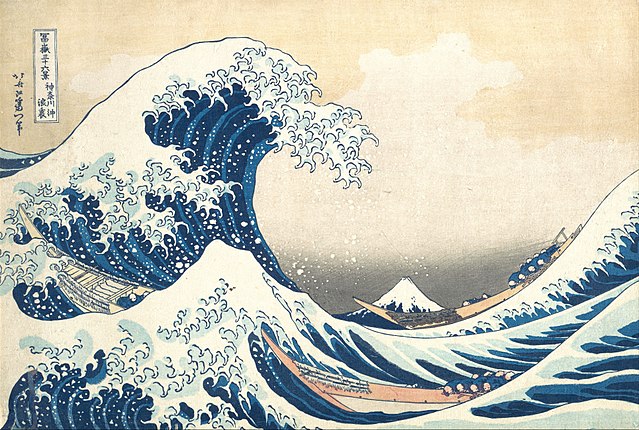
The Great Wave is an example of an ukiyo-e print. Ukiyo-e means “floating world” and refers to prints made during the Edo cultural period during the Tokugawa shogunate (1603-1867) in Japan. Ukiyo-e prints emphasize line, shape, and areas of flat color. Each color is printed with a separate block, with the black outline being the last block printed. The subject matter is often the ephemeral (fleeting) and sensual qualities of city life. For a deeper dive into this print, please view the video embedded below:
“Better Know: the Great Wave” (The Art Assignment, 8:35 minutes).
Another example of a woodcut print is the American artist Amanda Snyder’s (1894-1980), Ageless Woman (20th century, woodcut on paper). This print is in the collection of the Portland Art Museum, and while a high resolution image of it cannot be reproduced here, you may examine it through the Portland Art Museum’s online collections database.
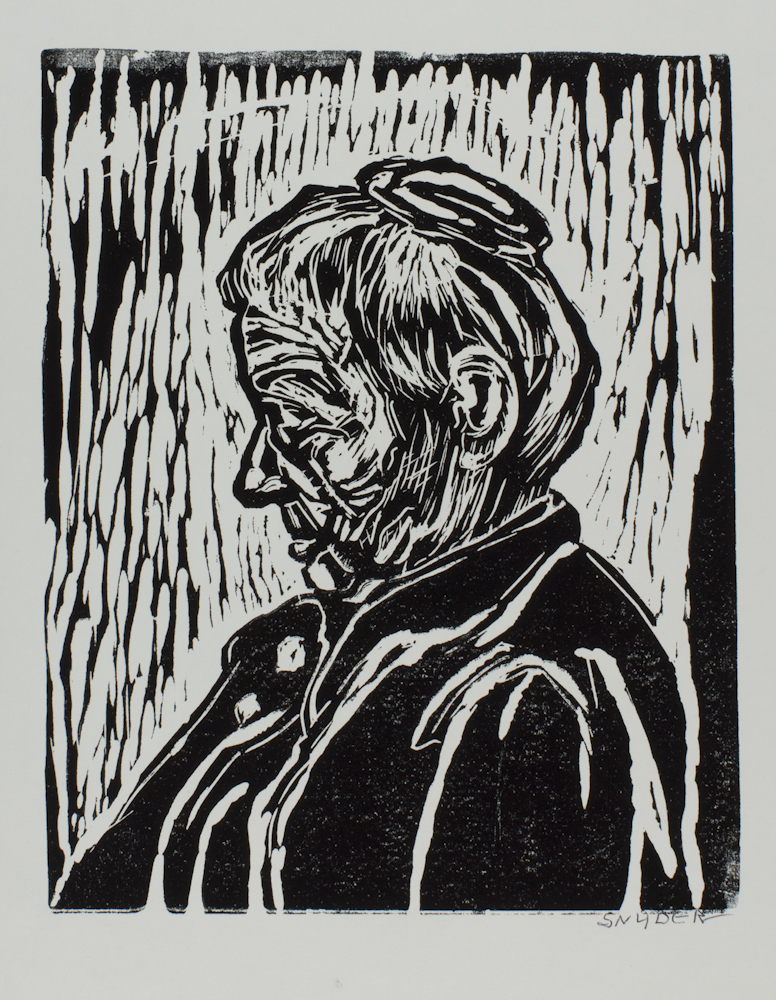
In Snyder’s print, we see a woman, in profile, her hair piled in a bun on top of her head. This is another example of a woodblock print, but unlike Hokusai’s work you looked at earlier, Snyder’s work is monochromatic. Remember, all the white areas in the print are where Snyder has removed wood from the block. Notice how she’s scraped away long linear areas around the woman’s head to emphasize her face. A combination of curved and cross-hatched lines define the figure’s hair, face, and ears.
Stop & Reflect: Amanda Snyder
- How would you describe the different lines Snyder creates? Think about both their direction and width. How do these lines move your eyes around the composition?
- How has Snyder created different textures in her print? Compare, for example, the texture of the woman’s hair with the texture of her garment.
- What do you think this woman is feeling? What parts of the composition led you to this conclusion?
Linoleum Cut (Linocut)
A linoleum, or linocut, is another type of relief process, which was popular with artists in the 20th-century. Linocuts are created like woodcuts, but use linoleum instead of wood as the matrix. Linoleum blocks usually have a wood base with a thin layer of linoleum on top. Linoleum is very soft, compared to wood, and can be cut away more easily in any direction, since there is no wood grain to contend with, creating more fluid, soft, and rounded lines. They also hold ink evenly on the surface and create smooth areas of light and dark. Below, you’ll examine a work by Elizabeth Catlett that highlights the qualities of this printmaking method. You can read about Catlett’s work on the Museum of Modern Art’s website for more information about this print.
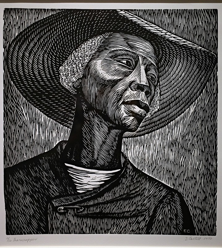
As mentioned above, compared to a block of wood, linoleum is easier to carve and creates a smoother line because there is no woodgrain to scrape against. This difference is evident by comparing the lines in Amanda Snyder’s Ageless Woman with those produced by Elizabeth Catlett in Sharecropper. Examine the lines in Catlett’s work carefully; how would you describe them? Since there is less resistance when carving into linoleum, you might have noticed how fluid and curvilinear Catlett’s lines appear.
As you read on the Museum of Modern Art’s website, Catlett’s work as a printmaker reflects her interest in creating socially engaged art. Since prints exist in multiples and can be more widely distributed than paintings or drawings, printmaking is an ideal medium for disseminating works to a large audience. Printmaking, especially linocut, is also a more affordable medium. Additionally, the subject matter of the print reflects Catlett’s socially engaged approach. After the Civil War in the United States (1861-1865), many former slaves became sharecroppers, meaning they were forced to give up the vast majority of their crops to the owner of the land they worked. This led to generations of poverty and kept many Black Americans bound to slavery by a new name.
Catlett produced this print while at the Taller de Gráfica Popular (The Workshop for Popular Graphic Art) in Mexico City, Mexico. There, she worked collaboratively with other artists and with labor groups, who would comment on works in progress. Artists at the Taller de Gráfica Popular would often adjust their compositions according to the critiques they received. This environment of collaboration and connection to the people their art would serve reveals the revolutionary nature of printmaking.
Stop & Reflect: Elizabeth Catlett
- How would you describe the figure in Sharecropper? How has the artist drawn the viewer’s attention to the figure? What is the person’s expression?
- Notice the use of light and shadow in Catlett’s black and white print. How has Catlett used black and white to create contrast? What aspects of the composition are highlighted? What areas are pushed into shadow?
- Where do you notice different textures in the print? What techniques does Catlett use to distinguish between different textures?
- How is the woman’s labor as a sharecropper alluded to in her dress and expression?
- Catlett also created a color linocut of this image. How does the addition of color impact your experience of the work?
- Finally, try to imagine what might be outside the picture’s frame. Where is the sharecropper? Is she alone or with others? Is she at rest? Can you imagine what she’s thinking?
Intaglio
A method of printing in which the image is printed from below the surface of the plate. Intaglio platemaking normally involves using etching, drypoint, aquatint, or engraving processes. Intaglio is the only way of printing that can print ink in varying thicknesses. All other methods deposit ink in a uniform layer from the surface of a plate to the surface of the paper or other material.
- Watch a video demonstrating the intaglio process from MoMA’s Pressure + Ink series (embedded below, 5:04 minutes).
- We’ll focus on examples of etching and engraving in this chapter.
Intaglio Processes
Etching
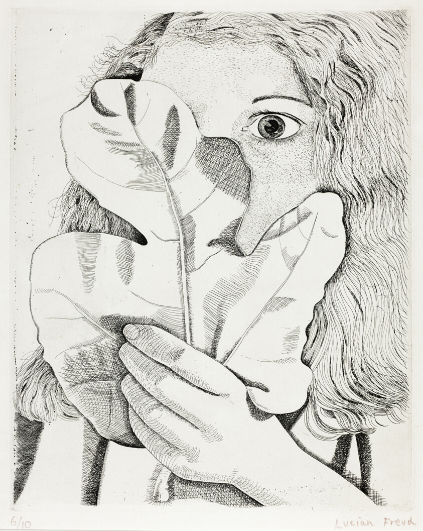
Please visit the Tate Museum website to examine a higher resolution of Lucian Freud’s etching on paper, Girl with a Fig Leaf, 1947 (298 x 238 mm, Tate Museum, London, England), and then continue reading to learn more about Lucian Freud etching and practice some close visual analysis.
Lucian Freud (1922-2011) was a British painter, draughtsman, and printmaker, known for his figurative work. Girl with a Fig Leaf shows a figure, her face partially obscured by a fig leaf she holds in her left hand. This print clearly demonstrates the etching process through its use of contrast and line weight. As you learned earlier, etching is when an image is printed from a metal plate incised by acid. The plate is first fully coated with an acid-resistant ground. The image is created as the artist removes parts of the ground. Next, the plate is submerged in acid and the areas without ground are bitten into by the acid, creating the image. Then, the whole plate is inked; as the artist wipes the plate, ink is left in the grooves created by the acid bath. Finally, paper is laid over the plate and the whole thing goes through the press. The press pushes the paper into the inked lines, producing the image.
Look closely at the lines in Freud’s print. Do you notice where he’s created darker areas using hatching and cross-hatching? You can see hatching in the contours of the leaf in the middle of the composition and cross-hatching under the figure’s left hand, as well as in the darker areas of the fig leaf. The bright white areas are actually the white of the paper, which were covered in the acid-resistant ground during the plate’s acid bath. Do you see how this creates contrast in the work?
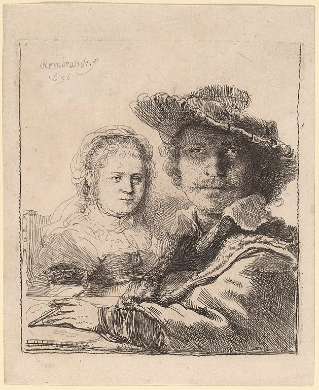
Rembrandt van Rijn (1606-1669) was a Dutch painter and printmaker, particularly known for his etchings. Much of the subject matter from his work came from life and was prolific in his portraiture, creating almost 80 self-portraits!
In Self-Portrait with Saskia, pictured above, we see the artist, Rembrandt, posing with his wife, Saskia. Examine this print closely by using the zoom tools on the Google Arts & Culture website. As you look at the work up close, notice how Rembrandt used lines to define the image. Imagine Rembrandt moving his etching needle around the plate, adding more lines, and using hatching or cross-hatching to create darker areas. He would then blot out areas of the plate with an acid-resistant ground, so they’d remain lighter, before placing it in an acid bath. Darker areas would remain in the acid longer, allowing the chemical to bite away at the exposed plate.
For an excellent example of cross-hatching, zoom in on Rembrandt’s face. Notice the intersecting diagonal lines that create an almost woven pattern on his forehead, under both eyes, and his left cheek. For an example of hatching, look at the more-or-less parallel diagonal lines that make up Saskia’s sleeve in top in the middle left of the composition. To learn more about Rembrandt and this work, please read the Smarthistory essay, “Rembrandt, Self-Portrait with Saskia.”
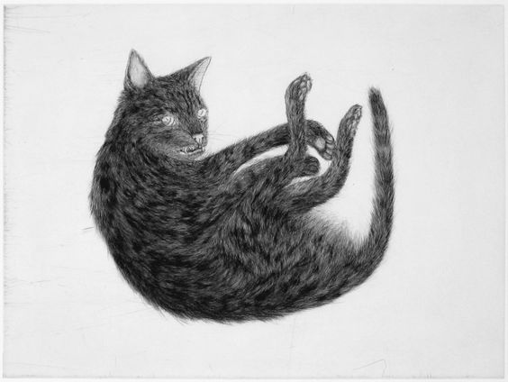
For a contemporary look at the intaglio process, let’s next examine Kiki Smith’s, Ginzer, 2000, which uses etching, aquatint, and drypoint (45.4 × 60.6 cm, Whitney Museum of American Art). You can also hear the artist discuss her interest in printmaking and see her work in a series of prints, including Ginzer by watching a video interview with Smith embedded earlier in this chapter from Art21 (4:56).
Kiki Smith’s print is a good example of how artists can combine different intaglio methods, in this case etching, aquatint, and drypoint, to create different textural effects. Etching and aquatint both use acid to bite into the plate, while drypoint lines are created by drawing directly on the plate with a tool called a needle. As little bits of the metal are scraped away, they end up crowding along the line’s edges, forming a burr. If left on the edges of the line and inked, this burr can create the soft, fuzzy line often associated with drypoint.
Look at the texture of the cat, Ginzer’s fur, for example. How would you describe it? You might have noticed its softness, which Smith achieves by combining drypoint with etching and aquatint. The aquatint provides areas of tonal variation on the cat’s fur and lend additional texture to the form.
Engraving
Engraving is a printmaking process where grooves are made in the plate directly, without the use of acid, like in etching. The technique of engraving involves the use of a specialized tool called a burin. The burin has a v-shaped blade, and the artist pushes it through the metal, removing the material on both sides of the cut. To recognize an engraved line, look for a slight swell towards the middle of a line and for a tapering “v” shape where the burin entered and then left the plate.
Stop & Reflect: Engraving
Select one of the examples of engraving below to examine further. See if you can recognize some of the identifying features of an engraved line.
- Martin Schongauer, Saint Anthony Tormented by Demons, ca. 1470-1475, engraving, 30 x 21.8 cm (Metropolitan Museum of Art, New York, NY).
- Evan Lindquist, Pull the String, 1998, engraving, 11 15/16 x 18 in. (Portland Art Museum)
- Beth van Hoesen, Celery Stalks, ca. 1960, engraving 8 ¾ x 5 ⅛ in. (Portland Art Museum)
Planographic
Planographic printing is one of the four basic methods of printmaking, which also include relief, intaglio, and stencil. In planographic printmaking, mainly lithography, the image is not incised but is printed from a single plane that has been treated chemically so some areas hold ink and others refuse it.
- Watch the video on lithography from MoMA Pressure + Ink: Lithography Process (7:05 minutes).
Planographic
In the planographic process, the image is not incised into the surface of the matrix. Instead, the design is printed from a single plane that has been treated chemically so some areas hold ink and others refuse it.
Lithography
The term lithography comes from the Greek lithos, meaning “stone” and graphein for “writing” and it is a planographic printmaking process based on the principles that oil and water don’t mix. Lithography is known for the stylistic diversity of its drawn and painterly marks, and is still one of the most common methods of commercial printing. The process of lithography involves a grease pencil or tusche, which is a greasy watercolor, that is applied to a limestone slab. A chemical mixture is used on the stone to make the negative space of the design more receptive to water, so the oil-based ink is attracted only to those areas that have been marked by the artist. When the ink is rolled over the stone, it adheres to these greasy areas and is repelled by the treated open areas of stone. Finally, a sheet of damp paper is laid on the surface of the stone, and the paper and stone are run through a press together, transferring ink from the surface.
Both Honoré Daumier’s (1808-1879), Rue Transnonain, 15 April 1834 and Jaune Quick-to-See Smith’s (b. 1940), Sticky Mouth, are excellent examples of lithography. In Daumier’s print, pictured below, we can see how the soft, textured lines create contrast between the light and dark areas of the composition. We can also see areas of tusche used to shade the top of the striped pillows that seem about to fall off the bed.

Daumier’s work shows the brutal aftermath of a massacre at a Paris apartment building. On April 13, 1834, French civil guard soldiers went from apartment to apartment looking for workers who had protested against the treatment of silk workers in the French city of Lyon. The soldiers shot indiscriminately into peoples’ homes, killing 19 people, including a four year old child. In his print, Daumier creates a crowded space, filled with four lifeless bodies, framed by areas of extreme light and darkness, effectively commenting on the violence that night.
For additional context, watch this video of art historian James Romaine discussing Daumier’s lithograph and his use of the “moral gaze” to counter injustice in 19th century France (6:00 minutes).
And for a glimpse at how a contemporary artist reflects on historical works, please see this video from the MET’s The Artist Project series with the artist Swoon (b. 1977) discussing Daumier’s painting, Third Class Carriage (2:56 minutes):
In Jaune Quick-to-See Smith’s print, Sticky Mouth, pictured below, we can see the effect of the lithographic line, which resembles both drawing and painting. Quick-to-See Smith is an enrolled member of the Confederated Salish and Kootenai Tribes and is of Métis and Shoshone descent. The title of the print, Sticky Mouth, is a translation of the Blackfeet word for bear. Notice, for example, the image of a human-bear transfiguration at the center of the composition. What other animals and insects can you find in the print? How do these forms interact with the human figures and faces? Consider the effect of color, as well as how Quick-to-See Smith plays with positive and negative shapes (note, for example, how some figures are outlined, while others are filled in). Thinking back to our discussion of the visual elements and principles of design how would you describe the use of line here?
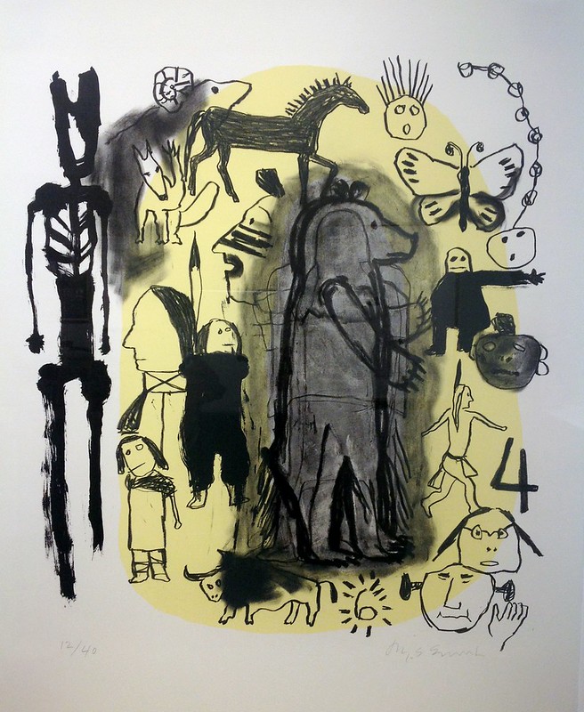
Figures of animals, insects, and humans overlap and intersect, reflecting the artist’s traditional Salish beliefs of human-animal transformations, as well as the juxtaposition between traditional Native American symbolism and different drawing styles. Compare, for example, the trickster coyote, outlined and facing out towards the viewer, in the top left of the composition, and the figure seen in profile view, feather in his hair, walking towards the lower right, which resembles 19th century Plains American Indian ledger art.
For additional context, please view the video below, “Meet Jaune Quick-to-See Smith,” which features the artist discussing her working inspiration and methods, from the Smithsonian American Art Museum (2:32 minutes).
Stencil
A method of printmaking in which ink is forced through a matrix. Its main use is in screenprinting and pochoir. In screenprinting, also called silkscreen or serigraphy, the stencil is attached to a fabric or wire mesh screen and the ink is pushed through with a squeegee. In pochoir the ink is hand-painted on paper or fabric through a stencil. Stencil printing is one of the four basic printmaking methods, which also include relief, intaglio, and planographic.
- This chapter will focus specifically on screenprints.
- Watch a demonstration of screenprinting from the Tate Museum, “How to Print Like Warhol” (5:29 minutes).
Stencil
In the stencil printmaking process, ink is pushed through an opening or cutout design on a matrix; negative space around the image is blocked out. You might have used stencil letters to make a sign or a poster, for example.
Screenprint
One common form of the stencil printmaking process is screenprinting, which is also called silkscreen or serigraphy. You’ve likely seen a screenprinted t-shirt or poster. In screenprinting, silk or nylon is stretched over a frame, and the ink is pushed through the screen with a squeegee. Negative space is blocked out with a photosensitive emulsion, while the areas to be printed are left open. Screenprinting is a very flexible printmaking method because it can be printed onto a variety of surfaces and allows the artist to control the ink’s opacity. As we’ll see in the examples below, screenprints can also be layered to create greater surface depth.
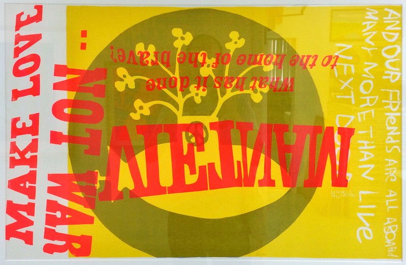
Corita Kent (1918-1986) was an artist, teacher, social justice advocate, and a Roman Catholic religious sister known for her vibrant, revolutionary screenprints, producing nearly 700 over the course of her career. She left the Immaculate Heart order in 1968, moving from Los Angeles to Boston, to live a secular life.
Kent’s art expresses her belief in reforming the Catholic Church, society, and politics, as well as her radical message to viewers of hope and love. Known for combining text and image, Kent mined advertising logos and slogans, appropriating these pop cultural references in her works. Working concurrently with the Pop Art movement, her work focused on the intersection of activism and the everyday. She also prioritized access by pricing her work affordably and refusing to number her prints in order to avoid any hierarchy.
In the print above, you can see Kent’s layering of text and image, as well as her use of strong, vibrant color. To the left of the print, the phrase “Make Love Not War” is shown adjacent to “Vietnam,” which is printed upside down and reversed. The question, “What has it done to the home of the brave?” is placed above “Vietnam,” while a line from the Beatles’ song, “Yellow Submarine” is printed vertically on the right. Behind the text, the shape of a submarine floats surmounted by abstract flowers; a peace sign can be partially seen on the submarine’s vertical fin.
Stop & Reflect: Corita Kent
- As you learned above, Corita Kent appropriated signs, images, and slogans from the world around her into her art. How does the meaning of these words change when they are incorporated into her art?
- In using lyrics from a Beatles’ song, Kent also demonstrates her interest in using sources from popular culture in her work. Listen to the Beatles’ song. How do you interpret the meaning of “Yellow Submarine?” Why do you think Kent would use this specific line in her work? How do the song lyrics interact with the other text Kent used?
Select another example of screenprinting below to examine further. See if you can recognize some of the identifying features of this printmaking method and consider why you think the artist featured in this section selected screenprinting, specifically, to communicate their ideas.
- Barbara Jones-Hogu (1938-2017), Unite, 1971, color screenprint, 22 ½ x 30 in. (Brooklyn Museum)
- Read more about Barbara Jones-Hogu and her print Unite on the Smithsonian Museum of American Art’s website.
- Mickalene Thomas (born 1971), Can’t We Just Sit Down and Talk It Over?, 2006-2007, color screenprint on white wove paper, 495 x 762 mm (New York Public Library Digital Collections)
“How 3D Printing Can Preserve History” (National Geographic, 4:06 minutes)
So far in this chapter, you have seen historic and contemporary examples of traditional printmaking techniques. You’ve also been able to connect these artists and processes to New Media more broadly through printmaking’s qualities of replicability, variability, and chance.
In the 21st century, as technologies have continued to advance, so have printmaking strategies, integrating computer technologies with fine art practices. Digital and 3D printing, for example, push the viewer to rethink conventional art historical categories and methods. One artist who is revolutionizing 3D printing is Iranian artist, writer, and activist Morehshin Allahyari (b. 1985), whose work, Material Speculations: ISIS, is pictured below.
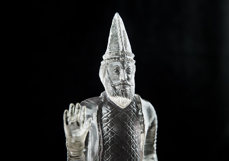
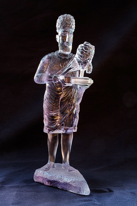
Material Speculation: ISIS is a series of small 3D-printed replicas of a set of twelve larger than life-size artifacts from the ancient cities of Hatra and Nineveh in Iraq that were destroyed by ISIS in 2015. To create accurate CAD representations of these destroyed objects, Allahyari researched each piece extensively and ensured she located images of them from every angle.
In 2016, she made all of her research on the first model, which is the sculpture of King Uthal seen above, public on the website Rhizome, as part of their series The Download. This allowed anyone with access to 3D printing technology to print their own version of the object. The original 3D printed sculpture, created by Allahyari, includes a flash drive and a memory card inside its body, containing maps, images, and information about the object, its original site, and how it was destroyed, creating a kind of digital time capsule to be accessed by future generations.
Conclusion
In this chapter we have learned about various printmaking processes and practiced recognizing them in both historical and contemporary examples. We have considered how printmaking democratized the process of making and collecting art, and how modern and contemporary printmakers explore the medium by devising new ways to connect the past with the present. There are different extension activities in the sections below that will help you reflect on what you’ve learned.
Key Takeaways
At the end of this chapter you will begin to:
- Explain the history of the printmaking medium.
- Describe and compare significant printmaking processes, explaining how each process contributes to meaning in a work of art.
- Recognize developments in the field of printmaking today, including considering how 3-D printing is connected to earlier developments in printmaking.
- Explain how printmaking exhibits some of the elements of New Media Art.
Optional: Lesson Extensions
Below are some lesson extension activities to encourage learners to engage more deeply with the material presented in this chapter.
Creative Interpretation Ideas
- Write a postcard from the point of view of one of the people featured in a print from this chapter.
- Try your hand at relief printmaking using an apple or a potato to create a stamp.
- Write a short story, journal entry, or poem based on one of the works featured in this chapter.
- Pick an artwork from this chapter and make a list of the top ten things you notice or think about the piece.
- Try writing for seven minutes about one of the works featured in this chapter.
Further Questions to Consider
Below are some additional questions to consider that ask learners to reflect on specific themes and examples presented in this chapter.
- For figural works, such as those by Mickalene Thomas, Barbara Jones-Hogu, and Honoré Daumier, think about the position of the figures in the composition. Are they gesturing or still? How do you interpret their movements, poses, or gestures?
- In prints that combine text and image, such as Unite and Pull the String, can you see what the words say? How do these words relate to what’s happening in the print? How do text and image combine to affect your interpretation and understanding of the print?
- Select an example of a lithograph or a screenprint featured above that uses shape and color. Take a few minutes to examine the artist’s use of shape and color. Which shapes are repeated? Would you describe them as organic (more curvy) or geometric (more straight edges) shapes? Which colors are repeated? Why? What effect does color have on the composition? What about shape?
Selected Bibliography
Crown Point Press. “Magical Secrets: Process.” Crown Point Press: San Francisco, CA. Accessed August 27, 2020. https://magical-secrets.com/process/.
Department of Asian Art. “Woodblock Prints in the Ukiyo-e Style.” In Heilbrunn Timeline of Art History. New York: The Metropolitan Museum of Art, 2000–. Last updated October 2001. Accessed September 2, 2020. http://www.metmuseum.org/toah/hd/ukiy/hd_ukiy.htm.
Gascoigne, Bamber. How to Identify Prints: A Complete Guide to Manual and Mechanical Processes from Woodcut to Ink-Jet. London: Thames and Hudson, 1986.
Gildow, Christopher. “Printmaking.” Lumen Learning. Accessed August 27, 2020. https://learn.canvas.net/courses/24/pages/m6-printmaking?module_item_id=44440.
Jenson, Jennifer. “A Brief History of Printmaking.” In Utah Museum of Fine Arts, Lesson Plans for Educators: Printmaking Through the Ages. Salt Lake City, UT: Utah Museum of Fine Arts, 2012. Last modified March 7, 2012. PDF. Accessed August 27, 2020. https://umfa.utah.edu/sites/default/files/2017-10/Printmaking-through-the-Ages.pdf.
Manovich, Lev. “What Is New Media?” The Language of New Media. Cambridge, Mass: MIT Press, 2001. 18-61.
Morris, Susan. “Museums and New Media Art: A Report Commissioned by The Rockefeller Foundation.” The Rockefeller Foundation, October 2015. PDF. Accessed September 2, 2020. https://www.cs.vu.nl/~eliens/archive/refs/Museums_and_New_Media_Art.pdf.
The Minneapolis Museum of Art. “Prints and Processes.” Minneapolis Museum of Art, Minneapolis, MN. Video series. Accessed August 27, 2020. https://www.youtube.com/playlist?list=PL60EF8C723EACBBB7.
The Museum of Modern Art. “Pressure + Ink.” Museum of Modern Art, New York, NY. Video Series. Accessed on August 27, 2020. https://www.youtube.com/playlist?list=PLD1240D899F3875A4.
The Museum of Modern Art: Department of Prints and Illustrated Books. “What Is A Print?”. Museum of Modern Art: New York, NY, 1999. Accessed on August 27, 2020. PDF. https://assets.moma.org/momaorg/shared/pdfs/docs/learn/courses/what_is_a_print_brochure_1999.pdf.
Suzuki, Sarah. “What Is a Print? Selections from the Museum of Modern Art.” New York: Museum of Modern Art, 2011. Exhibition guide.
Thompson, Wendy. “The Printed Image in the West: History and Techniques.” In the Heilbrunn Timeline of Art History. New York: The Metropolitan Museum of Art, 2000–. Last modified October 2003. Accessed August 27, 2020. http://www.metmuseum.org/toah/hd/prnt/hd_prnt.htm.

