
Document Design Basics
Designing Reader-Centered Pages and Documents
You build your communications out of visual elements: the dark marks of your words, sentences, and paragraphs against the light background of the page, as well as your drawings and graphs and tables. Your readers see the visual design of these elements before they read and understand your message. And what they see has a powerful effect on the success of your communications, on its usability and persuasiveness.
Here are ways that good design enhances usability.
-
-
- Good design helps readers understand your information.
- Good page design helps readers locate information quickly.
- Good design helps readers notice highly important content.
-
Here are some ways good design affects readers’ attitudes, thereby increasing a communication’s persuasiveness.
-
-
- Good design encourages readers to feel good about the communication itself.
- Good design encourages readers to feel good about the communication’s subject matter.
-
A Reader-Centered Approach to Design
Because page design can have such a significant impact on your communication’s usability and persuasiveness, you should approach design in the same reader-centered manner that you use when drafting text and graphics. Think continuously about your readers, including who they are, what they want from your communication, and the context in which they will be reading.
Design Elements of a Communication
It is helpful to think about the building blocks of a page design in the way that professional graphic designers do. When they look at a page, they see six basic elements:
-
-
- Text: Paragraphs and sentences.
- Headings and titles: Labels for sections of your communication.
- Graphics: Drawings, tables, photographs, and so on — including their captions.
- White space: Blank areas.
- Headers and footers: The items, such as page numbers, that occur at the top or bottom of each page in a multipage document.
- Physical features: These include paper, which may take many shapes and sizes, and bindings, which come in many forms.
-
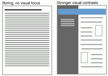
In Figure 4.1 below, notice how your eye is drawn to the blue header and the boxed elements. In these spaces, you can highlight the important parts of your message:
Document Formatting
Most academic and workplace documents are created using Microsoft Office products (Word, Excel, PowerPoint) or Google Docs (G-Suite). These are generally considered industry standards, so it is important that you learn to use them effectively to create professional workplace documents.
Table 4.1 provides some general specifications for many types of technical writing documents:
| MARGINS | Use 1″ margins on all sides (use 2″ when binding) |
| Justify your left margin only; don’t fully justify your paragraphs, as this can result in odd spacing | |
| FONTS | Headings: Sans serif, such as Arial or Calibri |
| Body text: Serif font, such as Times New Roman or Cambria | |
| FONT SIZE | Headings: 12-20 point sans serif font |
| Body text: 11-12 | |
| SPACING | Single-spacing is used for most letters, memos, and emails; 1.5 or double spacing to allow for comments. |
| LENGTH | Paragraphs tend to be no longer than 10 lines |
| Sentences are usually 15-20 words |
*This page borrows from the following source:
"Page Design." Technical and Business Writing. Source link.
