
1.2 Navigating Scientific Figures and Maps
Steps to Interpret Figures
Figures, charts, graphs, tables, and maps are visual representations of data. They all can be confusing at first glance, but there are a few simple steps to help you understand them.
The first step when looking at a scientific image is to determine how the information is being presented. Is the data in a table, a bar or pie chart, a line graph, or a map? Next, you want to look for information such as, title, axis titles, units, and possibly a key. Titles will give you a clear idea of what the figure is trying to present to the audience. Axis titles will provide information on what was measured and what unit of measurement was used. A key is not always used, but if there are multiple colors, lines, symbols, etc. a key will be shown explaining what each thing represents.
For example, the hypothetical figure below (Fig. 1.14), shows a title, axis titles, and a solid blue line with data points. The figure is titled “Fish Sizes through Time in the Nile River”. The x-axis, the horizontal axis, is titled, “Time (yr)”, and the y-axis, the vertical axis, is titled “Fish Length (cm)”. By looking at the title and axis titles, you can understand that the data is showing the different lengths of fish (in centimeters) caught in the Nile River from 2000 to 2010. Now that you have bearings on the data presented, you can now start to interpret the data, the final step. A good place to start is the figure caption, captions normally give you some insight into the purpose of the figure. If there is no caption, start to look for trends in the data, does the data increase, decrease, remain the same, or perhaps a mix of all three? In this figure, the data increases in the beginning, and then sharply decreases and then remains level. Does the trend you observe correlate with anything else? You may start to think, what caused an increase and then decrease in fish length, does anything correlate with this data? If you are provided with more information, such as a caption, you can see that the fishing industry had fishing restrictions in place that allowed the fish to grow to a larger size, but after the restrictions were lifted fish length diminished.
Digesting scientific data visually can take a lot of effort. A lot of figures are very complex and will require time to fully understand, but if you take the simple steps listed above you can start to interpret the data.
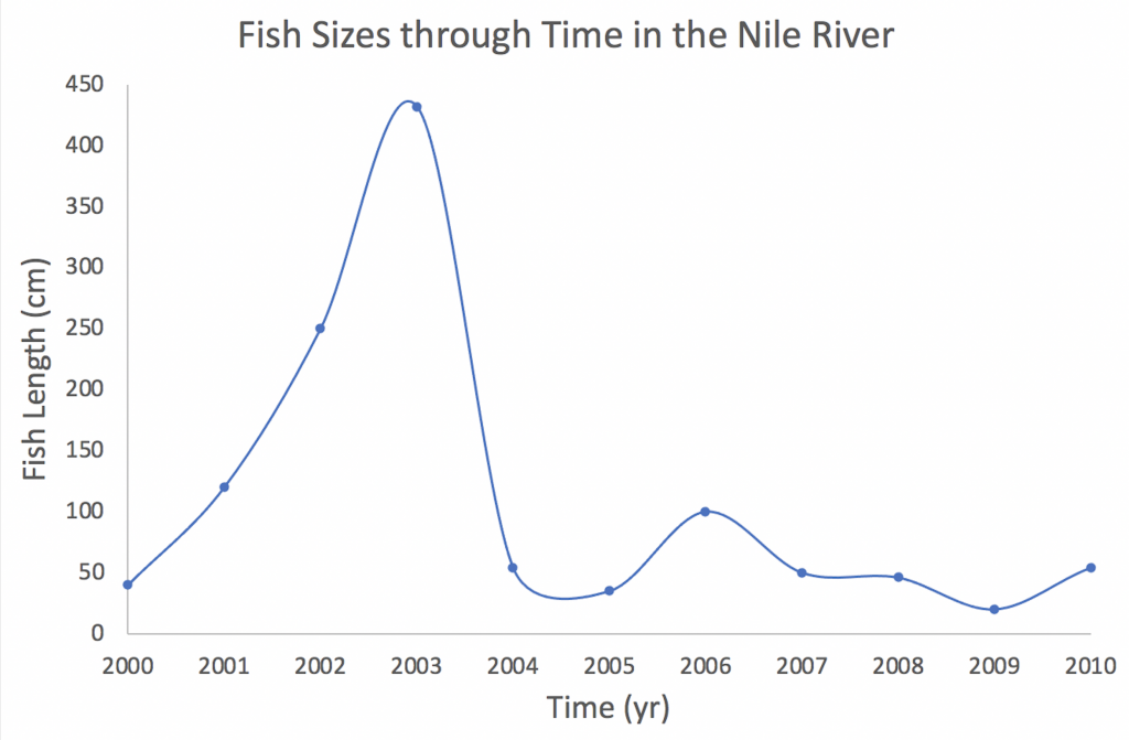 Figure 1.14 Fish lengths in the Nile River, Africa, through 2000-2010. After size restrictions were imposed on the fishing industry in the Nile River in 2000, fish body sizes increased due to the fish being able to grow to their full size. Fish size increased significantly in the early 2000s and peaked in 2003 and then decreased back down in 2004 after the restrictions were removed.
Video: Earth Rocks – Data Visualization
Latitude and longitude
When looking at maps, you may notice numerous vertical and horizontal lines cross-cutting the map or globe (Fig. 1.15). These lines represent a coordinate system, where the latitudinal and longitudinal lines intersect, that allows you to know the exact location on Earth.
Lines of latitude represent locations north (N) or south (S) of the equator and are expressed in degrees. The equator, the horizontal midline of Earth, is at 0 degrees N/S and increases in latitude to the poles to 90 degrees N or S. An easy to think of latitude is that it is like a ladder, so if you see parallel horizontal lines, like a ladder, on a map then you know those latitudinal lines.
Meridians or lines of longitude represent locations to the east (E) and west (W) of the Prime Meridian in Greenwich, England. Longitude begins at 0 degrees at the Prime Meridian and travels to the opposite side, 180 degrees E or W. A trick to help memorize longitude is that longitudinal lines are long because they run from pole to pole.
![]()
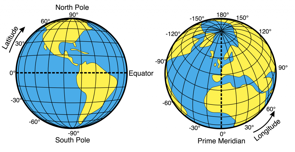
Figure 1.15 The left globe depicts lines of latitude. Parallel lines that crosscut the globe E to W (horizontally) that begin at the equator (dotted line) and end at the N or S pole. Lines of latitude represent the N or S direction from the equator. The right image shows meridians or lines of longitude. These meridians crosscut the globe N and S (vertically) and measure the E or W direction from the Prime Meridian (the dotted line). (Credit: Wikimedia Commons, Public Domain).
Video: Earth Rocks – Latitude and Longitude
