
9.3 Typical Ethics Issues in Technical Writing
There are a few issues that may come up when researching a topic for the business or technical world that a writer must consider. Let’s look at a few.
Research that does not support the project idea
In a technical report that contains research, a writer might discover conflicting data which does not support the projects’ goal. For example, your small company continues to have problems with employee morale. Research shows bringing in an outside expert, someone who is unfamiliar with the company and the stakeholders, has the potential to impact the greatest change. You discover, however, that to bring in such an expert is cost prohibitive. You struggle with whether to leave this information out of your report, thereby encouraging your employer to pursue an action that is really not feasible.
Suppressing relevant information
Imagine you are researching a report for a parents’ group that wants to change the policy in the local school district requiring all students to be vaccinated. You collect a handful of sources that support the group’s goal, but then you discover medical evidence that indicates vaccines do more good than potential harm in society. Since you are employed by this parents’ group, should you leave out the medical evidence, or do you have a responsibility to include all research, even some that might sabotage the groups’ goal.
Presenting visual information ethically
Visuals can be useful for communicating data and information efficiently for a reader. They provide data in a concentrated form, often illustrating key facts, statistics or information from the text of the report. When writers present information visually, however, they have to be careful not to misrepresent or misreport the complete picture.
The visual below shows two perspectives of information in a pie chart. The data in each is identical but the pie chart on the left presents information in a misleading way (see Fig. 1). What do you notice, however, about how that information is conveyed to the reader?
Fig. 1 – Misleading and regular pie charts
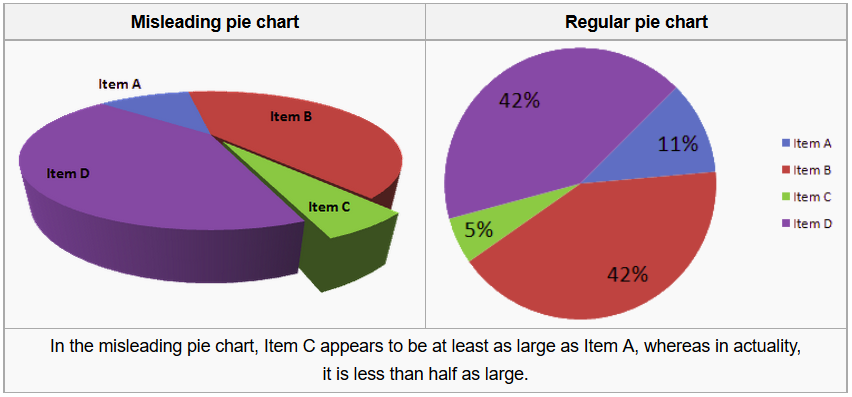
Imagine that these pie charts represented donations received by four candidates for city council. The candidate represented by the green slice labeled “Item C,” might think that she had received more donations than the candidate represented in the blue “Item A” slice. In fact, if we look at the same data in a differently oriented chart, we can see that Item C represents less than half of the donations than those for Item A. Thus, a simple change in perspective can change the impact of an image.
Similarly, take a look at the bar graphs in figure 2 below. What do you notice about their presentation?
Fig. 2 – Misleading and regular bar graphs
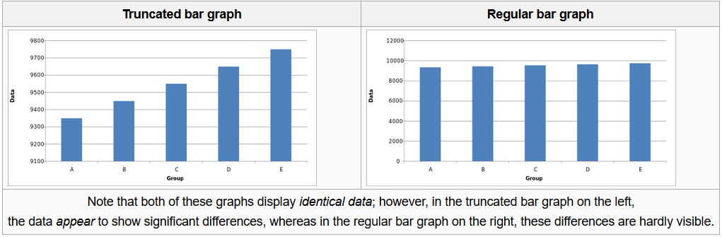
If the bar graph above were to represent sales figures for a company, the representation on the left would look like good news: dramatically increased sales over a five-year period. However, a closer look at the numbers shows that the graph shows only a narrow range of numbers in a limited perspective (9100 to 9800). The bar graph on the right, on the other hand, shows the complete picture by presenting numbers from 0-12000 on the vertical axis, and we see that the sales figures, have in fact been relatively stable for the past five years.
Presenting data in graphical form can be especially challenging. Keep in mind the importance of providing appropriate context and perspective as you prepare your graphics.
Limited source information in research
Thorough research requires that a writer integrates information from a variety of reliable sources. These sources should demonstrate that the writer has examined the topic from as many angles as possible. This includes scholarly and professional research, not just from a single database or journal, for instance, but from a variety. Using a variety of sources helps the writer avoid potential bias that can occur from relying on only a few experts. If you were writing a report on the real estate market in Central Oregon, you would not collect data from only one broker’s office. While this office might have access to broader data on the real estate market, as a writer you run the risk of looking biased if you only chose materials from this one source. Collecting information from multiple brokers would demonstrate thorough and unbiased research.
A few additional concerns
You might notice that most of these ethics violations could easily happen accidentally. Directly lying is unlikely to be accidental, but even in that case, the writer could persuade her/himself that the lie achieved some “greater good” and was therefore necessary.
Even more common is an ethics violation resulting from the person who is designing the information seeing it as evidence for whatever s/he understands as true and honestly not recognizing the bias in how s/he has presented that information.
Most ethics violations in technical writing are (probably) unintentional, BUT they are still ethics violations. That means a technical writer must consciously identify his/her biases and check to see if a bias has influenced any presentation: whether in charts and graphs, or in discussions of the evidence, or in source use (or, of course, in putting the crucial O ring information where the launch decision makers would realize it was important).
For example, scholarly research is theoretically intended to find evidence either that the new researcher’s ideas are valid (and important) or evidence that those ideas are partial, trivial, or simply wrong. In practice, though, most folks are primarily looking for support. “Hey, I have this great new idea that will solve world hunger, cure cancer, and make mascara really waterproof. Now I just need some evidence to prove I am right!”
In fact, if you can easily find 94 high-quality sources that confirm you are correct, you might want to consider whether your idea is worth developing. Often in technical writing, the underlying principle is already well-documented (maybe even common knowledge for your audience) and the point SHOULD be to use that underlying principle to propose a specific application.
Using a large section of your report to prove an already established principle implies that you are saying something new about the principle—which is not true. A brief mention (“Research conducted at major research universities over the last ten years (see literature review, Smith and Tang, 2010) establishes that. . . .”) accurately reflects the status of the principle; then you would go on to apply that principle to your specific task or proposal.
Chapter Attribution Information
This chapter was written by Annemarie Hamlin, Chris Rubio, and Michele DeSilva, Central Oregon Community College, and is licensed CC-BY 4.0. Thanks to Eleanor Sumpter-Latham, Humanities/Writing Professor at Central Oregon Community College for contributing to this chapter.
