
11.4 Concept 3: Make Your Publication More Inviting Using Basic Principles of Readability: CRAP
Despite the unfortunate acronym, CRAP is familiar to any graphic designer, and it should be familiar to writers as well. It originated with the influential designer and writer Robin Williams; she now regrets the acronym but not the ideas behind it.
I. C is for Contrast: Use difference to draw readers’ eyes to and through your text or publication
You can see evidence of the most basic aspects of contrast in any Web page or magazine. The headline text is always different from the body text. It’s often bigger and bolder; it can also be in a different typeface. Headlines make it easy to skip from one story to the next and get a cursory understanding of the news; news writers make it easy for people to read only the headlines in a newspaper or Web site.
Applying strong contrasting elements to your text is important because the human eye is drawn to difference, not necessarily size. When everything looks the same, it’s difficult to focus on anything. When things are different, they are more noticeable.
When a document has few or no contrasting elements, nothing stands out. The document isn’t easy to scan, and it doesn’t invite the reader to jump in and read. It’s harder to parse, and therefore it’s difficult for readers to glean information from the text easily and quickly, if that is their aim.
Figure 12: What stands out on this resume?
123 Fake Street
Beaverton, OR 97007
(123) 456-7890
tarrnation@fake.comObjective: The position of Front Desk Receptionist at Global Warranty GroupSkills and Abilities:Computer skills. Skilled with general applications like Internet Explorer, and Microsoft’s Office Suite,
and also with less-ubiquitous applications like Intuit QuickBooks and Sage Timeslips. Can learn to use
new programs quickly. Maintain hardware, for example printers and scanners.
Communication skills. Write numerous emails and letters to clients, insurers, and other Attorneys.
Comfortable making and receiving phone calls.
Education:
Portland Community College, Portland, OR
AA in General Studies
Grad: June 2013
Related Course Work:
Writing 121, 122, and 227
Employment History:
September 2009-present
Fake Law Office, LLC, Beaverton, OR
Legal Assistant, Secretary, Office Manager, and Paralegal
November 2012-February2012
Fake Faker Fakest & Imaginary LLP, Portland, OR
Freelance Billing Assistant
Summer 2009 (June-August)
Camp Freedom, Cody, WY
Camp Councilor, Windsurfing Instructor
References:
Available upon request.
Some documents, like business letters or academic papers, have fewer contrasting elements, but even line spacing and paragraph breaks help indicate where a related chunk of information begins and ends.
Contrast helps draw the reader’s eyes to certain elements in your text, and it also helps the reader follow the flow of the information and assess which items are most important and require immediate attention. Contrast creates readability, so you must pay attention to contrast in your documents. The following elements of a text can help you create a friendly, appealing sense of contrast:
Contrast Element I: Size
Your eye moves toward things because they’re different, not because they’re large or small. Your eye is impressed by novelty more than sheer size or color or any other visual characteristic.
There are all sorts of scientific theories about why this is so, but in short, it’s not so much that making something bigger makes it more noticeable. A person’s height, for example, isn’t so noticeable until the principle of contrast comes into effect.

There is such a thing as too much size contrast: think of those web sites with huge type or an overly enthusiastic use of the CAPS LOCK key. Less is more, but some size contrast is essential to draw the reader’s eye.
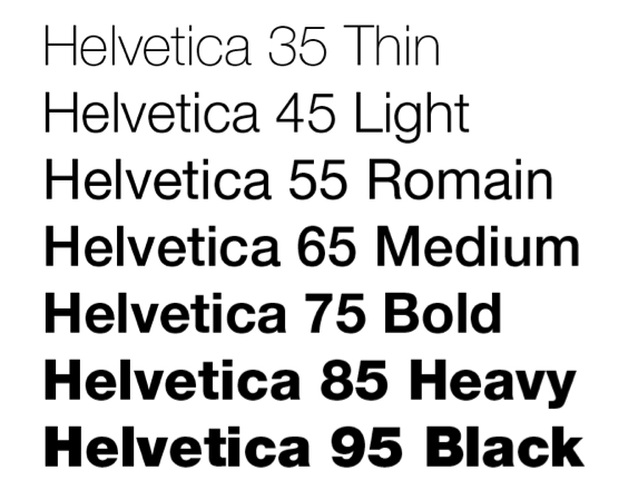
Contrast II: Font size/style/weight
A typeface is a collection of fonts. The distinction between the terms typeface and font stretches back to the days of typesetting: hand-placing individual letters made of wood or metal, inking them, and rolling paper over them. In the digital age, most people use the words typeface and font interchangeably, though the distinction still matters to experts like designers and typographers.
What’s important to most people is that we all have a huge variety of typefaces, or font families, to choose from: Times New Roman, Arial, Bookman, Georgia, and Garamond are familiar to many of us. It’s important to choose a font (a particular size, style, and weight within a typeface) that fits our purpose. Some, like script and handwriting typefaces, are too hard to read and so aren’t appropriate for body text, for example. Some typefaces work well as headlines: Franklin Gothic Condensed and Caslon are two typefaces often used for newspaper headlines. The “font” chosen (size, weight, style—italic, bold, etc.) will be the designer’s choice.
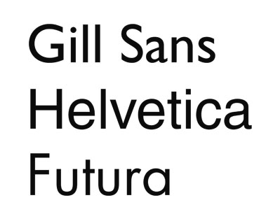
It’s also important to distinguish between serif and sans-serif fonts. Sans serif fonts, like Helvetica or Futura, are simple and smooth; the letters don’t display the “feet” and ornamentation (serifs) that serif fonts do. Sans serif fonts are often used for headlines, but serif fonts are more likely to be used for body text. Many typographers think serif fonts (also called Roman fonts) make large blocks of body text easier to read. Some of the preference is really just about tradition.

Contrast III: Direction (vertical, horizontal, circular, etc.) or position (top, bottom, side)
Changing the direction or orientation of text, graphic elements like lines, banners, or screens (smaller transparent or opaque boxes, often in a color that contrasts with the background)
Contrast IV: Alignment (center, left, right, justified)
Most students are familiar with how to align type. MLA and APA style, for example, mandate left-aligned body text and a centered headline. MLA Works Cited pages call for a hanging indent of ½ inch. A change in alignment can create visual interest. For example, headlines are often centered to make them noticeable.
Images are often placed in a particular location on a page (or slide) to draw readers’ attention in one direction or another. Consistent alignment with slight variations to provide interest is particularly important in PowerPoint presentations. You will be flipping from one slide to another, and if the text blocks and headlines are not aligned identically, your text and headlines will appear to “jump around” the screen in a distracting way.

Contrast V: Graphic elements like photos, banners/bands, pull quotes, or logos
Remember, we’re trying to create contrast, or difference—breaking up huge blocks of text with a variety of graphic elements can really add visual appeal and interest.
Just remember—as with the examples below, less is more. Think of all the publications and web sites you’ve seen whose designers thought it was awesome to make text bold AND underlined AND multicolored AND flashing. With a bright yellow background. And too many animated GIFs. It repels readers rather than attracting them. I know you know what I mean.
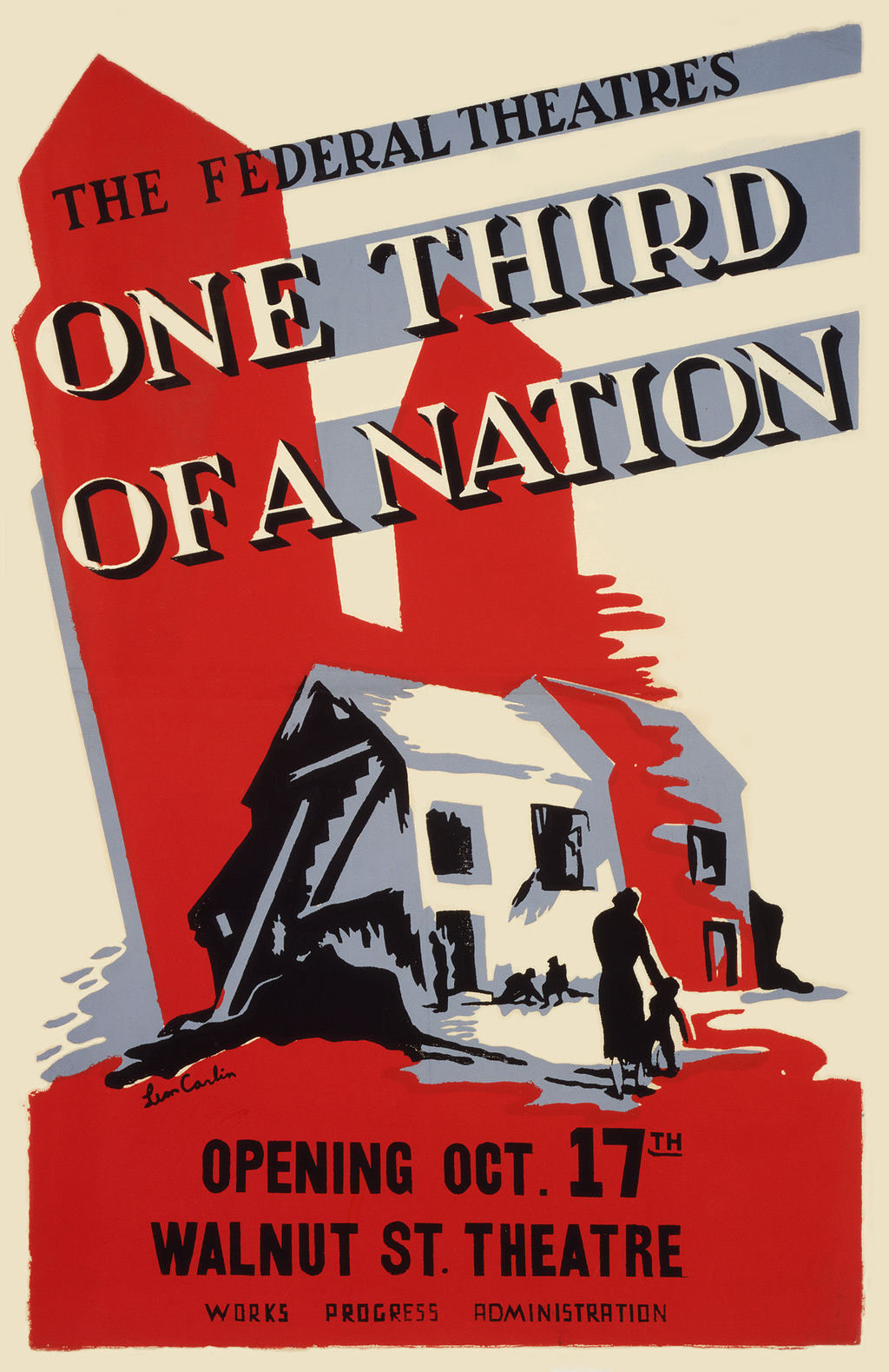
to create a dramatic effect. Less really can be more. “One-Third of a Nation, a Living Newspaper play by the Federal Theatre Project” by https://commons.wikimedia.org/wiki/File:One-Third-of-a-Nation-Poster-2.jpg is in the Public Domain
Contrast VI: Color (of background, text, graphic elements, etc.)
Use color to make certain elements stand out. Create a sense of drama when you contrast one color with another. Make sure you don’t use too many colors and your color combinations are easy to read.
Contrast VII: Use of negative or “white” space
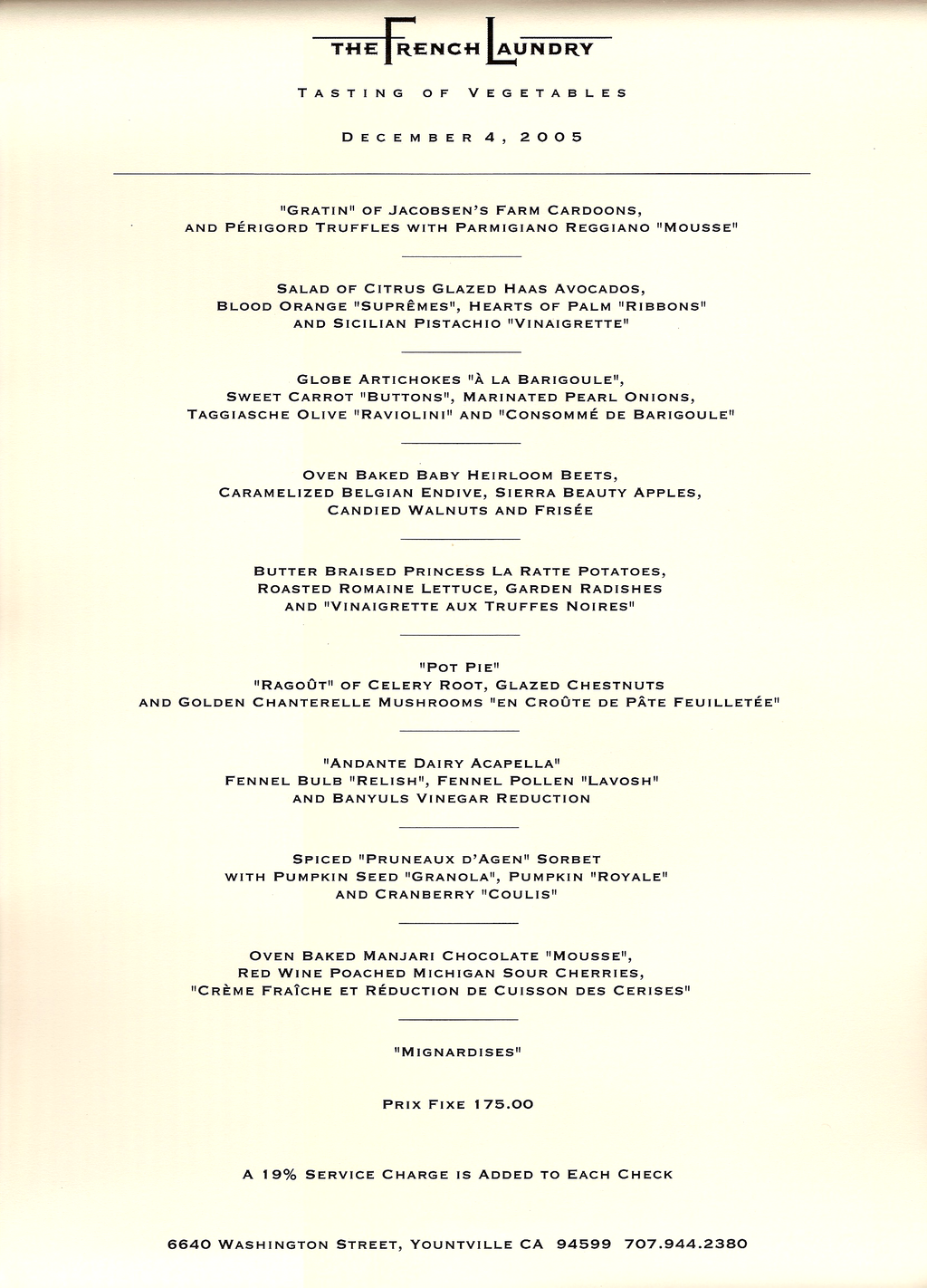
Sometimes, the best way to attract a reader’s attention to a contrast is to “go negative.” The absence of content provides air and space and draws the reader’s attention to the content itself. Negative space, or white space, is the space around text, images, and other elements in a document. It makes documents of all kinds (digital and print) more readable, more restful-looking, more inviting to the reader, simpler, and more elegant. It is associated with that “high-end” restaurant or salon menu look.
CHAPTER ATTRIBUTION INFORMATION
This chapter was written by Jodi Naas, Portland Community College, and is licensed CC-BY 4.0.
