
11.4 Concept 3: Make Your Publication More Inviting Using Basic Principles of Readability: CRAP, continued
IV. P is for Proximity: Items that have similar functions or purposes should be grouped together
Is this a rock formation or just a random collection of boulders?


product of modern England, it was constructed in the year 2000 to commemorate local stonemasons and
the long history of quarrying local hamstone. “Ham Hill Stone Circle” by Gaius Cornelius is licensed under CC BY-SA 3.0
The second photo depicts a deliberate grouping, though it probably wasn’t hard to figure that out. When we work with pictures and blocks of text and not stones, think of this: when design or text elements are placed next to each other in certain ways, readers or viewers can see that they are meant to be considered together and have some sort of relationship. For example, photos and figures have captions that explain their contents. Nearby images often illustrate the content found in body text. Headlines are placed above body text whose content and focus they describe in briefer form.
Proximity can be especially critical in booklets, newsletters, and brochures, in which certain pages or panels might be grouped together under a subheading. Individual pages can be designed to reflect a larger relationship with the overall theme or subject matter. For example, the themes provided by blogging platforms like WordPress take care of this for you—every page will have a recognizable layout and though individual pages might be slightly different, they’ll be recognizably related to the blog’s main page. Web sites work the same way, as do book chapters.
The principle of proximity even affects white space: equal amounts of white space and equal line spacing indicate that items are related or should be considered as parts of a whole. If headlines, captions, or body text blocks aren’t close enough to the image or text to which they are related, the reader could be confused about what is—and is not—related.

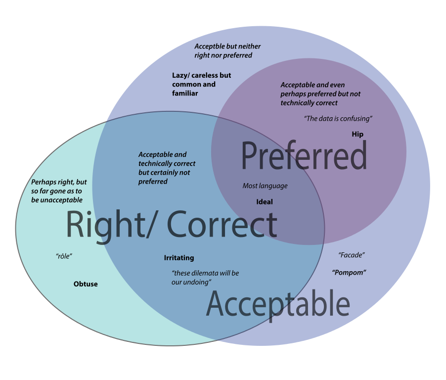
The Venn diagram above is very confusing. Why are there different font weights, sizes, and quotation marks setting off the words? Note that entries for the “Acceptable” lavender category are in both the top left and bottom right of the circle. Their relatively distant position (proximity) makes the relationship of these terms unclear. There are no headlines or labels here to help us understand, and the design strategy isn’t doing readers any favors.
Planning and adjusting how items are grouped on a page helps you design your text, graphics, and images so that readers can see what’s related, what goes together, what’s different, and what is similar. Relationships between items will be clear.
It’s clear which two are the couple in the illustration above. Same with headlines and body text, groups of bullet points, images and captions, and a whole lot more. What is close together will be seen to have a relationship. Moving items further away decreases the strength of that relationship in the minds of your readers.
ACTIVITY: Go online or out into the world. Try to find examples of publications (print or electronic) that convey messages clearly. Critique them according to the principles in this chapter: Purpose, Audience, and CRAP. Also, find an example of one that does not achieve its goal. See if you can identify and describe which of these principles are not being followed in less-effective publications.
CHAPTER ATTRIBUTION INFORMATION
This chapter was written by Jodi Naas, Portland Community College, and is licensed CC-BY 4.0.
