11.2 Concept 1: Know Your Audience
To some extent, you already know ways in which the nature of your audience can affect your text. In a class setting, other students and instructors will already be familiar with the assignment and the subject matter about which you are writing. You already adjust vocabulary and tone to suit your audience. Thinking about your audience’s potential needs, biases, knowledge, attitudes, and preferences helps you present your text suitably.
To help you reach your audience, first consider the formats open to you. In some cases, the context in which you’re writing and the audience for which you’re writing will determine the format(s) you can use. You wouldn’t send a booklet full of images to a teacher to inquire about your child’s progress. You can’t hand out copies of your blog at a music festival and expect it to get read right away.
ACTIVITY: Think of other audiences and writing contexts that require a particular format.
Second, consider the strengths and weaknesses of different formats for your particular audience. Are they already familiar with the ideas you are conveying? Do they already know something about the subject matter? What do they still need to know about it? Are there ideas that are likely to confuse them?
How will your audience be interacting with the text? Will they be glancing at your poster as they pass, or will they need to sit down and study your business plan? How much information do you expect them to take in? How much time do they have to devote to reading? Do they agree with you? How open to your message are they: Are they on your side, or do you need to persuade them of something? Do you need to take their age, education level, language background, condition, and cultural or social background into account? Knowing things about your audience can help you communicate effectively with them.

You even need to consider readers’ familiarity with the format itself. Would your grandfather know what to do when he sees a blue hyperlink on your blog? Would a third grader know how to unfold and read a topographical map? Will differences in physical ability affect how your audience interacts with your text? Does your audience need illustrations? Is a short video better than a text-only writeup for your audience? Which formats allow you to provide the information your readers need?
Most Western readers expect text to flow from left to right. But readers of Arabic, Urdu, Farsi, and Hebrew, for example, are accustomed to reading text from right to left. Twitter had to consider this when they adapted their product for an Arabic-speaking audience. Other forms of information are designed for different audiences with different preferences, background knowledge, cultural concerns, and language backgrounds. Chapter 13 offers more information about communicating with audiences whose backgrounds, language use, and cultural expectations are different from your own.


You have a lot of formats to choose from: letters, papers and other printed pages, flyers (double and single-sided), posters, booklets, a wide variety of multi-fold brochures or pamphlets, PowerPoint presentations, blogs, apps, tweets, web pages, vlogs, videos, audio files, and so on. All of these formats have strengths and weaknesses as delivery mechanisms for information.
ACTIVITY: Discuss the format(s) of the texts you are currently producing in class. Identify some features of your text format might present challenges for your audience?
Consider which audiences would be receptive to receiving this information in this format:


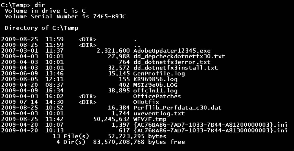
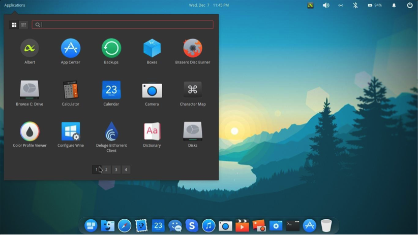
Think of what it meant to go from the interface above to the one below. Designers at PARC, Apple, Atari, and later Microsoft realized that most people needed an easier way to interact with software and hardware. Attention to the preference and experience of its users has consistently won Apple Computer legions of loyal fans.
CHAPTER ATTRIBUTION INFORMATION
This chapter was written by Jodi Naas, Portland Community College, and is licensed CC-BY 4.0.

