
3.2 Using Visuals
Visuals can express ideas or convey information in ways that words sometime can’t. They help to make abstract concepts concrete for readers; therefore, as a technical communicator, it is vital to know how to use visuals to your advantage. Visuals can work to help readers see what something looks like without having to describe it in writing, such as photos, illustrations, and maps. Visuals can also be effective in representing data, such as quantities or financial information, by using visually-pleasing and easy-to-understand tables, charts, and graphs. Technical communicators also use visual tools, such as flowcharts, Gantt charts, diagrams, and infographics, to help readers understand processes or relationships.
The principles of good writing—clarity, conciseness, directness, etc.—are equally important to consider when using visuals. Much of what’s been discussed so far about assessing audience and understanding purpose in writing also applies to using visuals. Clear visuals with appropriate context, such as introducing and discussing the visual, can help readers focus on key elements of your document, presentation, or website. Visuals without appropriate context run the risk of being overlooked or possibly misunderstood; even the best-looking visual will not help if your reader doesn’t understand what it is or why it is there.
Watch the following video, “Using Graphics in Technical Documents” by Clinton Lanier, for more information on using visuals effectively:
Choosing Visuals
As previous sections have discussed, technical writers use different language depending on their purpose, audience, and situation. The same holds true for using visuals.
EXAMPLE: An automobile owner’s manual contains mostly simple language that most readers can understand; an automobile repair guide, on the other hand, has much more complex language aimed at an audience of specialists. You can think of using visuals in the same way: an automobile owner’s manual would stick to simple diagrams that most people can grasp, while an automobile repair guide would use much more complicated visuals, such as schematics, based on its purpose and an audience of specialists.
As you organize your research and draft your project, note areas where a visual representation might be beneficial to readers.
Integrating Visuals
Each style of visual has its own conventions that you will recognize after you have seen enough of them. In addition, different publications have different style guides that dictate the specific of how to format and integrate visual elements. In general, however, whenever you integrate any kind of visual, you should adhere to five key rules.
-
-
- Give each visual a numbered caption and title
- Refer to the caption number within the body text and discuss its content
- Label all units (x and y axes, legends, column box heads, parts of diagrams, etc.)
- Provide the source of the data and/or visual image if you did not create it yourself
- Avoid distorting the data or image.
-
In addition, visual elements should also be surrounded with sufficient passive space (or “white space”) to emphasize the image and enhance its readability. If copying and pasting an image, make sure all elements are clear and the print size is readable. A visual that has been shrunk down to an unreadable size does not help the reader understand your ideas. If at all possible, try to orient the visual image in the same direction as the body text.
After carefully choosing your visuals, you should work to strategically integrate them into your text.
In your outlining and planning phases of writing, begin by considering the best or most appropriate locations for your visuals. Some writers find it helpful as they draft their work to note areas in their text where a visual might help readers better understand data, ideas, or a concept; once a draft is complete, the writer can then return to these “markers” to help plan the placement of their visuals. Some technical communicators will even create a rough sketch of their visual, while others simply jot down some basic information abut the visual. It’s often helpful, especially when preparing longer documents, to note why using a particular visual in a specific place might be helpful to readers.
Guidelines for Integrating Visuals
The following few guidelines will help you effectively integrate, position, and identify your visuals to maintain consistency and uniformity:
-
-
-
- Make notes: as you research and write, note places in your draft where a visual might help readers better understand your data, ideas, or concepts; once your draft is complete, you can then return to these “markers” to help plan and inform the placement of your visuals. Some technical communicators will even create a rough sketch of their visual, while others simply jot down basic information abut the visual. It’s helpful, especially when preparing longer documents, to briefly note why you thought that a visual in a specific place might be helpful to readers—you can then re-evaluate your choices as you revise.
-
-
-
-
-
- Keep visuals relatively simple: include only the information needed for discussion or illustration; remove any unnecessary labels, boxes, and lines (as well as your notes if you used them).
-
-
-
-
-
- Position text horizontally: any explanatory text for the visual should be placed horizontally with adequate white space around the visual.
-
-
-
-
-
- Make sure that:
- Units of measurement are specified,
- Relative sizes are clear, and
- Distances are explained or indicated where appropriate.
- Make sure that:
-
-
-
-
-
- Use consistent terminology and formatting for visual documentation: once you choose a format for integrating your visuals into your text, be sure to label them consistently throughout the report, so that readers become familiar with the layout and know what to expect.
-
-
-
-
-
- Define any abbreviations the first time you use them in the text and in figures and tables.
-
-
Examples of Visuals
The following are examples of the most common visuals used in technical communication:
-
-
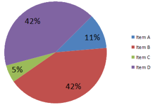
- Pie chart (Figure 3.2.1)
- Horizontal bar graph (Figure 3.2.2)
- Vertical bar graph (Figure 3.2.3)
- Line graph (Figure 3.2.4)
- Flowchart (Figure 3.2.5)
- Drawing/illustration (Figure 3.2.6)
- Photograph (Figure 3.2.7)
- Visual layout of a seating chart (Figure 3.2.8)
-


Website Examples
Take a look at how the following websites use visuals to enhance their message:
Additional Resources
- “Figures and Charts” from UNC’s Writing Center
- “Photos and Illustrations” from Lumen Technical Writing
- “An Introduction to Visual Thinking,” a slideshow by Ryan Coleman
CHAPTER ATTRIBUTION INFORMATION"Graphics." Online Technical Writing. [License: CC BY-SA 4.0] "Figures and Tables." Technical Writing Essentials. [License: CC BY 4.0] "Visuals." Lumen Technical Writing. [License: CC BY-SA 4.0] |
