
3.7 Infographic Example
The New York Public Library’s (NYPL) 2012 annual report infographic is a stellar example of using select information to build a compelling narrative that communicates the right message to its audience. Two crucial pieces of data (18 million total library visits in 2012 and an increase in total visits of 12 percent from 2008) are featured prominently to tell the story of an organization serving more people than ever in recent history.
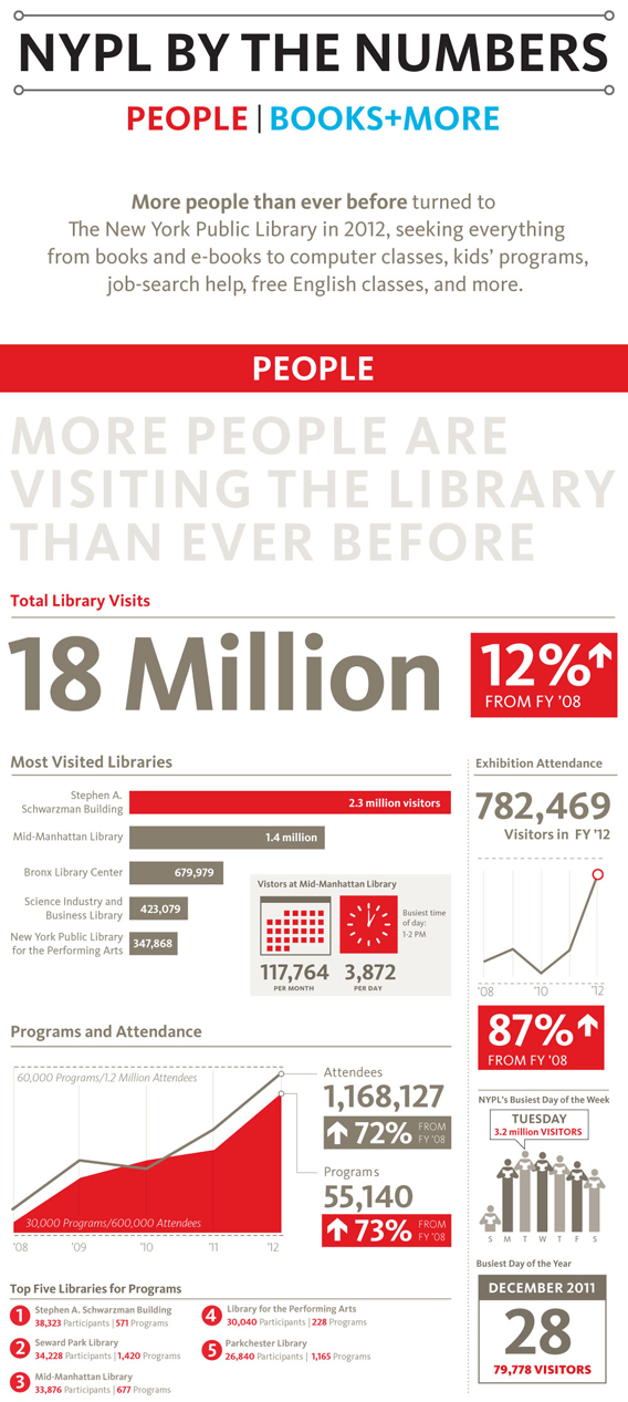
The New York Public Library’s 2012 annual report infographic, created by Richert Schnorr
NYPL emphasizes these two key pieces of data by making them larger than the rest of the text and placing them near the top of the infographic. The additional data included below, including the increase in visitors over time and the distribution of visitors among different locations, provides added context to support the main data points.
- “The Ultimate Infographic Design Guide” from Venngage.com.
CHAPTER ATTRIBUTION INFORMATIONSchnorr, R. (2012). "NYPL by the Numbers." 2012 Annual Report." NYPL.org. Accessed 22 May, 2019.
REFERENCESFriedenthal, Andrew. “4 Steps to Creating Infographics.” Softwareadvice.com. 25 April, 2017. Accessed 7 July, 2020. |
