Technical writers typically don’t need to be experts in website creation or graphic design, but as more and more writing goes digital, having a basic understanding of web design is useful. Designing websites is very similar to designing print documents. The basics are essentially the same: you need to understand space and layout, how to handle fonts and colors, and how to put it all together in a way that delivers your message effectively.
Like all effective technical communication, good web design caters to the needs of the audience. Will your audience be seeking information, products to purchase, technical assistance or instructions, entertainment, or some kind of interaction? Knowing your purpose and audience will help inform your design choices—each page or part of your website should have a clear purpose and work to fulfill a specific need for your audience.
Goals
Before designing a website it is important to set goals. As we noted above, ask yourself what purpose the website is serving. Not all sites serve the same purpose. For example, a retail site will have very different goals than a nonprofit site.
Some common website goals are:
Increasing sales
Marketing
Updating information
Generating leads
Distributing information
Goals, in any setting, are important to business success. By setting goals for one aspect of the business, in this case, the website, it will help in accomplishing other goals of the business, such as:
Expanding the audience
Connecting other businesses or other parts of the company
General communication
Design Message
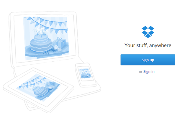
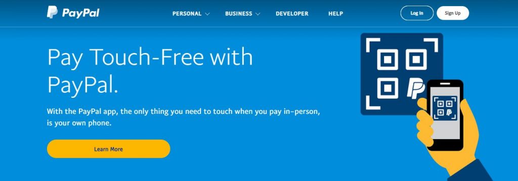
The design message is the image the organization wants to portray to the reader. This can also be called the brand. When creating the look of the website you must consider logos, colors, fonts, and images. These must all support the personality of the organization. Note in Figures 3.6.1 and 3.6.2 below how the companies Dropbox and Paypal make use of their brands:
Figure 3.6.1
Figure 3.6.2
Giving web pages a consistent look will help define it as a cohesive website and make it easier to navigate. Since many companies build their workplaces around the “theme” or “brand,” the website should as well. In fact, it is necessary for brand identification, thereby helping the company advance and succeed. A consistent brand and image also help build a company’s value and credibility.
Some important points to consider:
The brand, whether communicated through the website or the customer service, must be consistent
The brand should be found everywhere—there are no limits to exposure of brands
Short and simple is almost always the best route
You are the brand and the brand is you. If your brand does not reflect the values and beliefs of the company, it most certainly should not be on your website.
Audience
Like all technical communication, knowing your audience will help you to make better decisions when it comes to deciding how your website should look and function (as well as which browsers to support and which new technologies to endorse). Before designing a new website, it would be helpful to perform an audience needs assessment to ascertain users’ demographics, their technical knowledge, as well as browser and device preferences. For example, generally speaking, most younger users prefer to access web content on mobile devices, while some older users may favor accessing content via a traditional computer screen.
It’s important to note that putting content on the internet exposes that content to a wider audience, perhaps one beyond your intended audience, so the designer must strive for consistency, clarity, and conciseness.
Purpose
Figuring out how the site will be used in another important step in website design. Most internet users fall into three categories:
those seeking information
those seeking products or services
those seeking entertainment
For the informational sites, you may want to consider the technology of the user and/or use a more general approach to its design. The same can be said for For the sites of those seeking entertainment, more cutting-edge technology can be used to better the experience of the user when they are accessing your site.
As examples, note the differences between these three sites:
There are many ways content can be presented, depending on your audience and purpose, but the following are general tips for designing and formatting your web content:
Chunking: The average reader does not want to read long passages of text on a computer screen. Chunking the information can help break up long passages of text into shorter and more digestible bits of information that can be read independently from one other.
Using color scheme: Don’t mix a lot of colors. It is best to select only a few colors that either complement each other or are appropriate in representing the group for which the website is written, or appropriate for the audience. Also, colors can call attention to elements of importance.
Using images: Pictures, or video, can sometimes communicate information much more quickly and clearly than text. It is encouraged to include images where appropriate, but the designer shouldn’t clutter the page, or use gratuitous images, as this can confuse users.
Maintaining consistency: Visual appearance has a large effect on how users read and value websites, and consistency is a crucial aspect of web design. Information and user interface should be presented in a consistent manner throughout the page and the entire structure of the site. Logos, page titles, headers, and interface elements such as navigation, buttons, and graphics should all to be consistent. This will ensure the users can access the website without error or confusion.
As you compose and create your content, think carefully about the following questions:
What is the goal of the website (its purpose)?
Who is the website trying to reach (its audience)?
How much time to people have to spend reading information on the website?
How did individuals reach this website?
What is the most important information to the reader?
What questions might readers have?
What action is the reader supposed to take after reading the website content?
Another aspect to consider about website content is how it will be searched within different search engines. Key words are needed throughout your website to make sure that the website is found by people who are looking for specific information. It is important to be specific with words, and use them multiple times, so that search engine robots find the word and place it high on the results list.
Creating a Home Page
Your home page will be the most visited page on your website. Your home page may not always have what your viewers are looking for, so you should have something that will draw them in and make them want to look further for their information. You have roughly ten seconds to draw your customers into your site, or else they will hit the “back” button and look elsewhere. Your home page should load quickly. The ten seconds you have to draw the customers into your site begins when they click on the link to your site. If it takes five seconds for your site to load, you only have a few seconds left to draw customers in further. Here are some tips to help your site load quicker:
Keep media images small
Avoid using ads from external websites on your home page that may slow down the loading time. You cannot control how fast another server will serve its content.
Write your HTML in sections so that when the bottom of the page is still loading, your customers can read the top sections of your home page.
2. Note the homepage below in Figure 3.6.3: The color combination is problematical—the gray and black interspersed with bright red and white isn’t especially easy on the eyes. The page is also too busy by being overcrowded with content, low-resolution pictures, and varying fonts, all of which can be off-putting to users and make the website difficult to navigate. As you look it over, think about what you would change if you were the site’s designer.
Figure 3.6.3
Another important point about home pages it to never stop modifying them. Reviewing your log files once your website is up and working can help you make your home page more user-friendly. Updating the links or the colors may improve the appeal or ease of use to your site. Remember that everything can be changed, and you don’t have to settle for something if it’s not working.
Understanding a few basic web design concepts and being able to know the difference between good and bad design will give you the confidence and skills to begin designing your own websites or revising existing ones.