
Aggregate Demand in the Keynesian Model
Learning Objectives
By the end of this section, you will be able to:
- Explain the components of the Keynesian cross diagram
The fundamental ideas of Keynesian economics were developed before the AD/AS model was popularized. From the 1930s until the 1970s, Keynesian economics was usually explained with a different model, known as the expenditure-output approach. This approach is strongly rooted in the fundamental assumptions of Keynesian economics: it focuses on the total amount of spending in the economy, with no explicit mention of aggregate supply or of the price level (although as you will see, it is possible to draw some inferences about aggregate supply and price levels based on the diagram).
The Axes of the Keynesian Cross Diagram
The expenditure-output model, sometimes also called the Keynesian cross diagram, determines the equilibrium level of real GDP by the point where the total or aggregate expenditures in the economy are equal to the amount of output produced. The axes of the Keynesian cross diagram presented in Figure 1 show real GDP on the horizontal axis as a measure of output and aggregate expenditures on the vertical axis as a measure of spending.
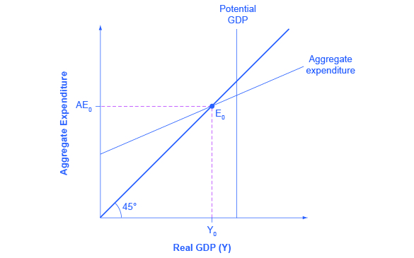
Remember that GDP can be thought of in several equivalent ways: it measures both the value of spending on final goods and also the value of the production of final goods. All sales of the final goods and services that make up GDP will eventually end up as income for workers, for managers, and for investors and owners of firms. The sum of all the income received for contributing resources to GDP is called national income (Y). At some points in the discussion that follows, it will be useful to refer to real GDP as “national income.” Both axes are measured in real (inflation-adjusted) terms.
The Potential GDP Line and the 45-degree Line
The Keynesian cross diagram contains two lines that serve as conceptual guideposts to orient the discussion. The first is a vertical line showing the level of potential GDP. Potential GDP means the same thing here that it means in the AD/AS diagrams: it refers to the quantity of output that the economy can produce with full employment of its labor and physical capital.
The second conceptual line on the Keynesian cross diagram is the 45-degree line, which starts at the origin and reaches up and to the right. A line that stretches up at a 45-degree angle represents the set of points (1, 1), (2, 2), (3, 3) and so on, where the measurement on the vertical axis is equal to the measurement on the horizontal axis. In this diagram, the 45-degree line shows the set of points where the level of aggregate expenditure in the economy, measured on the vertical axis, is equal to the level of output or national income in the economy, measured by GDP on the horizontal axis.
When the macroeconomy is in equilibrium, it must be true that the aggregate expenditures in the economy are equal to the real GDP—because by definition, GDP is the measure of what is spent on final sales of goods and services in the economy. Thus, the equilibrium calculated with a Keynesian cross diagram will always end up where aggregate expenditure and output are equal—which will only occur along the 45-degree line.
The Aggregate Expenditure Schedule
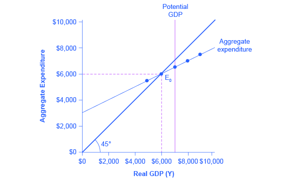
The final ingredient of the Keynesian cross or expenditure-output diagram is the aggregate expenditure schedule, which will show the total expenditures in the economy for each level of real GDP. The intersection of the aggregate expenditure line with the 45-degree line—at point E0 in Figure 1—will show the equilibrium for the economy, because it is the point where aggregate expenditure is equal to output or real GDP. After developing an understanding of what the aggregate expenditures schedule means, we will return to this equilibrium and how to interpret it.
Building the Aggregate Expenditure Schedule
Aggregate expenditure is the key to the expenditure-income model. The aggregate expenditure schedule shows, either in the form of a table or a graph, how aggregate expenditures in the economy rise as real GDP or national income rises. Thus, in thinking about the components of the aggregate expenditure line—consumption, investment, government spending, exports and imports—the key question is how expenditures in each category will adjust as national income rises.
Consumption as a Function of National Income
How do consumption expenditures increase as national income rises? People can do two things with their income: consume it or save it (for the moment, let’s ignore the need to pay taxes with some of it). Each person who receives an additional dollar faces this choice. The marginal propensity to consume (MPC), is the share of the additional dollar of income a person decides to devote to consumption expenditures. The the share of the additional dollar of income a person decides to save (MPS) is the share of the additional dollar a person decides to save. It must always hold true that:
MPC + MPS = 1
For example, if the marginal propensity to consume out of the marginal amount of income earned is 0.9, then the marginal propensity to save is 0.1.
With this relationship in mind, consider the relationship among income, consumption, and savings shown in Figure 2. (Note that we use “Aggregate Expenditure” on the vertical axis because all consumption expenditures are parts of aggregate expenditures.)
An assumption commonly made in this model is that even if income were zero, people would have to consume something. In this example, consumption would be $600 even if income were zero. We’ll call this autonomous consumption (Ca), where ‘autonomous’ just means independent of the level of income. Then, the MPC is 0.8 and the MPS is 0.2. Thus, when income increases by $1,000, consumption rises by $800 and savings rises by $200. At an income of $4,000, total consumption will be the $600 that would be consumed even without any income, plus $4,000 multiplied by the marginal propensity to consume of 0.8, or $ 3,200, for a total of $ 3,800. The total amount of consumption and saving must always add up to the total amount of income. (Exactly how a situation of zero income and negative savings would work in practice is not important, because even low-income societies are not literally at zero income, so the point is hypothetical.) This relationship between income and consumption, illustrated in Figure 2 and Table 1, is called the consumption function.
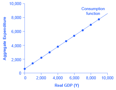
The pattern of consumption shown in Table 1 is plotted in Figure 2. To calculate consumption, multiply the income level by 0.8, for the marginal propensity to consume, and add $600, for the amount that would be consumed even if income was zero. Consumption plus savings must be equal to income.
| Income | Consumption | Savings |
|---|---|---|
| $0 | $600 | –$600 |
| $1,000 | $1,400 | –$400 |
| $2,000 | $2,200 | –$200 |
| $3,000 | $3,000 | $0 |
| $4,000 | $3,800 | $200 |
| $5,000 | $4,600 | $400 |
| $6,000 | $5,400 | $600 |
| $7,000 | $6,200 | $800 |
| $8,000 | $7,000 | $1,000 |
| $9,000 | $7,800 | $1,200 |
However, a number of factors other than income can also cause the entire consumption function to shift. These factors were summarized in earlier int he chapter. When the consumption function moves, it can shift in two ways: either the entire consumption function can move up or down in a parallel manner, or the slope of the consumption function can shift so that it becomes steeper or flatter. For example, if a tax cut leads consumers to spend more, but does not affect their marginal propensity to consume, it would cause an upward shift to a new consumption function that is parallel to the original one. However, a change in household preferences for saving that reduced the marginal propensity to save would cause the slope of the consumption function to become steeper: that is, if the savings rate is lower, then every increase in income leads to a larger rise in consumption.
Investment as a Function of ‘Animal Spirits’
Investment decisions are forward-looking, based on expected rates of return. Precisely because investment decisions depend primarily on perceptions about future economic conditions–what Keynes referred to as the ‘animal spirits’ driving the optimism (and pessimism) or business people–, they do not depend primarily on the level of GDP in the current year. Thus, on a Keynesian cross diagram, the investment function can be drawn as a horizontal line, at a fixed level of expenditure. Figure 3 shows an investment function where the level of investment is, for the sake of concreteness, set at the specific level of 500. Just as a consumption function shows the relationship between consumption levels and real GDP (or national income), the investment function shows the relationship between investment levels and real GDP.
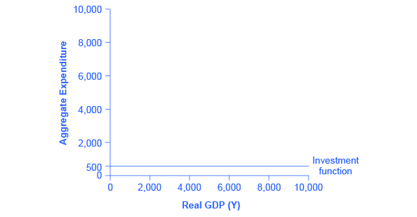
The appearance of the investment function as a horizontal line does not mean that the level of investment never moves. It means only that in the context of this two-dimensional diagram, the level of investment on the vertical aggregate expenditure axis does not vary according to the current level of real GDP on the horizontal axis. However, all the other factors that vary investment—new technological opportunities, expectations about near-term economic growth, interest rates, the price of key inputs, and tax incentives for investment—can cause the horizontal investment function to shift up or down.
Government Spending and Taxes as a Function of National Income
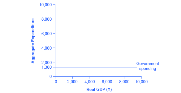
In the Keynesian cross diagram, government spending appears as a horizontal line, as in Figure 4, where government spending is set at a level of 1,300. As in the case of investment spending, this horizontal line does not mean that government spending is unchanging. It means only that government spending changes when Congress decides on a change in the budget, rather than shifting in a predictable way with the current size of the real GDP shown on the horizontal axis.
The situation of taxes is different because taxes often rise or fall with the volume of economic activity. For example, income taxes are based on the level of income earned and sales taxes are based on the amount of sales made, and both income and sales tend to be higher when the economy is growing and lower when the economy is in a recession. For the purposes of constructing the basic Keynesian cross diagram, it is helpful to view taxes as a proportionate share of GDP. In the United States, for example, taking federal, state, and local taxes together, government typically collects about 30–35 % of income as taxes.
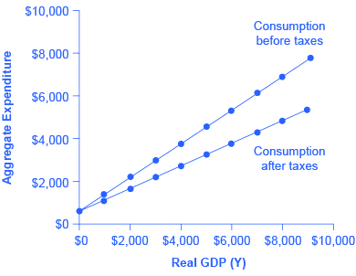
Table 2 revises the earlier table on the consumption function so that it takes taxes into account. The first column shows national income. The second column calculates taxes, which in this example are set at a rate of 30%, or 0.3. The third column shows after-tax income; that is, total income minus taxes. The fourth column then calculates consumption in the same manner as before: multiply after-tax income by 0.8, representing the marginal propensity to consume, and then add $600, for the amount that would be consumed even if income was zero. When taxes are included, the marginal propensity to consume is reduced by the amount of the tax rate, so each additional dollar of income results in a smaller increase in consumption than before taxes. For this reason, the consumption function, with taxes included, is flatter than the consumption function without taxes, as Figure 5 shows.
| Income | Taxes | After-Tax Income | Consumption | Savings |
|---|---|---|---|---|
| $0 | $0 | $0 | $600 | –$600 |
| $1,000 | $300 | $700 | $1,160 | –$460 |
| $2,000 | $600 | $1,400 | $1,720 | –$320 |
| $3,000 | $900 | $2,100 | $2,280 | –$180 |
| $4,000 | $1,200 | $2,800 | $2,840 | –$40 |
| $5,000 | $1,500 | $3,500 | $3,400 | $100 |
| $6,000 | $1,800 | $4,200 | $3,960 | $240 |
| $7,000 | $2,100 | $4,900 | $4,520 | $380 |
| $8,000 | $2,400 | $5,600 | $5,080 | $520 |
| $9,000 | $2,700 | $6,300 | $5,640 | $660 |
Exports and Imports as a Function of National Income
The export function, which shows how exports change with the level of a country’s own real GDP, is drawn as a horizontal line, as in the example in Figure 6 (a) where exports are drawn at a level of $840. Again, as in the case of investment spending and government spending, drawing the export function as horizontal does not imply that exports never change. It just means that they do not change because of what is on the horizontal axis—that is, a country’s own level of domestic production—and instead are shaped by the level of aggregate demand in other countries. More demand for exports from other countries would cause the export function to shift up; less demand for exports from other countries would cause it to shift down.
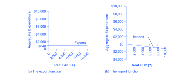
Imports are drawn in the Keynesian cross diagram as a downward-sloping line, with the downward slope determined by the marginal propensity to import (MPI), out of national income. In Figure 6 (b), the marginal propensity to import is 0.1. Thus, if real GDP is $5,000, imports are $500; if national income is $6,000, imports are $600, and so on. The import function is drawn as downward sloping and negative, because it represents a subtraction from the aggregate expenditures in the domestic economy. A change in the marginal propensity to import, perhaps as a result of changes in preferences, would alter the slope of the import function.
Building the Combined Aggregate Expenditure Function
All the components of aggregate demand—consumption, investment, government spending, and the trade balance—are now in place to build the Keynesian cross diagram. Figure 7 builds up an aggregate expenditure function, based on the numerical illustrations of C, I, G, X, and M that have been used throughout this text. The first three columns in Table 3 are lifted from the earlier Table 2, which showed how to bring taxes into the consumption function. The first column is real GDP or national income, which is what appears on the horizontal axis of the income-expenditure diagram. The second column calculates after-tax income, based on the assumption, in this case, that 30% of real GDP is collected in taxes. The third column is based on an MPC of 0.8, so that as after-tax income rises by $700 from one row to the next, consumption rises by $560 (700 × 0.8) from one row to the next. Investment, government spending, and exports do not change with the level of current national income. In the previous discussion, investment was $500, government spending was $1,300, and exports were $840, for a total of $2,640. This total is shown in the fourth column. Imports are 0.1 of real GDP in this example, and the level of imports is calculated in the fifth column. The final column, aggregate expenditures, sums up C + I + G + X – M. This aggregate expenditure line is illustrated in Figure 7.
| National Income | After-Tax Income | Consumption | Government Spending + Investment + Exports | Imports | Aggregate Expenditure |
|---|---|---|---|---|---|
| $3,000 | $2,100 | $2,280 | $2,640 | $300 | $4,620 |
| $4,000 | $2,800 | $2,840 | $2,640 | $400 | $5,080 |
| $5,000 | $3,500 | $3,400 | $2,640 | $500 | $5,540 |
| $6,000 | $4,200 | $3,960 | $2,640 | $600 | $6,000 |
| $7,000 | $4,900 | $4,520 | $2,640 | $700 | $6,460 |
| $8,000 | $5,600 | $5,080 | $2,640 | $800 | $6,920 |
| $9,000 | $6,300 | $5,640 | $2,640 | $900 | $7,380 |
The aggregate expenditure function is formed by stacking on top of each other the consumption function (after taxes), the investment function, the government spending function, the export function, and the import function. The point at which the aggregate expenditure function intersects the vertical axis will be determined by the levels of investment, government, and export expenditures—which do not vary with national income. The upward slope of the aggregate expenditure function will be determined by the marginal propensity to save, the tax rate, and the marginal propensity to import. A higher marginal propensity to save, a higher tax rate, and a higher marginal propensity to import will all make the slope of the aggregate expenditure function flatter—because out of any extra income, more is going to savings or taxes or imports and less to spending on domestic goods and services.
The equilibrium occurs where national income is equal to aggregate expenditure, which is shown on the graph as the point where the aggregate expenditure schedule crosses the 45-degree line. In this example, the equilibrium occurs at 6,000. This equilibrium can also be read off the table under the figure; it is the level of national income where aggregate expenditure is equal to national income.
Glossary
- autonomous consumption
- the amount of aggregate consumption expenditure that would occur even if income dropped to zero
- marginal propensity to consume
- the share of the additional dollar of income a person decides to devote to consumption expenditures
- marginal propensity to save
- the share of the additional dollar of income a person decides to save
a model in the heterodox tradition of Keynes that shows aggregate expenditure as a function of income and equilibrium at the point where spending and output are equal
the share of the additional dollar of income a person decides to devote to consumption expenditures
the amount of aggregate consumption expenditure that would occur even if income dropped to zero
