
The Keynesian Synthesis
Learning Objectives
By the end of this section, you will be able to:
- Explain the coordination argument, menu costs, and macroeconomic externality
- Explain the Phillips curve, noting its impact on the theories of Keynesian economics
- Graph a Phillips curve
- Identify factors that cause the instability of the Phillips curve
- Analyze the Keynesian policy for reducing unemployment and inflation
While Keynes’ own work, especially in the General Theory, was considered revolutionary in the world of economics, it wasn’t long before his ideas were merged into orthodox thinking within the discipline. This resulted in what has variously been called New Keynesianism, the Keynesian Synthesis, or, as economist and colleague of Keynes himself, Joan Robinson called it, Bastard Keynesianism. From this view Keynesian economics is not about a fundamentally different way of understanding capitalist economies. Instead, Keynesian economics is simply an approach within orthodox economics that focuses on explaining why recessions and depressions occur and offering a policy prescription for minimizing their effects. In particular, the Keynesian view of recession is based on the fundamental insight that aggregate demand simply is not always automatically high enough to provide firms with an incentive to hire enough workers to reach full employment.
The first building block of this Keynesian diagnosis is that recessions occur when the level of demand for goods and services is less than what is produced when labor is fully employed. In other words, the intersection of aggregate supply and aggregate demand occurs at a level of output less than the level of GDP consistent with full employment. Suppose the stock market crashes, as in 1929, or suppose the housing market collapses, as in 2008. In either case, household wealth will decline, and consumption expenditure will follow. Suppose businesses see that consumer spending is falling. That will reduce expectations of the profitability of investment, so businesses will decrease investment expenditure.
This seemed to be the case during the Great Depression, since the physical capacity of the economy to supply goods did not alter much. No flood or earthquake or other natural disaster ruined factories in 1929 or 1930. No outbreak of disease decimated the ranks of workers. No key input price, like the price of oil, soared on world markets. The U.S. economy in 1933 had just about the same factories, workers, and state of technology as it had had four years earlier in 1929—and yet the economy had shrunk dramatically. This also seems to be what happened in 2008.
As Keynes recognized, the events of the Depression contradicted Say’s law that “supply creates its own demand.” Although production capacity existed, the markets were not able to sell their products. As a result, real GDP was less than potential GDP. The question becomes, then, how can this view be reconciled with an orthodox economics in which Say’s law still holds. And there are in fact a number of answers to this question, but one important one is: wages and prices don’t adjust appropriately, at least not quickly.
Visit this website for raw data used to calculate GDP.

Wages and Price Stickiness
Some modern orthodox economists have argued that, along with wages, other prices may be sticky, too. Many firms do not change their prices every day or even every month. When a firm considers changing prices, it must consider two sets of costs. First, changing prices uses company resources: managers must analyze the competition and market demand and decide the new prices, they must update sales materials, change billing records, and redo product and price labels. Second, frequent price changes may leave customers confused or angry—especially if they discover that a product now costs more than they expected. These costs of changing prices are called menu costs—like the costs of printing a new set of menus with different prices in a restaurant. From this perspective, prices do respond to forces of supply and demand, but from a macroeconomic perspective, the process of changing all prices throughout the economy takes time.
To understand the effect of sticky wages and prices in the economy, consider Figure 1 (a) illustrating the overall labor market, while Figure 2 (b) illustrates a market for a specific good or service. The original equilibrium (E0) in each market occurs at the intersection of the demand curve (D0) and supply curve (S0). When aggregate demand declines, the demand for labor shifts to the left (to D1) in Figure 1 (a) and the demand for goods shifts to the left (to D1) in Figure 1 (b). However, because of sticky wages and prices, the wage remains at its original level (W0) for a period of time and the price remains at its original level (P0).
As a result, a situation of excess supply—where the quantity supplied exceeds the quantity demanded at the existing wage or price—exists in markets for both labor and goods, and Q1 is less than Q0 in both Figure 1 (a) and Figure 1 (b). When many labor markets and many goods markets all across the economy find themselves in this position, the economy is in a recession; that is, firms cannot sell what they wish to produce at the existing market price and do not wish to hire all who are willing to work at the existing market wage. The Clear It Up feature discusses this problem in more detail.

Why Is the Pace of Wage Adjustments Slow?
The recovery after the Great Recession in the United States has been slow, with wages stagnant, if not declining. In fact, many low-wage workers at McDonalds, Dominos, and Walmart have threatened to strike for higher wages. Their plight is part of a larger trend in job growth and pay in the post–recession recovery.

The National Employment Law Project compiled data from the Bureau of Labor Statistics and found that, during the Great Recession, 60% of job losses were in medium-wage occupations. Most of them were replaced during the recovery period with lower-wage jobs in the service, retail, and food industries. Figure 2 illustrates this data.
Wages in the service, retail, and food industries are at or near minimum wage and tend to be both downwardly and upwardly “sticky.” Wages are downwardly sticky due to minimum wage laws. They may be upwardly sticky if insufficient competition in low-skilled labor markets enables employers to avoid raising wages that would reduce their profits. At the same time, however, the Consumer Price Index increased 11% between 2007 and 2012, pushing real wages down.
Keynes and the Aggregate Demand/Aggregate Supply Model
Many orthodox economists believe that, once issues like sticky wages and menu costs are recognized, the simplified AD/AS model that we have used so far is fully consistent with Keynes’s original model. Figure 3 is the AD/AS diagram which illustrates two basic Keynesian assumptions—the importance of aggregate demand in causing recession and the stickiness of wages and prices. Note that because of the stickiness of wages and prices, the aggregate supply curve is flatter than either supply curve (labor or specific good). In fact, if wages and prices were so sticky that they did not fall at all, the aggregate supply curve would be completely flat below potential GDP, as Figure 3 shows. This outcome is an important example of a macroeconomic externality, where what happens at the macro level is different from and inferior to what happens at the micro level. For example, a firm should respond to a decrease in demand for its product by cutting its price to increase sales. However, if all firms experience a decrease in demand for their products, sticky prices in the aggregate prevent aggregate demand from rebounding (which we would show as a movement along the AD curve in response to a lower price level).
The original equilibrium of this economy occurs where the aggregate demand function (AD0) intersects with AS. Since this intersection occurs at potential GDP (Yp), the economy is operating at full employment. When aggregate demand shifts to the left, all the adjustment occurs through decreased real GDP. There is no decrease in the price level. Since the equilibrium occurs at Y1, the economy experiences substantial unemployment.

More recent research, though, has indicated that in the real world, an aggregate supply curve is more curved than the right angle depicted in the figure above. Rather, the real-world AS curve is very flat at levels of output far below potential (“the Keynesian zone”), very steep at levels of output above potential (“the neoclassical zone”) and curved in between (“the intermediate zone”). Figure 4 illustrates this. The typical aggregate supply curve leads to the concept of the Phillips curve.

The Discovery of the Phillips Curve
In the 1950s, A.W. Phillips, an economist at the London School of Economics, was studying the Keynesian analytical framework. The Keynesian theory implied that during a recession inflationary pressures are low, but when the level of output is at or even pushing beyond potential GDP, the economy is at greater risk for inflation. Phillips analyzed 60 years of British data and did find that tradeoff between unemployment and inflation, which became known as the Phillips curve. Figure 5 shows a theoretical Phillips curve, and the following Work It Out feature shows how the pattern appears for the United States.

The Phillips Curve for the United States
Step 1. Go to this website to see the 2005 Economic Report of the President.
Step 2. Scroll down and locate Table B-63 in the Appendices. This table is titled “Changes in special consumer price indexes, 1960–2004.”
Step 3. Download the table in Excel by selecting the XLS option and then selecting the location in which to save the file.
Step 4. Open the downloaded Excel file.
Step 5. View the third column (labeled “Year to year”). This is the inflation rate, measured by the percentage change in the Consumer Price Index.
Step 6. Return to the website and scroll to locate the Appendix Table B-42 “Civilian unemployment rate, 1959–2004.
Step 7. Download the table in Excel.
Step 8. Open the downloaded Excel file and view the second column. This is the overall unemployment rate.
Step 9. Using the data available from these two tables, plot the Phillips curve for 1960–69, with unemployment rate on the x-axis and the inflation rate on the y-axis. Your graph should look like Figure 6.
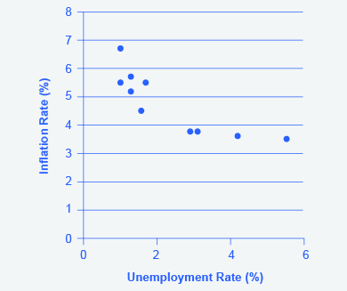
Step 10. Plot the Phillips curve for 1960–1979. What does the graph look like? Do you still see the tradeoff between inflation and unemployment? Your graph should look like Figure 7.

Over this longer period of time, the Phillips curve appears to have shifted out. There is no tradeoff any more.
The Instability of the Phillips Curve
During the 1960s, economists viewed the Phillips curve as a policy menu. A nation could choose low inflation and high unemployment, or high inflation and low unemployment, or anywhere in between. Economies could use fiscal and monetary policy to move up or down the Phillips curve as desired. Then a curious thing happened. When policymakers tried to exploit the tradeoff between inflation and unemployment, the result was an increase in both inflation and unemployment. What had happened? The Phillips curve shifted.
The U.S. economy experienced this pattern in the deep recession from 1973 to 1975, and again in back-to-back recessions from 1980 to 1982. Many nations around the world saw similar increases in unemployment and inflation. This pattern became known as stagflation. (Recall from The Aggregate Demand/Aggregate Supply Model that stagflation is an unhealthy combination of high unemployment and high inflation.) Perhaps most important, stagflation was a phenomenon that traditional Keynesian economics could not explain.
Economists have concluded that two factors cause the Phillips curve to shift. The first is supply shocks, like the mid-1970s oil crisis, which first brought stagflation into our vocabulary. The second is changes in people’s expectations about inflation. In other words, there may be a tradeoff between inflation and unemployment when people expect no inflation, but when they realize inflation is occurring, the tradeoff disappears. Both factors (supply shocks and changes in inflationary expectations) cause the aggregate supply curve, and thus the Phillips curve, to shift.
In short, we should interpret a downward-sloping Phillips curve as valid for short-run periods of several years, but over longer periods, when aggregate supply shifts, the downward-sloping Phillips curve can shift so that unemployment and inflation are both higher (as in the 1970s and early 1980s) or both lower (as in the early 1990s or first decade of the 2000s).
Keynesian Policy for Fighting Unemployment and Inflation
Keynesian macroeconomics argues that the solution to a recession is expansionary fiscal policy, such as tax cuts to stimulate consumption and investment, or direct increases in government spending that would shift the aggregate demand curve to the right. For example, if aggregate demand was originally at ADr in [link], so that the economy was in recession, the appropriate policy would be for government to shift aggregate demand to the right from ADr to ADf, where the economy would be at potential GDP and full employment.
Keynes noted that while it would be nice if the government could spend additional money on housing, roads, and other amenities, he also argued that if the government could not agree on how to spend money in practical ways, then it could spend in impractical ways. For example, Keynes suggested building monuments, like a modern equivalent of the Egyptian pyramids. He proposed that the government could bury money underground, and let mining companies start digging up the money again. These suggestions were slightly tongue-in-cheek, but their purpose was to emphasize that a Great Depression is no time to quibble over the specifics of government spending programs and tax cuts when the goal should be to pump up aggregate demand by enough to lift the economy to potential GDP.

The other side of Keynesian policy occurs when the economy is operating above potential GDP. In this situation, unemployment is low, but inflationary rises in the price level are a concern. The Keynesian response would be contractionary fiscal policy, using tax increases or government spending cuts to shift AD to the left. The result would be downward pressure on the price level, but very little reduction in output or very little rise in unemployment. If aggregate demand was originally at ADi in [link], so that the economy was experiencing inflationary rises in the price level, the appropriate policy would be for government to shift aggregate demand to the left, from ADi toward ADf, which reduces the pressure for a higher price level while the economy remains at full employment.
In the Keynesian economic model, too little aggregate demand brings unemployment and too much brings inflation. Thus, you can think of Keynesian economics as pursuing a “Goldilocks” level of aggregate demand: not too much, not too little, but looking for what is just right.
References
Hoover, Kevin. “Phillips Curve.” The Concise Encyclopedia of Economics. http://www.econlib.org/library/Enc/PhillipsCurve.html.
U.S. Government Printing Office. “Economic Report of the President.” http://1.usa.gov/1c3psdL.
Glossary
- contractionary fiscal policy
- tax increases or cuts in government spending designed to decrease aggregate demand and reduce inflationary pressures
- expansionary fiscal policy
- tax cuts or increases in government spending designed to stimulate aggregate demand and move the economy out of recession
- Phillips curve
- the tradeoff between unemployment and inflation
- coordination argument
- downward wage and price flexibility requires perfect information about the level of lower compensation acceptable to other laborers and market participants
- macroeconomic externality
- occurs when what happens at the macro level is different from and inferior to what happens at the micro level; an example would be where upward sloping supply curves for firms become a flat aggregate supply curve, illustrating that the price level cannot fall to stimulate aggregate demand
- menu costs
- costs firms face in changing prices
- sticky wages and prices
- a situation where wages and prices do not fall in response to a decrease in demand, or do not rise in response to an increase in demand
a significant decline in national output
downward wage and price flexibility requires perfect information about the level of lower compensation acceptable to other laborers and market participants
costs firms face in changing prices
a situation where wages and prices do not fall in response to a decrease in demand, or do not rise in response to an increase in demand
occurs when what happens at the macro level is different from and inferior to what happens at the micro level; an example would be where upward sloping supply curves for firms become a flat aggregate supply curve, illustrating that the price level cannot fall to stimulate aggregate demand
the tradeoff between unemployment and inflation
an economy experiences stagnant growth and high inflation at the same time
a general and ongoing rise in price levels in an economy
tax cuts or increases in government spending designed to stimulate aggregate demand and move the economy out of recession
tax increases or cuts in government spending designed to decrease aggregate demand and reduce inflationary pressures
