
Chapter 5: Color Theory & Basic Shapes
5.2 Exercise 2: Top or bottom?
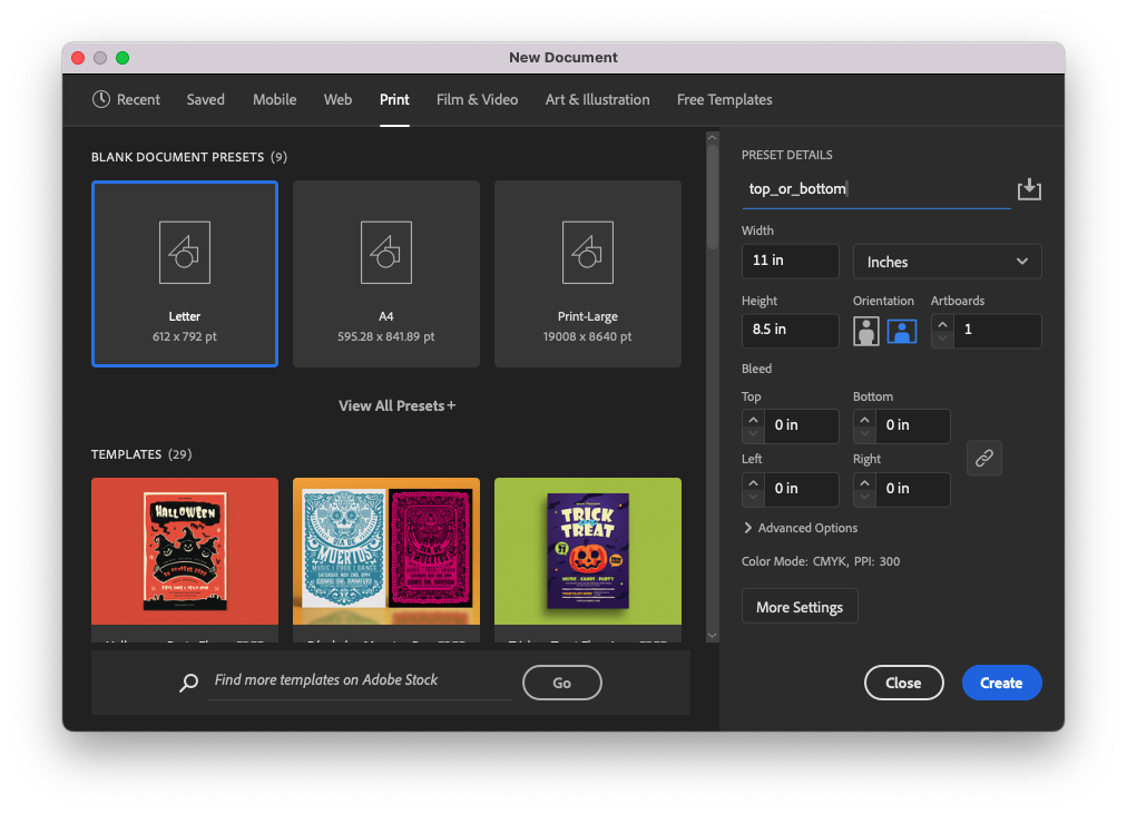
- Create a new file in Illustrator® using basic CYMK color mode in landscape orientation. Illustrator® will remember your settings from the last document you created. If you have not created a new document since completing the above exercise, your document settings will already be programmed. Name the file document top_or_bottom.
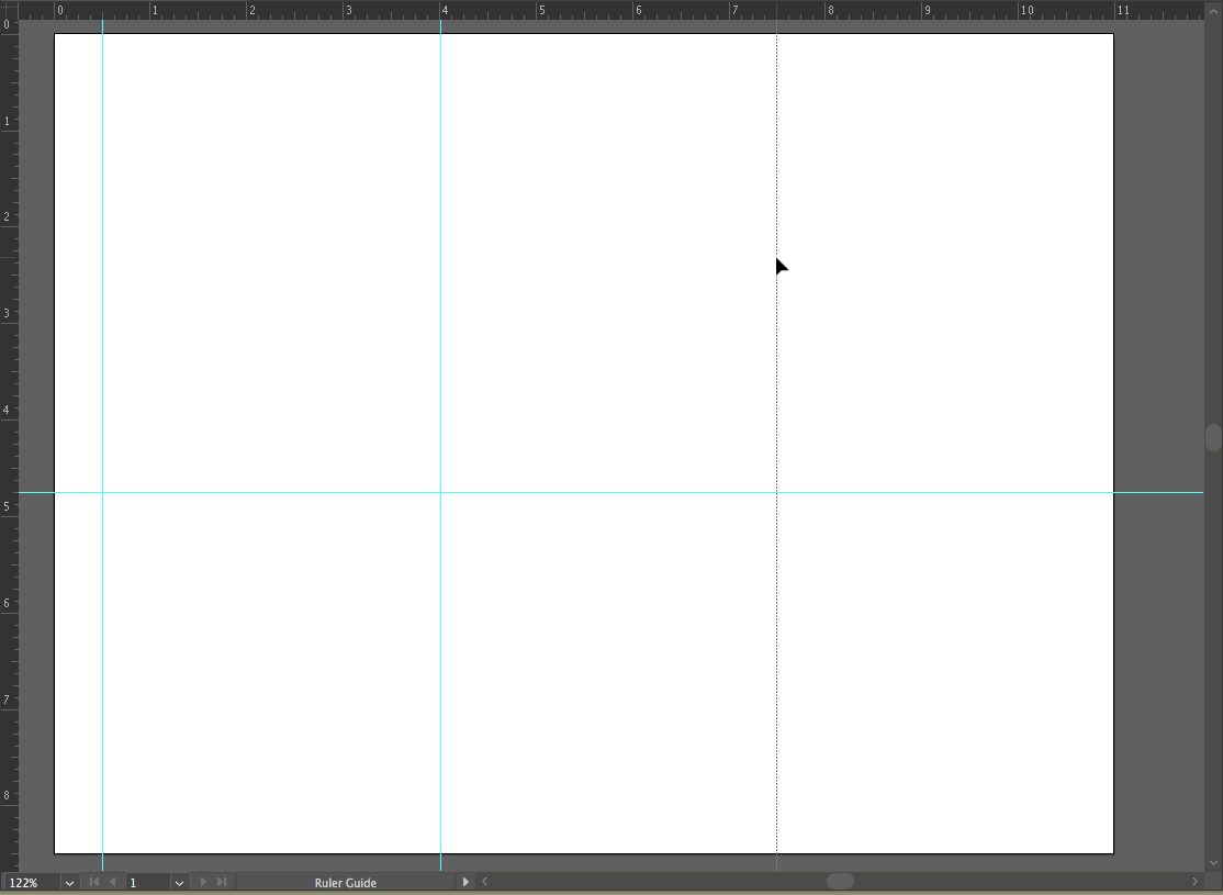
Create a new document in landscape mode (horizontal). - Use one horizontal guide and three vertical guides to divide the page. Create the guides by clicking on the ruler and dragging the cursor onto the Artboard. Place the horizontal guide at 4.75 inches, which is half an inch below the center of the page. Place three vertical guides at .5, 4 and 7.5 inches. If you don’t see your rulers, turn them on by clicking View > Rulers > Show Rulers (CMD+R). You may want to make sure your guides are locked into place. View > Guides > Lock Guides (or check in the Properties panel).
Setting Guides for Alignment - Create a 2 x 2″ square on the top half of the page. Align the bottom of the square to the horizontal dividing line and the left edge to the middle vertical guide. To make the square exactly 2 by 2″, double-click on the art board with the Rectangle Tool to see the Rectangle Options Dialog Box. Type “2 in” into the horizontal and vertical measurement boxes.
If the dialog box is set to a different unit of measurement when it first opens, for instance points or pixels, typing “2 in” tells the program to use inches instead of the units of measurement that initially appeared in the dialog box.
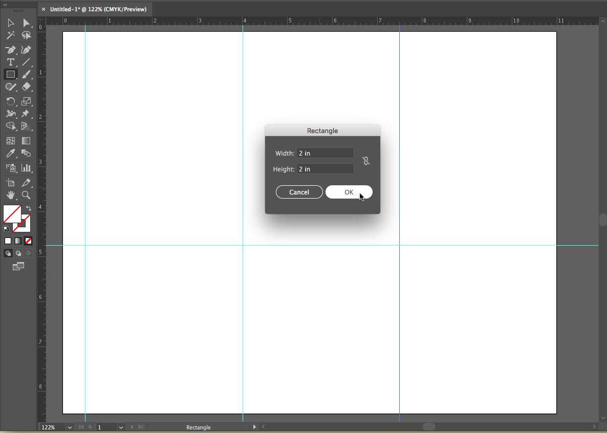
Using the Rectangle dialog box to set measurements for your square. Using the Color Picker
-
Colors have three properties: Hue, Value and Saturation. Hue is the name used to define the color. For instance red, yellow, blue, and so on, are hues. Value refers to how much white or black is mixed into the color. Baby blue has white in it, while navy blue has a greater black value. Saturation is the level of intensity of the color. The color of pale winter tomatoes are less saturated than the color of ripe summer tomatoes.
Double-click on the fill color in the bottom of the Tool Panel and the Color Picker dialog box appears. The Color Picker is another location for choosing colors and has controls for all three properties, hue, value and saturation. Choose a hue on the vertical slider to the right of the color selection area. Then choose a value by moving the color selection circle (in the large color box under Select Color:) up or down vertically. The higher you move the circle, the higher the value and the lighter the color appears. The lower the circle is placed correlates to a lower value and the color becomes darker. Choose a saturation by moving the color selection circle left or right horizontally. The further to the left the circle is moved, the lower the saturation. The color becomes more gray. The more right you move the circle, the higher the saturation value, and the more intense the color becomes.
- Make sure that the square is selected before choosing a color in this step. Use the Color Picker to choose a hue with a low value for the fill color of the square. Do not assign a stroke.
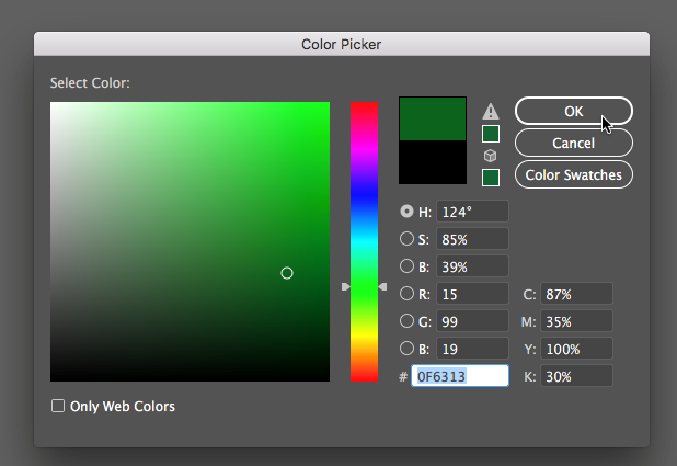
Use the Color Picker to choose a hue with a low value. - Option-Drag your square to the right to create a copy (holding down shift after you start dragging will retain it to a movement along the x-axis). Align the bottom of the new square to the horizontal guide, and the left side of the square to the vertical on the left side of the page.
- Repeat this action to make a copy of the square to the right, once again aligning the bottom edge with the horizontal guide and the left edge with the vertical guide farthest to the right. This will give your squares even spacing.
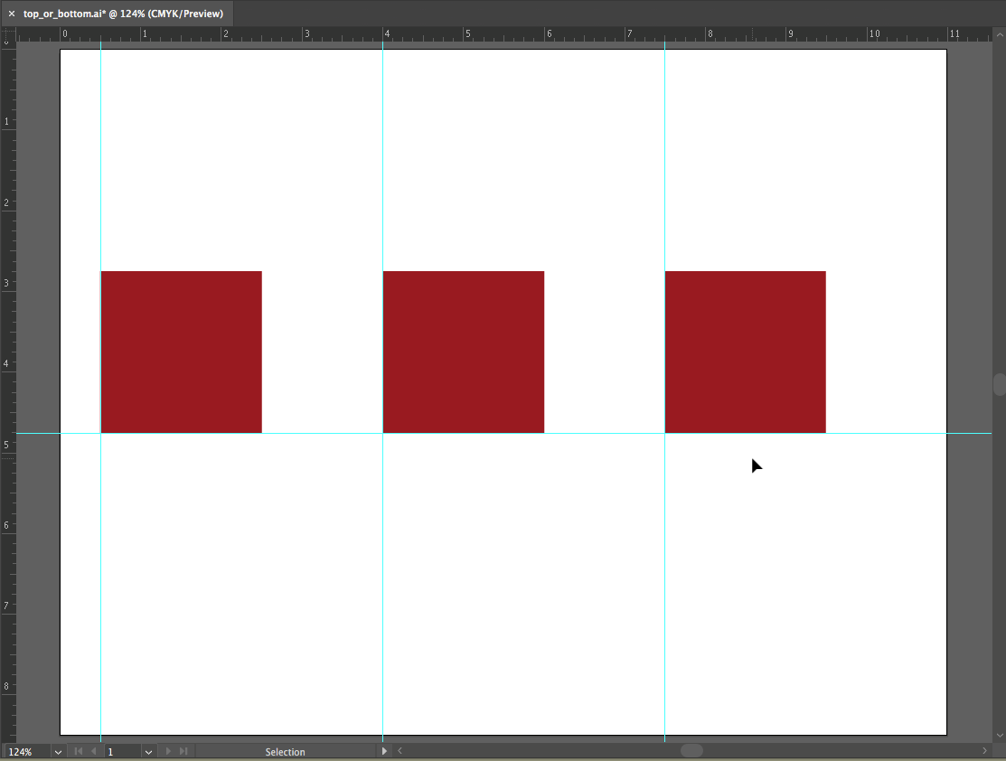
Create 3 squares by duplicating, then align to your guides. - Select all three of the squares and Option-drag them down to the right so that 1 inch of the upper left corner of the new squares overlap with 1 inch of the bottom right corner of the original squares. Hold down the shift key to drag the squares at a 45 degree angle.
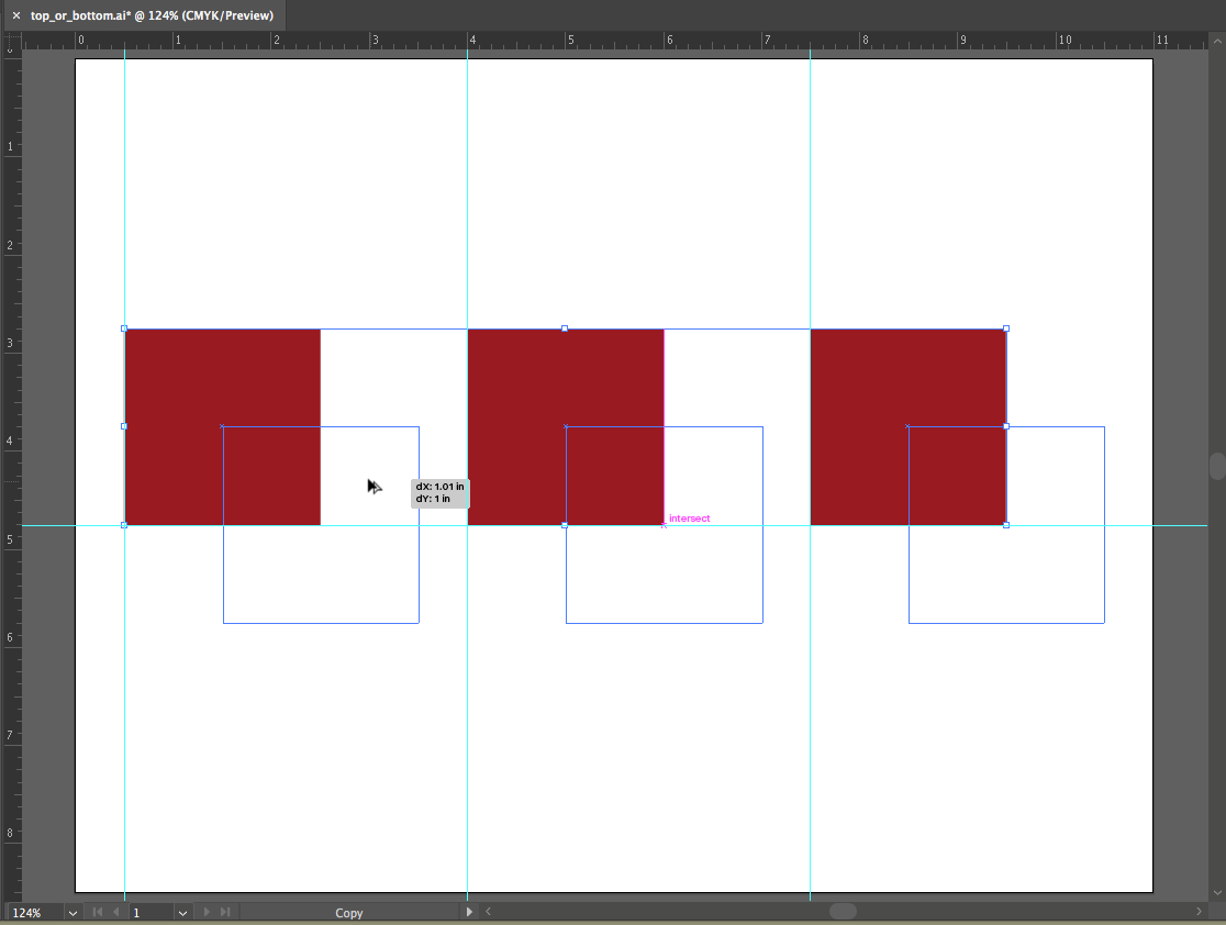
Duplicating and offsetting the squares - Give all three of the new squares a different hue with a higher value from the top three: With all three squares selected, double click on the fill square to bring up the color picker. Choose a different hue, and choose a higher value so the color has less black in it.
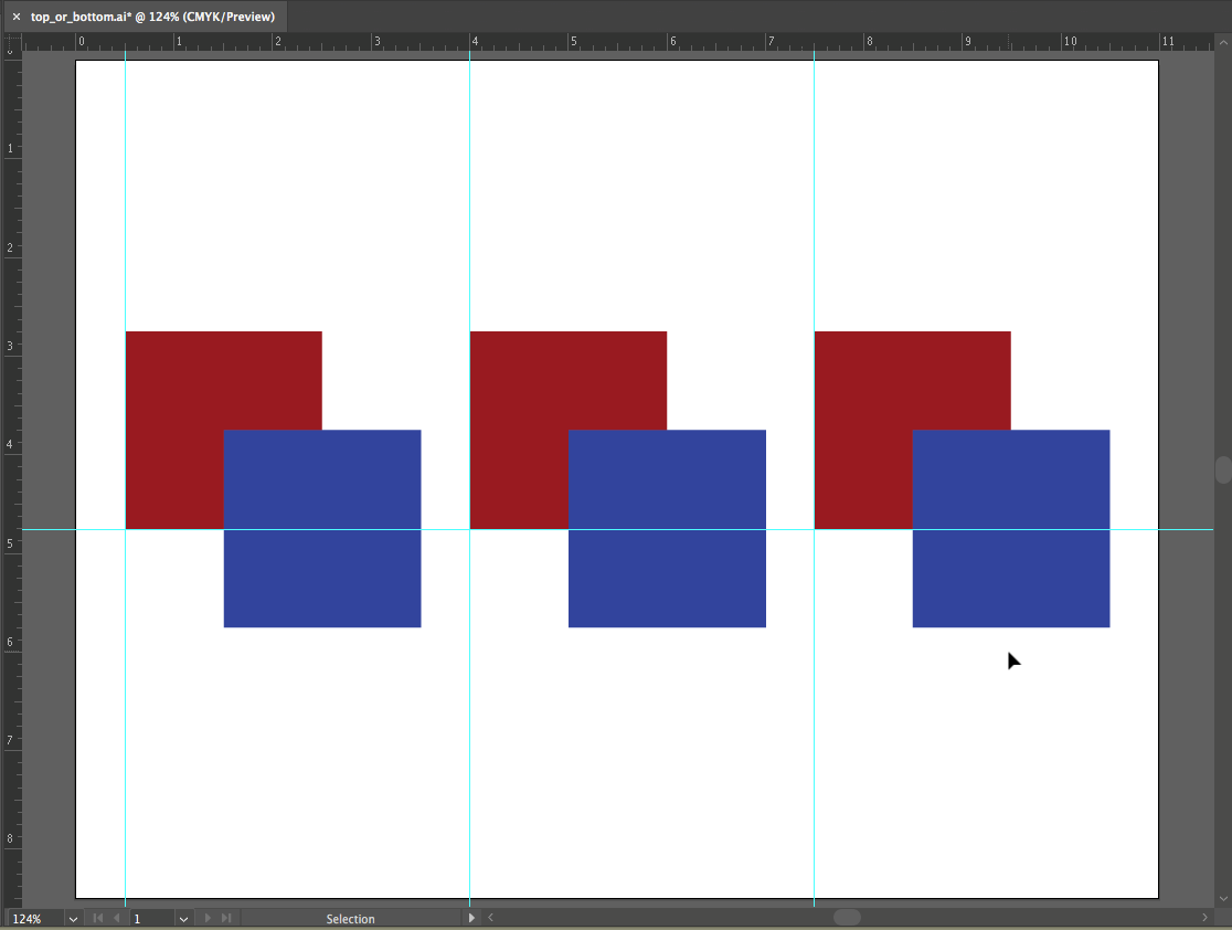
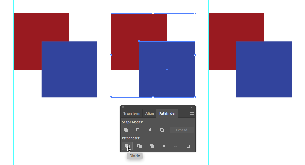
Give 3 bottom squares a higher value from the squares on the top row. - Select the left set of two squares (drag with the Selection Tool, or shift-click with the Selection Tool).
- With the two shapes selected, open the Pathfinder Panel (Window > Pathfinder). Click on the “Divide” button, the first button under the Pathfinder heading. Dividing two objects creates a new shape at the intersection of the paths. The overlapping space is the one inch square. It will become its own whole shape, and the three shapes will remain grouped.
The Pathfinder panel can be displayed using Window > Pathfinder from the menu bar. - Select all three shapes and ungroup them by clicking Object > Ungroup (CMD+SHIFT+G). Now they can be selected and treated individually.
Ungrouping objects. From the menu bar choose Object > Ungroup. -
Repeat steps 10-12 with the middle and right set of squares.
Creating foreground and background depth using hue and value
Now we will modify the color of the middle squares, starting with the left square. The purpose of this exercise is to see how hue and value can be used to create space or depth within a color field. You will set the middle colors to see how that middle square can be pulled forward or pushed back in space, visually, in relationship to the other two squares.
- For the left set of squares, you will modify the center square such that it appears it is part of the top square, and both it and the top square are floating above the bottom square. Achieve this by choosing a hue and value that creates strong contrast with the bottom square (you will especially see this at the boundary between the two shapes), and little or no contrast in value with the top square.
- For the center set of squares, modify the smaller middle square such that it is floating over both of the larger squares. This is achieved by choosing a hue and value that creates strong contrast with both of the other squares.
- For the right set of squares, modify the smaller middle square such that it is part of the bottom square, and both it and the bottom square are floating over the top square. This effect is achieved by choosing a hue and value that creates strong contrast with the top square, and little or no contrast with the bottom square. Be sure to save your document.
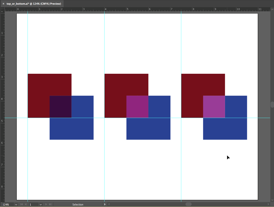
Your finished exercise should be similar to this exampe.
Save your work and start the next exercise when you’re ready.
