
Chapter 4: Type on a Grid
4.4 Exercise 4: Creating body copy with the Type Tool
Body copy is the content of an article, a book chapter, an essay on a web page, and so on. Body copy should be set within a text box, also referred to as Area Type, in all of the Creative Cloud® programs. As body copy is usually set within rectangles, consider the overall shape of text to normally create a rectangular shape on the page. By utilizing a grid system, the production artist controls how many columns of text appear in the final layout.
The artist should be interested in creating legible body copy. Legible body copy is not too big, too small, too lengthy, too short, too light, or too dark. For a considerable amount of body copy (a full article, for example), the copy should be set in columns between 3.5 and 4 inches in length or 35 – 65 characters. This is the point at which many readers begin to read back over the words that they have already read. Instead of re-reading the same words, a 3.5 inch line of body copy encourages the reader to move to the next line of type at about the time that they are ready to move their eyes from right to left.
Assessing body copy as part of a composition is easy: squint your eyes while looking at the printed body copy. The overall grayscale value of the printed rectangle (body copy) should be about 40 – 50%. It should not read as stripes of black against the page. In this exercise we will consider adjustments that can be made if the copy is too light or dark.
- Create a new vertical guide at the end of the last “s” in Systems. This, along with the first vertical guide you created, will establish our space for some body copy in our layout grid.
- Activate the Type tool and then use the font controls in the Properties panel or Control bar to set your character fonts to Gill Sans Regular at a size of 11 points. If Gill Sans isn’t installed on your computer, use another sans-serif font such as Myriad Pro.
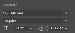
Example of the Character settings in the Properties panel. -
Clicking and dragging with the Type tool, instead of clicking one time and creating Point Type, creates a box for Area Type. Area Type is used for blocks of text like body copy, while Point Text is use for shorter single-line text such as headings.
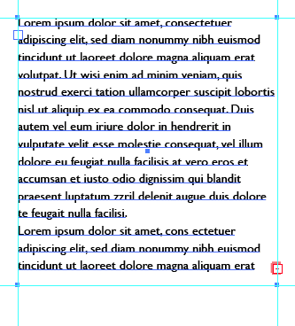
Create an Area Type box starting at about 7.25 inches (vertically), between the two vertical guides, and drag it down so the bottom of the box is at about 10.5 inches on the vertical ruler. If you want to you can set horizontal guides at the 7.25 inch and 1.5 inch marks on the vertical ruler.
Similar to when Point Type is created, an Area Type box will be automatically filled with one or more paragraphs of standard placeholder text that graphic designers have been using since the 1500s. The text begins with the two words, Lorem ipsum, and is referred to as “Greeking” or simply “Lorem ipsum” (i.e. “Put some Lorem ipsum in there for now, we should be receiving the copy in a couple of days.”). Lorem ipsum is used as placeholder body copy when the actual text is not available, as the letters within the Lorem ipsum text are more or less evenly distributed. Looking at “placeholder text inserted here, placeholder text inserted here” repeated enough times to create a block of body copy draws attention to itself as the repetition of so few letters becomes a noticeable pattern.
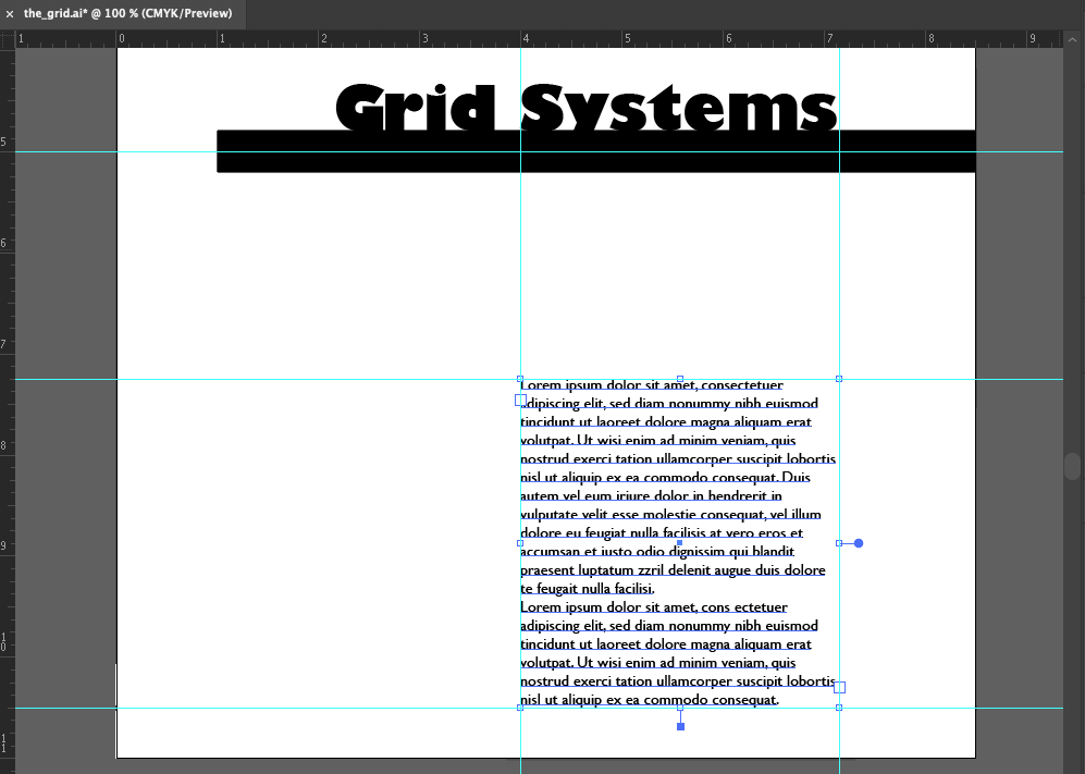
Our layout so far. Note the added horizontal guides at 7.25″ and 10.5″ and the Area Type box filled with placeholder “Lorem Ipsum” text. -
The body copy in the new text box should be left-justified by default; but if it is not, use the Paragraph controls in the Control bar, Properties panel, or Paragraph panel (Window > Type > Paragraph) to set the justification to the left. Using left justification results in a sharp “line” created by the alignment of single letters in a column on the left side of the text. This “line” extends to the headline, as it is aligned with the S in Systems.
By the property of continuation, a line is made from the S to the body copy on the page. While this “line” created by the left margin is not as literal or heavy as the black line made in Exercise 2, it is just as relevant to the layout as it provides an intersection with the black line, further defining the grid on the page. These are all examples of how alignment is used as a principal of composition in a layout design.
-
Leading is the space between lines of type. The body copy is set at 11 points, and the leading is set at 13.2 points (the default auto-leading value). These values are referred to as 11/13.2 in traditional typesetting notation. We’re going to adjust the leading now.
Using the Type tool, click into any area within body copy and then press CMD + A on the keyboard to select all of the type within the type box. With all of the type selected, press OPT + Down Arrow on the keyboard to “open” (increase) the leading (OPT + Down Arrow can be used to “close” or decrease the leading). The following images show this process of adjusting the leading.
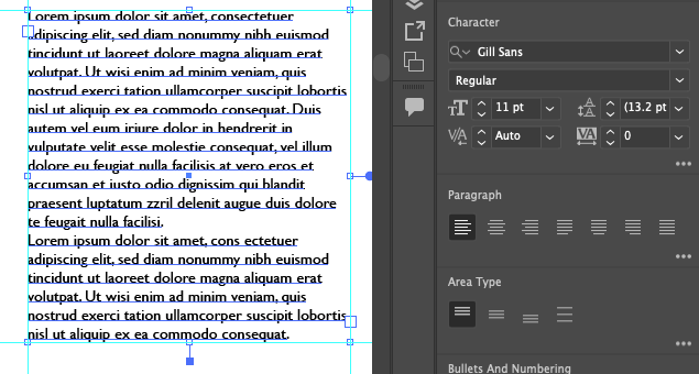
Example 1: we start with the auto-leading setting at 13.2 points. Notice that the leading value is in parentheses, indicating it’s an auto-leading value. 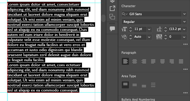
Example 2 – all text in the type box has been selected using the CMD+A (select all) key command. 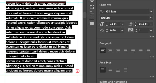
Example 3 – leading has been increased to 15.2 pt. Notice there are no parentheses around the leading value now, indicating that the value has been manually set. -
Because the Area Type box has a fixed height, the increase in leading has created what’s referred to as overflow. This occurs when an Area Type box contains more text than it can display within its boundaries. Overflow is indicated by a red square with a + inside it, located to the right of the last line of text in the text box.
Correcting overflow can be done by resizing a text box using Selection tool and dragging the text box’s resize handles to accommodate all of the text, or sometimes text might be edited if it needs to occupy a specific amount of space. Since we want to retain the space occupied by this text, let’s remove some of the first paragraph.
Using the Type tool, click into the text to edit it. Click and drag to select the last three lines of text in the first paragraph, then delete those lines so that the paragraph ends with “vero eros et.” You should see the overflow icon disappear after that edit is complete.
The red box with a + inside indicates overflow in a text box. 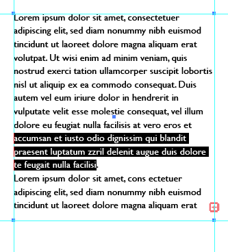
Select the last three lines of the first paragraph and delete them. 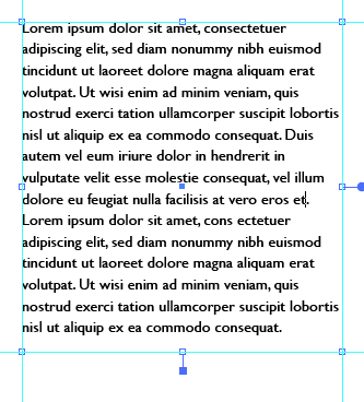
After editing the text, the overflow is corrected and your text box should look like this. - Let’s observe the effect of what we’ve done here. With the leading adjusted, notice how opening or loosening the leading has created a slightly lighter grayscale value when you squint your eyes and look at the block of text (or if we look at a reduced-size view of the layout as shown below).
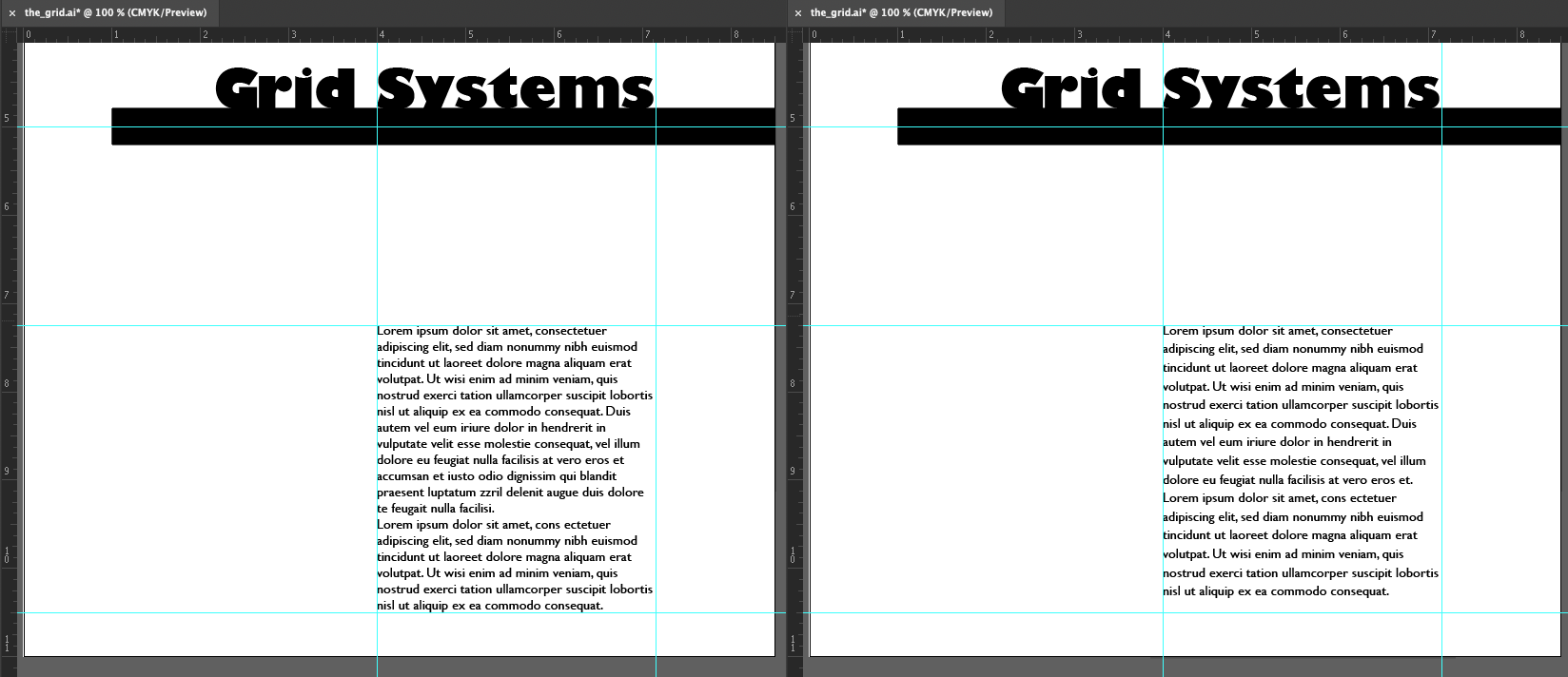
Notice the slight difference in the perceived grayscale value of the body copy with 13.2 pt leading (on the left) and 15.2 pt leading (on the right). Although this did not occur in our exercise, two other typographic problems to look out for are orphans and widows. An orphan is a single word that dangles on the last line of body copy, and a widow is a single word at the top of a new column of text, before a paragraph break. These are undesirable type happenings that create imbalance and draw attention to a place on the page where you don’t necessarily want the viewer to focus.That’s all for this exercise. Save your work and then continue to the next exercise when you’re ready.
