
Chapter 4: Type on a Grid
4.3 Exercise 3: Using the Type Tool to create a headline
Headlines are typically larger than body copy and maintain a heavier weight on the page than most other elements. The scale of the headline often relates to the scale of an accompanying photograph or illustration (it may be the same width or half of the width, for example, as a photograph on the front page of a newspaper). Headlines and sub-headings being larger than body copy establishes a hierarchy of topics for the information being presented.
As you may be aware, there are many fonts to choose from when working with type in a design. System fonts are the default fonts that are installed on all computers, such as Arial, Chicago, Times, New York, and so on. These fonts typically aren’t used by print designers, as they’re intended for on-screen use. Web designers used to rely specifically on system fonts for body copy until webfont technologies were commonplace.
Display fonts (ornamental fonts, such as those that are free to download from sources like http://chank.com/freefonts.php) are not legible enough to be used for body copy, but are often selected for headlines as they tend to be more ornate. Sans serif type was first invented by William Caslon IV (1816) and was reserved, as John Kane writes in his A Type Primer, “almost exclusively for headlines” (36). Using a sans-serif font for headlines is not a rule, but often commands attention as they are sleek and authoritative in comparison to serif fonts. In this exercise, Gill Sans is the typeface we used for both the headline and the body copy. The ultra-bold font style creates a weighty headline, and the regular variation of the typeface is very easy to read as body copy.
- Select the Type Tool in the Tool Palette (shortcut key T)
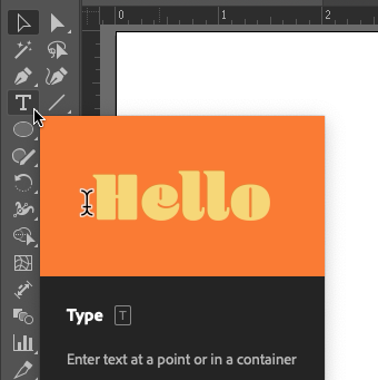
The Type tool’s icon is a “T” in the Tools panel. Activate it by clicking it or by pressing the T key on your keyboard. -
With the Type tool active, click once (don’t drag) anywhere on the Artboard. Clicking just one time will set what is called Point Text in the place where you clicked, and the words “Lorem ipsum” will be automatically entered and selected. This is placeholder text and since it’s already selected you can replace it by typing the text you want. Type “Grid Systems” (without the quotation marks) to set the text for our headline.
Illustrator® is a pretty smart program, but it doesn’t know when you are finished using the type tool. You have to tell it “I’m done;” and there are many ways to do this (see the tip box below). When you are finished typing your headline, click on the Selection Tool. The type is automatically selected as an object and the flashing cursor is gone.
Tip – How to tell Illustrator® you are done using the Type Tool: 1. Hold CMD and click anywhere outside of the type on the Artboard. The type is now deselected. 2. Press the Escape Key on the keypad. Notice your Selection Tool is automatically activated. - Once the type is created, it can be edited by using the Selection Tool and inputs found in the Control bar, the Properties panel, or the Character panel (Window >Type > Character). We’ll refer to these as the font controls for simplicity. If your type is not selected, click on it with the Selection Tool.
- In this exercise, Gill Sans Ultra Bold was used for the headline. While the type is selected, choose Gill Sans Ultra Bold (if you have it installed) or any other font of your choice from the Character pull-down menu in either the font controls.
- The font size can be edited by typing a number into the font size box in the font controls or by scaling the type with the Selection Tool. To scale the type, click on any of the four anchor points at the corners of the selected type object and drag towards (decreases the scale) or away from (increases the scale) the center of the type while holding SHIFT to retain the font’s correct proportions. In this exercise, the headline is set at 44 points.
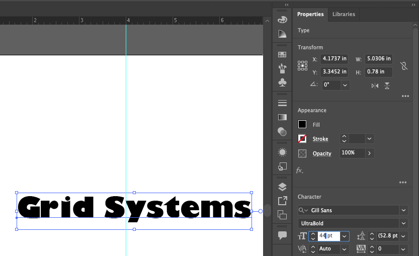
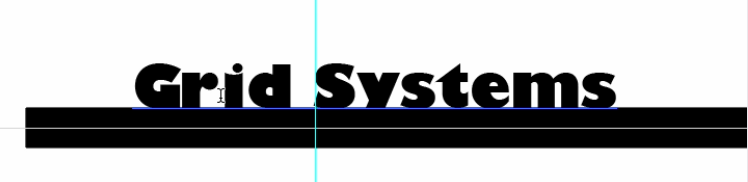
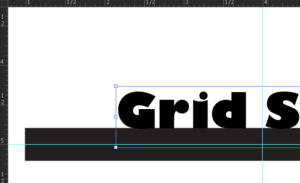
Font controls for the font family, style, size, and more can be found in the Properties panel, shown here. Similar controls are also located in the Control bar at the top of Illustrator’s Essentials Classic workspace, or in the Character panel (Window > Type > Character). - Use the Selection Tool to click and drag the headline and move it so that the baseline is within the black line and the S in Systems is just to the right of the vertical guide, as shown here:
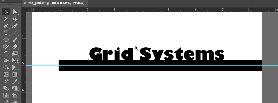
Your work should look similar to this. Note the alignment of the first “S” in “Systems” with the vertical guide, and the baseline set slightly within the 30pt black line. The word “baseline” refers to the invisible line upon which typographic letters rest, as demonstrated here:
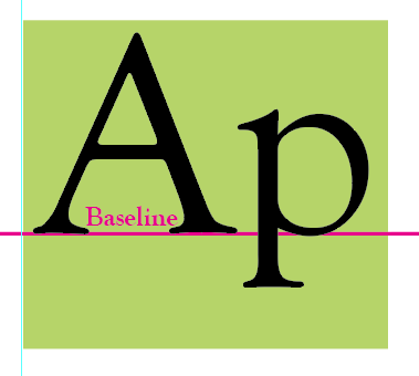
‘A’ and ‘P’ on a baseline -
Kerning is the space between letter pairs in a single word. When you set body copy (for instance, a letter typed in Microsoft Word), you usually do not have to be concerned with kerning. The digital fonts are typically designed to be well-kerned at smaller font sizes (such as 10 – 12 points). However, when working with display text, such as a 44 point headline, the kerning should be studied and adjusted where needed.
Traditionally, the amount of space between each letter pair in a word should be visually even. In this exercise, we will adjust the space between the r and i in Grid and between the s and t as well as the t and e in Systems. Activate the Type tool and place the cursor just between the r and i in the word Grid. Click when you see that the cursor looks like an “I beam” line to edit the word.
Click between the r and i when the “I beam” cursor is displayed. Watch Out: If you accidentally click when the Type Tool looks like a T with a dotted-box around it, you will make a new type object. If you accidentally create a type box use the Selection Tool to select it and then hit the Delete Key on your keypad.After clicking between the r and i in Grid, you should see a flashing vertical line cursor between those letters. Hold down the OPT key on your keyboard and while continuing to hold OPT, press and release the Right or Left Arrow keys on the keyboard to nudge the letters to the left or right. This is the method of manually adjusting the kerning of the display text in Illustrator®, Photoshop® and InDesign®. Repeat this for the s/t and t/e pairs in the word, “Systems”.
If you have used a different font you may need to adjust kerning between other letters. Remember, the goal is to have visually balanced space between the letter pairs, so that they’re not too close or too far apart. The whole word should read smoothly and the space between all letter pairs should feel comfortably balanced.
Before kerning there is a slightly awkward amount of space between the r and i in the word “Grid”. 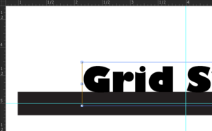
After kerning, the space between the r and i is closer and helps “Grid” flow as a single word. Save your work and then start the next exercise when you’re ready.
