
Chapter 8: Tonal Scale
8.2 Exercise 2: Understanding the histogram
Now we will take a look at the tonal range within the image. This can be done in any color mode, but for the purpose of keeping this process easy for the first time, we’ll change the image to grayscale color mode.
- Click on Image > Mode > Grayscale to convert the image from RGB color mode to Grayscale. You will see a dialog box with a message asking if you want to discard color information, click Discard. Use File > Save As and save this version of your file using ch8-lastname-flower_gray.psd as the file name.
- The next part of this exercise is to be observant about the value of the light and dark tones in your image. We do this with the use of the Histogram panel. Click Window > Histogram to display the Histogram panel.
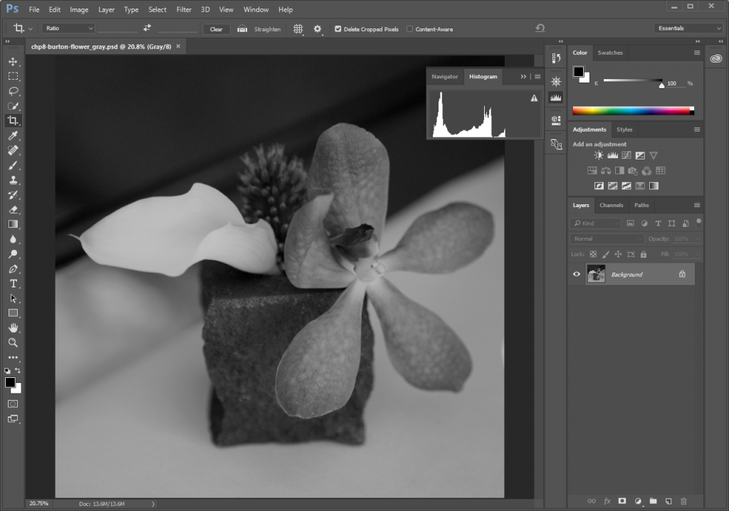
Notice the histogram for this image is clipped on the shadow side. This panel conveys information about the grayscale tones in the document. This is true regardless of whether the document is in color or grayscale, as color images are rendered digitally by compositing separate color channels (red, green, and blue, for example), each with corresponding grayscale values. So once again, the Histogram displays information about grayscale values, even if they correspond to color information. Here’s the quick version of how to read a histogram:
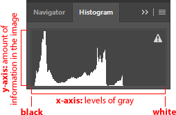 The overall histogram graph displays the amount of information within the image (y-axis) at the various levels of gray from black (on the left side of the x-axis) to white (the right side of the x-axis). There are 255 levels of gray in any 8-bit image. Consumer scanners and digital cameras typically capture 8-bit images. There are professional scanners and cameras that capture 16-bit images, yielding more options for adjusting the tonal range; but for the beginning digital media student, we will remain focused on 8-bit images.Tip: The exclamation point triangle icon in Photoshop® usually means “out of gamut,” but in the histogram it is meant to indicate that the panel is showing cached information. Clicking on the icon will refresh the panel information. In this exercise we are not changing anything, so it is not important to refresh.
Look at the histogram for your open image to make the following observations:
A. Does the histogram start and end at the beginning (dark values) and end (light values) of the x-axis? This would mean that there actually exists image information in the darkest shadow areas and the lightest highlight areas. If the graph seems to end before the edges of the box containing the histogram, the graph is “clipped” and there is no information at one (or both) end(s) of the spectrum. There is probably a noticeable lack of contrast in the image if the graph is clipped.
B. Where on the x-axis of the graph is most of the image information stored? In other words, where are the spikes in the graph? This should make sense in terms of how dark or light the overall image appears.
Imagine in the image above of the histogram that the midway point on the x-axis is where 50% gray occurs in the image. In this image the highest spike appears somewhere between the blackest shadow and 50% gray.
C. Does the histogram have any gaps where information does not exist? This means that there is no image information in areas where gray values between black and white are expected. This is usually a result of “over-tweaking” an image with tonal adjustments, as opposed to something that will be noticeable from a scan or digital camera capture. Sometimes this is a reasonable result of increasing contrast in an image, especially when certain areas are particularly hot (bright or blown out highlights).
In our image, the histogram has no gaps. In the next exercise we will be making changes to the histogram and you will see gaps as a result.

