Chapter 5: Color Theory & Basic Shapes
5.4 Exercise 4: Interaction of colors
And now for the magic trick: in the next exercise three colors appear as four colors.
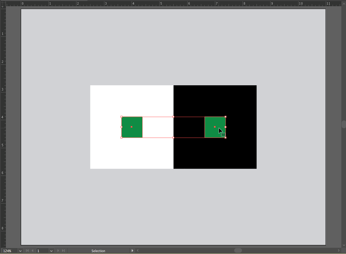
- Re-save your Exercise 3 file with a new name using File > Save As and name it interaction2.
- Shift select the two smaller squares and use the Color Picker or the Color Sliders (Window > Color) to assign the same new hue to them.

Interaction of colors. Notice how the same hue looks different according to the colors it is next to. - Select the larger square on the left (in this example, the white square is selected) and assign it a middle value and a complementary hue to the hue you just chose for the smaller square. You can use the Color Picker or the Color Panel, or you can “cheat” and follow these steps to find the complementary color:
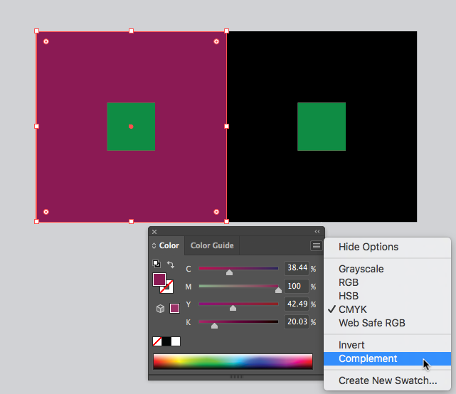
- Select the large square to the left, then use the Eye Dropper Tool to click on the smaller square. This will fill the large square with the same exact color that you used in the inside smaller square and for a moment, there will be no distinction between these two shapes and the smaller square disappears. The large square remains selected, so do the next step before you accidentally deselect!
- While the large square is still selected, use the pull-down menu from the top right corner of the Color Panel to choose “Complement.” This will assign the exact complementary color (in the color model that you have assigned to your document) to the larger square.

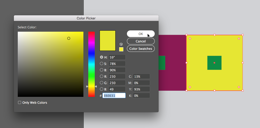
Complementary color study - Now we will change the squares to the right to show analogous color works. Select the larger square on the right (in our example, the black square) and assign it an analogous hue to the hue of the smaller square (ours is green) with a middle gray value. Remember analogous colors are colors next to each other on the color wheel.

Using the Illustrator® Color Picker and color slider to alter hues and values First we used the Eye Dropper Tool to set the fill of the larger, black square to the same hue/value combination used in the small square (a repeat process from step a). Then in the Color Picker, we slid the hue cursor up slightly for the analogous hue and a little to the left for a value closer to middle gray.
- Notice that the two small squares look like they are different colors. They are, in fact, the same color, but the presence of the complementary and analogous colors influences our perception. The complementary color emphasizes the perception of the hues, and the analogous color subtracts the perception of the hues.

Notice that the two small squares look like they are different colors. Time to save your work, you’ve completed Chapter 5!

