Chapter 4: Type on a Grid
Download Materials for Chapter 4
Click here to download the Chapter 4 work files
There are no files needed to complete this chapter. Download and view the completed exercise examples.
For many students and educators, The Bauhaus has become a symbolic point of entry to art and design education. The precision of the grid in design and architecture was made relevant through studies at The Bauhaus. In Ellen Lupton’s The ABCs of (triangle, square, circle) The Bauhaus and Design Theory, the movement is credited as being “the mythic origin of modernism” as founder Walter Gropius and László Moholy-Nagy were devoted to creating a “universal language” and embraced methods of mass production (Lupton and J. Abbott Miller, 2).
The grid is utilized in all areas of design as a structure upon which forms can be precisely placed, reflected, balanced or imbalanced. The grid is the invisible underlying structure that sustains the relationships between all formal elements in print design, interactive design, industrial design, architecture, fashion, and more. Its origins are established in the High Neolithic Era (4500 – 3500 BCE), according to Joseph Campbell who defines the grid as “a geometrical organization of an aesthetic field.” While the origin of the grid as an organizational structure precedes the Bauhaus art movement and institution by more than 5,500 years, the Bauhaus movement perceived the grid as not only an organizational structure, but as a structure that could be easily multiplied and reproduced. By understanding the relationship between the grid and the organizational requirements of automation and mass replication, The Bauhaus is responsible for design solutions utilizing the grid that became popular in the 1920s and is still noticeable today.

http://flickr.com/photos/digitalfoundations/2229001727/
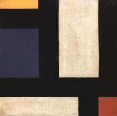
Piet Mondrian and Theo van Doesburg created oil paintings of grid structures that illustrate the foundations of Modernism. Mondrian was a Dutch painter who contributed to the De Stijl (in English, “The Style”) movement founded by Theo van Doesburg. Although neither Mondrian nor van Doesburg were masters at The Bauhaus, Bauhaus members were aware of De Stijl and influenced by contemporary art movements. These grid-compositions have been an inspiration to artists and designers who rely upon the grid as an organizational design asset.
While the black and white paintings with brief areas of vibrant hues in primary colors appear to be simple horizontal and vertical intersections, the renderings might allude to a city map, an electrical circuit board, or an abstracted blueprint. The negative space in the composition can be perceived as the windows of tall buildings. The grid is understood as a layout or a supporting structure while these compositions are the essence of the often unnoticed foundations of modernity. Formulating an abstract concept from simple lines and planes is a practice in translating visual cues into language-based meanings. It is the goal of any visual communicator to learn to do this as both the reader of the message and the generator of visual content.

