Chapter 6: Line Art and Flat Graphics
DOWNLOAD MATERIALS FOR CHAPTER 6
Click here to download chapter 6 work files
There are files needed to complete this chapter. In this chapter you will need to turn in the ch6-hand.psd file with your files. Make a copy of the file and place it in your chapter work folder prior to doing the work. The completed file is also available for you to view.
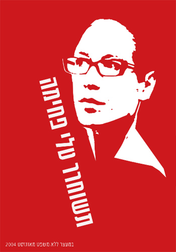
Line art is a composition made strictly in black and white, which does not include a shift in tonal scale. The gradation of colors in a photograph of a sunset would not be considered line art, while a newspaper headline is line art, as it is a work in typography, typically created in black on white. Line art most closely relates to drawing with a bold marker, as the ink is either on the paper or it is not. The result is a composition understood through the exploitation of positive and negative space.
Historically, line art referred to flat graphics or illustrations made in ink on paper, and was a method of efficiently producing “camera-ready” materials for the commercial printer. If the work of art consisted of a gradation or more values than black and white, the technical requirements for silkscreen printing became more cumbersome. Layers of line art would have to be created and photographed, so the printer could recreate the gradation on the single printed page with individual screens of overlapping color or value. Since the 1980s, digital technologies have influenced both the commercial printing industry and the designers and media crafters who send files to print. Printing has become less focused on “camera-ready” materials now that print-ready files eliminate the need for re-photographing original art.


The original “flat graphic style” can be located in Plakatstil, which translates from German to English as “Poster Style.” Plakatstil is the opposite of decoration. It is bold and minimal, the type is large, while the image is sparse and colors are bright. Lucien Bernhard’s 1906 poster design entry to a contest held in Berlin by the Priester Match Company is considered the first work to embrace this new graphic style, possibly inspired by the industrialization of city life and a desire for fast-paced communication.
Although line art and flat graphics are especially utilized for the commercial purposes of logo and identity pieces, the outcome of drawing a single line is as personal as your signature. Artists such as Pablo Picasso and Egon Schiele (see chapter 1) are often identified by their line quality. Two lines can contrast one another due to the weight of each line (the thick or thinness of the line), the amount of pressure used to draw the line, or the boldness or starkness of a line that is heavy or one that is broken up into smaller pieces that reach towards a single direction.
The Pen Tool
The Pen Tool is prominently used for creating flat graphics or line art. It can be used to make complicated forms by tracing images and combining simple shapes. In addition to contouring and tracing, the Pen Tool is often used to create shapes that are used for masking. The Pen Tool can be a little difficult to learn, as the process of using this tool sometimes feels counter-intuitive. The artist has to know where her next point is before plotting it. Visualizing lines, shapes, and space before they exist can be challenging. In this exercise the paintbrush is used to create quick gesture drawings of the lines and shapes that will be recreated accurately with the Pen Tool to eliminate the type of forethought that accompanies the use of this tool. With enough practice on top of template layers, newbies are sure to develop Pen Tool intuition.

