Chapter 14: Two-Page Spreads
14.3 Exercise 3: Adding Variety and Visual Interest
Now we’ll work with refining some of our type styles, adding visual contrast to help the reader more easily distinguish the various parts of text in our spread, and giving a little flair to the design.
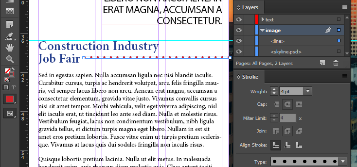
- With the Type tool, select the words “Construction Industry Job Fair” in the bottom text frame, then change the following settings to visually set it apart as a subheading:
- Set the font to Minion Pro Semibold, 24pt type with 24pt leading
- Change color to Navy Blue (C=100 M=90 Y=10 K=0)
Lastly, break the subheading into two lines using a soft return. Your work should resemble the sample image below.

- Unlock your image layer and make sure it’s your active layer. Using the Line Tool, draw a horizontal rule between the left edge of the picture to the right edge of the word “Fair”, aligning the line vertically with the top of the letter “r”. Using the Stroke and Swatches panels, turn the rule into a 4pt dotted line with a red color. Lock the image layer again when you’re finished.

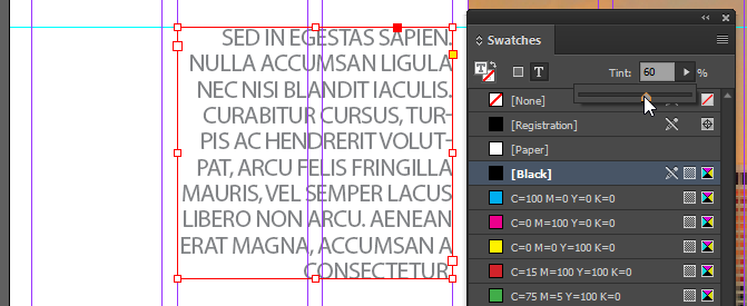
- Change the text color of the intro paragraph to 60% gray (hint: select that text frame and change the tint of the black in your swatches panel – make sure you’re adjusting the Type color!)

- In the headline of your spread, select the text “A Room with a” and set its color to Navy Blue (C=100 M=90 Y=10 K=0). Select the word “View” in your headline and set its color to [Paper], then save your work.


