Chapter 3: Symmetry
Download Materials for Chapter 3
Click here to download the Chapter 3 work files
There are no files needed to complete this chapter. This download includes completed exercise examples provided for reference.
Screencast for Chapter 3
View the Chapter 3 video [30.53min] and refer to it as needed.
This video gives an in-depth look at the chapter work and includes techniques and tips not included in the text content.
Symmetry is achieved when the weight of a composition is evenly balanced. Symmetrical forms are perceived as being stable. In order to achieve symmetry in any composition, the designer must create balance with the compositional objects in both their positive and negative spaces in relationship to the grid. The positive space often contains the active design elements while the negative space in a symmetrical composition is usually passive.
The opposite of symmetry is asymmetry. Asymmetric compositions can be balanced or imbalanced, but the overall weight distribution between the positive and negative space will be uneven. The negative space in an asymmetric composition may be more active than the positive space.
The designer chooses to create symmetry or asymmetry within the composition in order to reach the visual or psychological expectations of her audience. These decisions connect the concept of the presented material to the presentation. For example, a logo for a bank should feel secure and restful, connoting safety and trustworthiness, while a horror movie poster should feel emotionally charged, suspenseful and frightful. Logos for banks tend to be symmetric compositions, and asymmetric designs are used to convey unstable ideas.
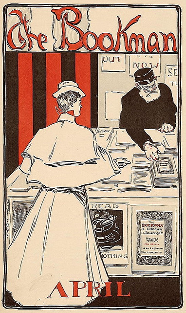
This advertisement is symmetric as the scale and lightness of the female figure in the foreground is counterbalanced by the scale and darkness of the male figure on the right side of the image. The symmetry is reflected over the y-axis in the center of the composition. The typography is centered at both the top and bottom portions of the advertisement.
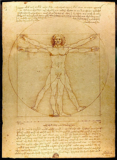
Leonardo da Vinci’s classic drawing of the human form demonstrates the principle of symmetry in the human body.
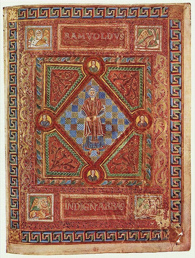
Symmetry is achieved in Adalpertus’ book painting across both the x and y axes.